One of the big visual changes just happened in KDE 4, the
transition of kdelibs to the Oxygen Icon set. This transition is
still in progress, and it includes a massive icon naming scheme
change that affects thousands of files. But, the Oxygen artwork
project much is more than just an icon set, it's a unified way to do
artwork for KDE 4. SVG an essential part of Oxygen, so many
applications that are now capable of SVG display are also using
Oxygen styled artwork. Read on for more...
Please keep in mind that the artwork I am showing today is a
work in progress, but shows things that have already made
their way into KDE's SVN as the new default. Oxygen will be the
default art scheme throughout KDE 4, but many of the elements can
still use some tweaking. If you have constructive feedback on any
of the artwork demonstrated today, the Oxygen team would be happy to
hear about it in the comments. :)
Back on the first of January, I wrote an article showing some SVG
widgets making their way into KDE, thanks in part to Qt's new SVG
capabilities. Some of the artwork shown in that article was
placeholders that were produced by the Oxygen team. Since then,
there have been improvements to much of those graphics, but the
really big visual change that just happened is the inclusion of the
new Oxygen Iconset into the KDE libraries as the new defaults.
Oxygen is a far reaching project, and extends well beyond icons.
They have a sort of unofficial tagline: "a breath of fresh air for
your desktop", which encompasses the look and feel of the whole KDE
environment. They are a team of developers and artists that are
dedicated to making things look beautiful. And not just shiny
effects either, they are ensuring that KDE has a unified, easy to
recognize interface. For example, icons that end up in toolbars all
have the same shadows below them to give them a consistent look.
Colour palettes have been created for the artwork to ensure that
icons don't clash with one another, and yet are still easily
recognizable. All of the icon sources are SVG files create using
Inkscape (and other SVG capable programs), and having the sources
available makes it easier to make simple tweaks to the SVG files.
We also now have an official icon naming scheme for KDE 4.
Previous versions of KDE grew the naming scheme organically as KDE
evolved, so it was somewhat random in many places. The Oxygen team
was responsible for developing parts of this naming scheme, but they
did so as part of freedesktop.org so that there is less confusion
about icon schemes between Gnome and KDE (and other environments) in
the future.
So, rather than just talk about Oxygen, I have some screenshots
to show the icons in action.
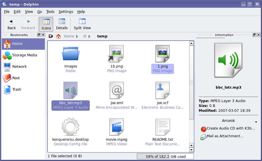
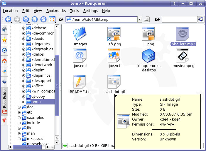
Below is a screenshot of Dolphin showing Oxygen icons, and a shot
of Konqueror (from KDE 3.5.6) showing the same folder. Many of
these mimetypes also have previews available for them, when previews
are enabled.
You'll notice in the Dolphin shot that there are still a few old
icons sticking around, even though the Oxygen iconset includes
replacements to those icons. One of the biggest changes that
happens are part of the Oxygen transition is that many icons got
renamed. Old code may be referring to the old icon names, rather
than the newly corrected Oxygen names -- when the crystal SVG icons
are removed from kdelibs, it will become more apparent which names
are affected. For those who like the old icons better, they will
also get renamed, and be offered as an icon-theme within the KDE
artwork package.
As the Oxygen Icons have now been made the default, you will be
seeing them in all future articles in the Road to KDE 4 series, and
should get a better appreciation of how complete this artwork is.
Of course some icons still have room for tweaking, which is easy
thanks to using SVG sources. I'm not providing the screenshots of
the whole iconset in this article as you can find them in websvn or by
building KDE 4 yourself. The next snapshots of KDE 4 will of course include the new icons as they are now considered the default.
But, like I said, Oxygen isn't just about the icons. There are a
lot of other places within KDE where the Oxygen artwork is popping
up. Here is a shot of KDE 4's new logout dialog.
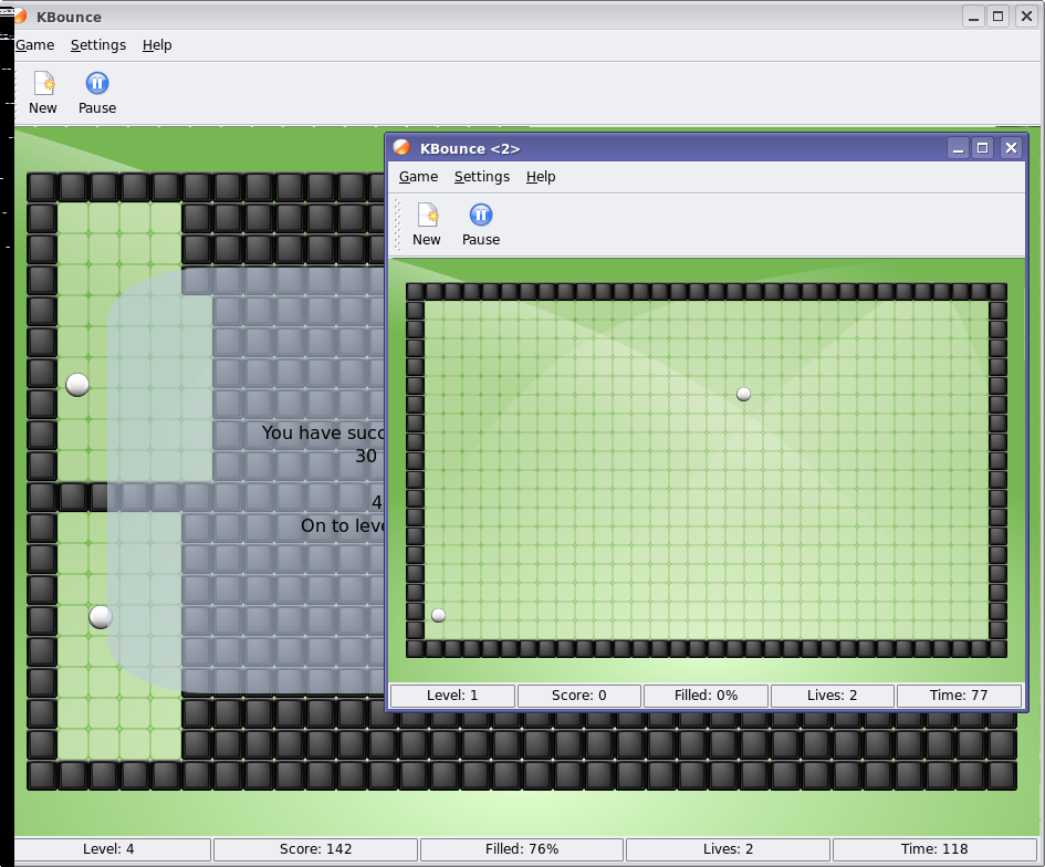
One of the biggest advantages to using Oxygen artwork in various
locations throughout KDE is that it is (mostly) resolution
independent. Which means, certain applications can be made to scale
to any size you want, and it will still look good. So, for
instance, if you are playing KBounce (from KDE Games), and you want
it to be big or small, it just adjusts the size for you.
So while KDE 4 is not a true, resolution independent desktop, and
this isn't necessarily a goal for KDE at this time, some KDE
components do now operate on a resolution independent basis.
There is another two elements of Oxygen currently in development,
that are not yet complete. These are the Oxygen Widget Style, and
the Oxygen KWin Decoration. These have not yet been made the
defaults for KDE 4 as they are not yet far enough along. But owing
to the fact that it has not yet become the default for KDE, I'll
decline to show it off just yet. Just bear in mind that the Oxygen
Icons and related artwork are just a few elements of the Oxygen
project. The Oxygen team is making a lot of progress on the Style
and Windeco, but this whole project is an enormous amount of
work.
There are also other visual elements of KDE 4 underway that do
not directly involve the Oxygen team, but will work together with
them when required. These are things like KWin's composite branch,
or the Plasma Workspace theming capabilities.
For those that are interested in helping KDE out through
artwork, you should visit #kde-artists on irc.kde.org and get in
contact with some of the artists there. They are quite friendly,
and take constructive feedback from artists and non-artists
alike.
Individual KDE projects are also looking for artists: Recently,
Carsten Niehaus of Kalzium put out a request
for some help producing some kid-friendly icons to represent the
elements of the periodic table in an optional kid-friendly layout.
Anyone up to the task should visit the #kalzium irc channel.
Also, the Amarok project has recently informed me that they are
in need of some artwork for their upcoming 1.4.6 release (for KDE
3.5.x) which doesn't need to be Oxygen styled, as Oxygen is intended
for KDE 4. Join the #amarok irc channel if you're interested, and
talk to 'markey'.
Editorial aside: I'm glad that so many people are showing
interest in KDE 4's development, but please try to provide
constructive feedback to help improve KDE 4. Many of the developers
read the comments on the dot and implement things that users request
if they are well-reasoned. For example, Peter Penz implemented the
Tree View in Dolphin, and Rafael Fernández López made changes to the
Job Progress Manager based on your constructive feedback. Your
feedback is very welcome, but as last week's article has shown, when
the comments get out of hand, it becomes harder to sift through them
for the constructive ones. On the flip side, that article
absolutely demolished the previous dot.kde.org comment records.
Hopefully we can break those records again one day as the interest
in KDE 4 grows. Until next week...
Comments
On the screenshot there is a padlock on the PNGs for cystal, but why not for oxygen?
never mind I found the awnser. No emblem for locked yet.
I've been browseing around the web-svn, thanks for the link Troy, I couldn't find it yesterday, and I have some comments. I'll may have more later.
I like the folder-music, folder-video, etc. but folder-tar dosn't look so good. I know the tar is supposed to be a cardboard box, but at that angle its more like a brown square, or a brown doghouse. Change the angle a bit, or maby use an actual ball of tar.
BTW how dose that setup work? is it that a user defines a folder to use one of those, or some alogrithum.
And on the subject of folders, I prefer the angle used by cystal to that of Oxygen. I don't suppose there is any plan to create an Oxygen style folder set drawn from the same angle as cystal?
Apps: I can't comment as a whole, since their so varied, but the ones I checked were lovely. Although why dosn't Kmail have an @ on the stamp?
Mimetypes, I'm afraide I don't like this set, the source code files just have the letters "C" or "py" on a standard file. It should be a very styleised C and a python respectively. As for the archives (tar tgz zip rpm deb), why are they an icon inside a file? surely they should look big and chunky to represent the fact they're often many files in one.
That said most of the actual files, like the image or midi are quite nice.
A more general coment, I noticed that you've put the word oxygen around the place, such as Oxygen is the address to Kmail, and Oxygen times is on the news file. Gave me a little chuckle :)
"or maby use an actual ball of tar."
Ehm... what would a ball of tar look like?
I mean, I know about tar, some kind of greasy dirty liquid,
but I'm not familiar with the concept of a "ball of tar"
and I can't visualize that. So the association would
probably be lost on me.
You know I didn't actually think of that,
I suppose the closest you could get would be a ball of playdo, with the imperfections http://cookingmonster.files.wordpress.com/2006/04/playdo.jpg
only make it black. and stick a big zipper on the front if its a compressed tarball.
Or a tar baby, though that might be seen as racist I suppose.
A barrel of tar?
How about a tared and feadered person then?
I don't think an actual picture of tar is a good idea. For those unfamiliar with what a tarball is they would be clueless as to what it means but most people will recognize a box or package as a extracted zip or something similar which is more what they are going for. Obviously this is just my opinion though.
I really love how the icons are coming, keep up the great work.
Then how about a box of tar? ;p
Indeed, I think it's a bad idea. I am not a native English speaker and before reading this thread I didn't even know that tar was something else than an archive type. Let alone people who don't speak English at all.
As a general rule I think it is good to avoid icons based on a pun on the file type, since it is highly language dependant.
And as a user I usually don't care about what type an archive is when I see one. I think it is better to keep all the archive icons under the same format and for example adding the letters of the extension on it.
a katamari ball! ;)
...but really, um, I dunno. the comment about language dependence made some very good points. maybe the box could use a little decoration... boxes sent through the mail always seem to end up with lots of junk stuck to them :)
Or just a diffrent angle so it looks like a box and not a doghouse
I have to agree that the Crystal folder angle is much better than Oxygen's. I suspect part of the reason this angle hasn't been used is that it is viewed as too extreme, which is an understandable viewpoint. Perhaps a sort of compromise could be made? Rather than making Oxygen's folder a totally straight-on view, it could be turned a bit on the Y axis so that one side appears "closer" to the viewer than the other. This would give the appearance of depth while also maintaining the square shape (as opposed to the somewhat diamond shape Crystal folders have, since they appear to also rotate along the Z axis).
I also agree with the above poster regarding the archive icons. Rather than having an icon inside a file, like other mimetypes, they should be something different to represent the fact that they are a collection of files. Perhaps a base "package" icon could be used with a smaller image on top of that to represent the type of archive it is.
I hope these ideas have been expressed clearly. If not, and you're interested in either of them, feel free to respond here or e-mail me and I'd be happy to try and clarify. I'm just an end-user, but I think we can all appreciate good looking desktops :)
In the past (on windows ;( ) I saw an icon represending a folder with a zipper running across it. I allways liked that one.
What I seem to notice is that the new Oxygen style misses the coherence among the icons like Crystal had.
Is this intended?
Or is Oxygen still about to change in that regard?
> What I seem to notice is that the new Oxygen style misses
> the coherence among the icons like Crystal had.
Well keep in mind that the actual release is very likely about 6-8 months away. Given that and given the huge amount of work these guys have accomplished it looks pretty coherent already. I'm pretty sure it will be even more coherent than Crystal in the end. One of the reasons is that Oxygen is using a well-defined color palette.
if you're basing that on the screenshot in the article, note that a number of those icons are actually crystal icons and not oxygen icons.
if it is what's actually in svn, ther are some sets of icons that are still finding their place in life such as the back/forward/home buttons. but the final icons are pretty consistent.
there are differences between types of icons, however, and that's intentional. device icons are recognizable as device icons; filesystem icons as filesystem icons; action icons as action icons; etc... the design principles for each group has been selected for the given use case each fulfills and to allow them to be easily discernable.
Hi all
I think KDE needs more and more Widget Style and WinDecos, but currently creating them is hard, needs code and compiling and...
I was thinking that its a dream that we make Widget Style/WinDecos by easy XML files and SVG artwork.is that really possible?
I know Dekorator is there, but currently:
--Everybody who wants to use Dekorator, needs to install it (its not default)
--Installing themes for it is not easy (yes, i know thats just download and copy, i mean it should use KHotNewStuff)
--Selecting themes in different Theme Engines makes some problems, there just be one list, windecos list, currently you have to choose Engine and select your theme in the Engines list.
KHotNewStuff is really needed for Windeco selection, icon part and Style widgets part.
PS:why didnt you talk about the Oxygen Sound Theme??
There are some plans in this area, so it might be possible in KDE 4. But nobody is really working on this yet, as far as I know. Currently, themes are C++ code, apparently because of performance reasons...
At one point there was work on a SVG-based widgetstyle engine for KDE 4, CoKoon. Then the author lost interest I think.
There is also Detente for pixmap-based widgetstyles in KDE 3.
Qt 4 has introduced the possibility to do styles using CSS some syntax. There was even an article about that at this site. Dunno how that works for doing gradients, and other drawing effects...
Anyway, I have just started a project for a KDE style that uses GTK+ for the rendering (the opposite of gtk-qt-engine) [1]. Saying this cause I have done this QSimpleStyle layer which simplifies doing a C++ style using QStyle. It handles the placement of widgets parts, their sizes and etc, as well as highlighting, for you. You just need to paint primitives (like the step button of a scroll bar) and set the size of some attributes (stuff like how much pixels the label of a button should be displaced when pressed).
I will be doing a simple Qt style with it as an example... Anyway, if someone is interested, drop me an email.
[1] http://gtk4qt.sourceforge.net/
I was wondering if theres a web site that has widget styles to download in rpm form. i use FC7 and im kinda sick of kemerik style. its one of the style i use. i love it but i want to have a veriety to choose from. that give a 3d look to buttons and all that great stuff. thanks for a reply. i am also using the crystal theme. i also have dekorator, and its not as hard to install themeś as you think.
I recently installed Dolphin 0.8.2 to get a little glimpse of what to expect of KDE4. Well, Dolphin is certainly a step forward. It solved the long-standing problem for me to have separate bookmarks for web and file browsing. Some things are a bit confusing though IMHO. For instance in Konqueror, when in the detail view, I could select a file without opening it, by not clicking on the filename but somewhere to the right i.e. on the date or filesize column. This doesnt work anymore in Dolphin and I really, really miss it. The new filter is great. It works much better than Konqueror's and doesnt forget about filter settings when changing folders which makes it much more useful. Storing folder views is still very problematic here. But it has been in Konqueror for a long time as well. So, not worse but no improvement either here. I tried in vain to once a for all store detail view for all folders. Still, Konq and Dolphin come up with icon view folders for some reason. This seems to happen particularly often on FISH:// folders but perhaps that's just my impression... All in all - I can see a promising direction and I do appreciate it.
Hello...
just to put some emphasis on this:
> when in the detail view, I could select a file without
> opening it, by not clicking on the filename but
> somewhere to the right
Yes! definitly missing this feature! The first click I made within Dolphin disapointed me, beacause it throw me into a folder, but i just wanted to select it.
How is it at all possible to select just one file for eg copy? The two options i found: right click and then close the menue (by rightclick again) or pressing ctrl and clicking.
Both options are very cumbersome and nervewrecking... so how is it indeed planned to select one file?!
Best regards
Daniel
If you want to copy it, just right-click on it and choose copy. If you want meta-info just hover over the file.
If you really just want to select the file, you can draw a frame around just one file, that's easy and fast to do in icon view but a tad cumbersome in list view. You could also use keyboard navigation.
Is there any reason to select just one file, unless you want to perform an action on it (->right-click), d&d it (just do it =) or get file-specific information (hover)?
Now one thing I hate about the debian community more than anything else is the "why'd you want to do that" attitude whenever I have a question, so please note I'm not dismissing your question, but I think it would help me find better suggestions or join you in demanding that feature if I knew why you want it.
Some reasons:
1) Sometimes if lots of files are selected, I'd like to click somewhere to clear the selection and get a plain view on the files again and not have a whole screen draped in blue. And as ridiculous as it sounds: It somehow gives me a safe fuzzy feeling that not so many files are selected and could be deleted or whatever just by the touch of a button...
2) If you like to use Ctrl+C and Ctrl+X/V to move and copy files or you like to use the Delete key instead of the context menu, you can't use that if you cannot simply select a file. Right now I'm opening the context menu and press "Escape" but I also find that somewhat cumbersome. Not that I'm in favour of copying every feature of Konq. It's ok to go different ways. But this is really a basic feature for me and the solution found in Konqueror is so simple anyway.
1. At least with my Dolphin version (0.8.2 - Debian Unstable) clicking to the right of the files in list view deselects everything.
2. Just found out that a middle-click *does* select a file without triggering an action. Hadn't tried that till now because I'm used to Konqi's "middle-click opens in background tab" behavior. =)
Jeah, Michael already named two of the main usecases for selecting a file by clicking.
Some other which would come to my mind:
*) sometimes if you show someone something on your computer (if you sit together in front of it or over a VNC-Session) "Just take that file [click and select] and...."
*) for setting a marker, if you have to to something with multiple files, and you have to go to another program, select the next-to-handle file.
*) mostly, if i select multiple files, id like to select the first one, without pressing ctrl, to be sure, that there are no other (unwanted) selected files anymore (which might be out of scroll)
*) and so on...
The nice thing about that feature is, it wouldnt annoy you, if you dont want to use it. or?
cheers,
Daniel
"They are a team of developers and artists that are dedicated to making things look beautiful."
What about that big ugly empty space to the right of the menu and the toolbar buttons?
The first thing I do in Windows is to make one bar ot the top of explorer and set the scrollbar to minimum width.
I do this with Firefox too.
How can I do this in KDE 4?
I mean like this:
Do you mean, like this?
Close, but one or two bars too many.
Exactly. Yours is a little cluttered for my taste though :) All those buttons have keyboard shortcuts, and you can search google and any other search engines right from the address bar. The only thing you need is the back and forward buttons, because there is no easy way to skip back multiple pages using the keyboard. This gives plenty of space for the address bar.
Yes, but see how much empty real estate there is on the grab-bar.
It's ready for developement.
- and - correspond to back and forwards. Easy enough on most keyboards, and amazingly easy on some laptops, particularly the smaller ones. Works in dang near every browser, too.
I agree. Believe it or not that's the *only* reason I use Firefox instead of Konqueror as a web browser.
http://bugs.kde.org/show_bug.cgi?id=35795
Pending more than 6 years.
If it doesn't happen with KDE 4, it will never happen.
The Oxygen team must look into this, it's both about usability and estetics.
This goes a lot deeper than Oxygen and even Usability.
It might require changes in Qt. I am not sure.
that's actually not a domain within which the oxygen project works.
while i'm all for simplified toolbars that highlight just the most used and critical items, shoving icons and menus into one big line is perhaps generally questionable =)
it could be one of those configurable things, i suppose, but it would require a fair amount of hacking. for how much benefit? *shrug*
For the benefit of at least 3 users on this thread alone.
You could do it in KDE 1, look at this:
For the benefit of at least 3 users on this thread alone.
now 4,
Personally i found menu bar as a great place for bookmark folders.
At least 5 people.
At least with certain screen dimensions I like the MacOS style of having the menu bar at the top of the screen, but even then I have it on the same bar as the system tray, pager, shortcuts, etc.
Given a different screen size (here at work) I would like to toss the menu and toolbar on the same row.
Vertical screen real estate is in high demand on these wide screen displays...
at least one on the other hand doesn't find that this is something even close to being useful. 2, counting aseigo (I suppose :)
asiego counts as an infinite number, the cause is lost, lost....
heh ... not infinite; comensurate to participation, perhaps, and certainly within a reasonable distance to the origin. the biggest problem with me is i try and get rational argument and bit of big picture thinking into the mix. that sucks. it's much easier when you can line up 5 like minded people and bend the will of a project ;)
Actually this is about reading pages, documents, on screen like it was on paper.
I don't want any unnecessary bars or borders to obstruct my reading enjoyment.
Preferably I also would like to be able to move the window (paper) around on the
desktop by grabbing it anywhere on the page, holding down a mouse button.
Also move the page inside the window by holding down another mouse button. (Or chord)
Who would want a frigging stereo on top of his document? That's like having a
frigging laser on top of a shark, and who would want that? Dr Who? No! Dr No?
No, Dr Evil, thats who!
Fortunately for you both, it already provides you with all you need/want, then. I'm happy for you.
I suppose it's similar to me finding the keyboard switching globally or per application not even close to useful. But thankfully I do have the option for per-window. So I'm happy, and so is anyone who prefers a different configuration. (That option in the Keyboard Tool was, incidently, the deciding factor for me to choose KDE over Gnome when I first switched to Linux).
We all have our preferences, and by permitting one thing we don't need to limit another. So whether or not we ever get our wish, will in no way harm you or your preferred setup. :)
I also agree, wanted to post this as a wish to bugs.kde.org, but then I think it's a Qt limitation, which they really can't workaround. But it would definitly be very usefull to save this wasted space.
What you are perceiving as ugly is not perceived as ugly by most people.
It's a common concept called "white space" or "negative space".
http://en.wikipedia.org/wiki/White_space_(visual_arts)