Emanuele Tamponi, an 18 year old student from Calangianus, Sardinia
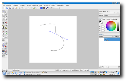
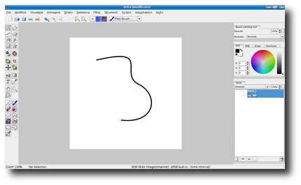
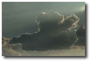
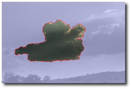
had the ambitious plan to add three important features to Krita:
Emanuele was mentored by Bart Coppens and did indeed finish his project on
time and on spec, and is now getting ready to port his work to KOffice 2.0.
His tools will first be release in KOffice 1.6 -- real soon now!
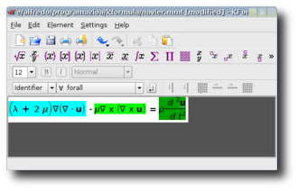
Alfredo is now the official maintainer of KFormula. His mentor was David Faure.
Fredrik Edemar, a computer science student from Uppsala, Sweden. has
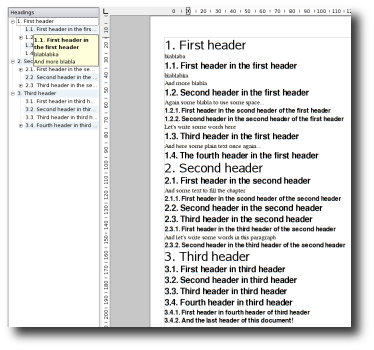
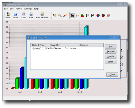
have worked on two smaller projects: automatic heading recognition in KWord
and version support for all KOffice applications. Both these new features
will be included in KOffice 2.0.
Fredrik was mentored by Boudewijn Rempt. As soon as the current sweeping redesign of KWord's
frame system is done, Fredrik will port the header feature to KWord 2.0; the versions feature was
developed in 2.0 already.
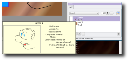
Mentored by Cyrille Berger, Gabor Lehel coded a second-generation widget for all of KOffice, based
on his work for Krita's layers widget.
Thomas Schaap studies in Delft, the Netherlands and was selected by Finalist to participate
in the Dutch Programmeerzomer. Having wanted to work on KOffice for quite some time, he grabbed
this opportunity to really get into KOffice. Brad Hards was the real, practical mentor,
while Boudewijn Rempt was his pro-forma mentor.
The project was to provide support for encrypted documents in KOffice. The big difficulty, which is still not completely solved, is compatibility with OpenOffice encrypted
documents. Thomas not only had to learn KOffice and its development culture, but also needed to learn
about OpenOffice and find his way on their mailing lists. And then, of course, Thomas needed to
work in KOffice trunk. The day his project began was also, coincidentally, the first day that KOffice
2.0 actually compiled against KDE 4!
But despite these difficulties and a very tight schedule,
he managed to finish all core functionality and get it checked in -- as Thomas says himself: "I did
a good job of, the KOffice guys are really happy with what I did." Next stage: signed documents!
Five projects, five successes! Thanks Thomas, Gábor, Fredrik, Alfredo and Emanuele for your
work, and thanks Google and Finalist for organizing these projects!
Comments:
Wow - ale - 2006-09-05
Wow, seems like KOffice is getting features that does not even exist in MS Office or OO.
Re: Wow - Inge Wallin - 2006-09-05
It has had them for a long time. Neither OO.o nor MS Office has any equivalent of Krita.
Re: Wow - marce - 2006-09-05
What? Isn't the gimp a part of gnome's oo.org , and photoshop a component of windows?
Re: Wow - Inge Wallin - 2006-09-05
Nope. OpenOffice.org is an office suite totally independent of Gnome, Gimp is not a part of it and photoshop is not a part of MS Office.
Re: Wow - marce - 2006-09-05
Nevermind, I tried to be ironic on my previous post.
Pls apologize for any inconvenience.
Re: Wow - Inge Wallin - 2006-09-05
Ok, but don't let this become a habit. *stern look* :-)
Re: Wow - Brandybuck - 2006-09-06
It's hard to tell, because some people REALLY do think any software remotely associated with GTK+ is part of GNOME. To these people Firefox, GIMP and OO.org are all GNOME apps.
Re: Wow - Thomas - 2006-09-06
But OO.org wrote its own widget set from scratch which it uses on all platforms. There is no GTK usage there at all.
What surprises me is why so many people think that there are just two widget sets; Qt and Gtk. And everything not Qt must therefor be Gtk. Which is pretty far from the truth :)
Re: Wow - furangu - 2006-09-06
Just add KDE dialogues and Crystal Icons and people feel at home.
But honestly, a wxwidgets backend for QT would improve things dramtically.
No can do - wxWidgets Dev - 2006-09-08
wxWidgets allows unrestricted commerical use licenced under the LGPL so a Qt version of wxWidgets is legally impossible.
Re: No can do - James Richard Tyrer - 2006-09-08
If you are saying that you can't link GPL software and LGPL software, you are very confused.
Re: No can do - Bobby - 2006-09-14
Most of kdelibs is LGPL. GPL can be linked to LGPL just fine. Why do you think there are businesses like The Kompany (i.e.- http://www.thekompany.com/home/) that creates semi-closed source software that uses kdelibs?
Bobby
Re: Wow - ale - 2006-09-06
Is Skype a KDE-app then? Or everything that uses Qt? Wow...
Re: Wow - superstoned - 2006-09-05
yeah, i'm impressed. i mean - helloooooh, version support!!!!! that's soooo cool... i hope it has/will have a good gui, a timeline and it'll keep the undo after subsequent savings - these things i've been looking for for a long time.
i would also love some way to attach/embed some text snippets, alternatives, to (parts of) documents. i often have a second or third alternative for a paragraph with text - and i'd love to be able to save them some way. but i guess that's a little too much to wish for, and there are much things which have higher priority ;-)
Re: Wow - Rafał Malinowski - 2006-09-06
Fill a bug about it ;)
It seems like a cool idea for me!
Re: Wow - kephnos - 2006-09-13
It would be awesome to have some sort of versioning system for documents... like when you save, you can save it as a more recent version, but still keep all the previous incarnations in the same file. Then have a view mode that lets you see the document with all the previous versions at the same time, in a heirarchical view, in reverse chronological order... maybe even let you pick out, paragraph by paragraph, the version you want to keep, then at the end, view what you picked as a coherent document. It might help to have some sort of plugin that runs diff on each section of text against every other section, so as to weed out duplicate paragraphs. This would be quite awesome.
some thoughts - me - 2006-09-05
Congratulations to all of the five! It's great to hear about these developments and potential new developers!
I've heard that the bezier-code won't be used in krita2.0, since that will use flake, and that will somehow replace the current bezier code. I hope that it will live on in flake?!
I think the layers/parts-widget still needs a lot of tweaking: First, it wastes a lot of space, like many such widgets in koffice. The "layers"-tab is too high, then there's too much vertical space before the "normal" combobox. There needs to be some room between the listwidget and the buttons below. Then, it doesn't really need a statusbar. The information for each layer (thumbnail, layername, the eye, the lock) looks really cluttered at one point, while there is LOTS of space to the right. And it goes on and on.
I realize its development code, so this is just meant as constructive criticism!
thanks!
Re: some thoughts - Boudewijn Rempt - 2006-09-05
The statusbar you see in the screenshot is Krita's statusbar :-). As for the layout, we hope we'll be able to have it tighter once KDE4 settles a bit. As it is now, it's really hard. Sometimes buttons appear (like to the right of the opacity spinbox), for instance.
Re: some thoughts - Gabriel Gazzán - 2006-09-05
Please, is there a way to replace the current "spinboxes" with something similar to what Adobe products use?
I mean, values appearing just as underlined colored numbers, over which the user can drag left/right to decrease/increase them, or just click on them to manually enter it's numeric value?
It, both, saves a lot of screen space, and is a much practical solution than the currently implemented one.
Thanks!
p.d. I'm really amazed at Krita's development pace and direction. A great work you guys are doing, indeed! :)
Re: some thoughts - Boudewijn - 2006-09-05
Just getting a drop-down slider was already really hard! We took the example for that from Photoshop 5.5 for OS X. Coding custom widgets like these takes a lot of time, so I cannot promise we'll be able to have the time to code something like you mention.
Re: some thoughts - Gabriel Gazzán - 2006-09-05
I know, I know, I was asking just in case... ;)
What would be really great is if Qt libraries themselves implemented such a widget, don't you think?
And in the end, it maybe worth it for Trolltech if they want to attract Adobe to choose Qt for their Linux port of Photoshop. ;) ;)
Thanks anyway for all your efforts!
Re: some thoughts - furangu - 2006-09-05
Doesn't Adobe use QT?
Re: some thoughts - Gabriel Gazzán - 2006-09-05
I think only for Photoshop Album or something like that.
Re: some thoughts - ac - 2006-09-05
> I mean, values appearing just as underlined colored numbers, over which the user can drag left/right to decrease/increase them, or just click on them to manually enter it's numeric value?
Can you provide the screenshot of how this looks like in Adobe programs, and explain the functionality in a bit more details? Maybe someone will feel inspired and start hacking...
Re: some thoughts - Gabriel Gazzán - 2006-09-05
woohoo! :)))
well, sorry... ;)
here is an image with 4 screenshots of an effects palette showing how it looks. The last two are perhaps not as frequently used, but I put it here for reference.
The widget is really simple, so simple I would say it's almost the absense of it what makes it so great:
- If I want to change a parameter calles, let's say, Brightness. The program presents it's name and to the right the value, there's no input box, just the underlines value, as if it were an Internet link.
- If I press left mouse button over the value and drag to the left, I decrease the value (pressing Shift while doing this, will change the value by ten units increments).
- If I press left mouse button over the value and drag to the right, I increase the value (pressing Shift while doing this, will change the value by ten units increments).
- If I single press left mouse button over the value and release it, then the value appears surrounded by a white box (with the value selected) to let me input a new value to replace the current one. (At this moment, pressing right mouse button allows the standard Cut, Copy, Paste operations with the value).
- If I single press right mouse button over the value a context menu appears offering to setup the limits the "virtual slider" (let's call it that way) moves between when dragging to change values, and also to reset this parameter to the default value.
Basically that would be all. If you have any doubt I am willing to help.
And thanks for just trying! :)
Re: some thoughts - Gabriel Gazzán - 2006-09-05
I forgot to mention...
it doesn't show on the screenshots, but when the mouse pointer is over the value it is shaped almost equal as when you are using an Internet browser (a hand with the index finger pointing upwards) but it also shows tiny left-right pointing arrows to the sides of the index finger, to indicate the direction of possible movement. Once the user starts dragging, the hand disappears and only the tiny arrows remains on the screen.
Adobe patents/copyright on widgets? - Anon - 2006-09-06
I'd be careful. I know Adobe has in the past sued people like Macromedia for creating similar interfaces to its products...
Re: Adobe patents/copyright on widgets? - Jaroslaw Staniek - 2006-09-06
And then it bought them out :)
Don't worry, Adobe has not enough money to buy KDE.org...
Re: Adobe patents/copyright on widgets? - sebastian - 2006-09-08
There can't be any copyright on this. FLTK is using such wifgets a while now. I really like the concept. Agreed, I don't like the way KDE is mostly using MS Windows like widgets. Toolkits like FLTK provide some astonishingly well though widgets, take the file selectors for example - just intuitive and simple.
Re: some thoughts - Thomas Zander - 2006-09-06
I'm personally less then impressed by these widgets. They are quite unlike anything I ever saw and I'm pretty sure many will not see it as something they can alter at all without being trained to do so.
And in the end the small buttons are not taking a lot of space at all so the advantages are pretty small to begin with.
Re: some thoughts - me - 2006-09-06
These widgets are *very* nicely usable. To be honest, I think opensource lacks a little in the widget-department. For example, there are STILL input fields for INTs from 0 to 100 that have up-and-down-arrows. How useless is that?
It would make sense if one could hold the field and then move the mouose to adjust the value, but who actually taps these two buttons?
Honestly, there's a lot of stuff, especially annoying in krita, karbon14 etc.
I know this sounds harsh, and we all know that I won't commit any coolSliderThingy.{h,cpp} to svn myself, but please, try these widgets first! You'll see, training is not needed!
Re: some thoughts - BenAtPlay - 2006-09-06
The Adobe widget looks like a subclassed QLabel with the mouseMove/mousePress/mouseRelease events overriden. It shouldn't be too hard to override. The difficult part would be to get the context menu working right IMHO.
Cheers
Ben
Re: some thoughts - ac - 2006-09-06
> And in the end the small buttons are not taking a lot of space at all so the advantages are pretty small to begin with.
It's true that those small up and down buttons do not take up much space, but I think they are entirely useless. Something like a QSlider is much better suited to vary a quantity over a fixed range. It seems to me that this proposed widget is basically a slider without actually showing it. How about temporarily displaying the slider when it's in "drag mode"?
By the way, what is this context menu good for? If I understand you correctly, you can already enter a specific value by simply clicking on the widget,
Re: some thoughts - Gabriel Gazzán - 2006-09-06
- The "Edit Values..." option in the context menu mainly allows the user to redefine the span of the slider (its Mínimum and Maximum values). This is sometimes useful in certain cases where the default span is so big that you lose precision while dragging (perhaps changing from 1 to 2 is already a great change in the effect, but as the slider goes from -1000 to + 1000, each time you drag the value changes too much and the slider turns "incontrolable", so lowering the span of the slider increases this precision while dragging and makes it comfortable again).
In theory the span should be preset by the programmer to "useful" values, but often users use effects in situations not foreseen by the programmer, so I guess is in these cases when this option is more appreciated.
- The other useful option in the context menu, is one allowing to "Reset" the value to their default state. Good after you've been experimenting and want to return safe home. :)
p.s. I completely agree on the current state of sliders in Qt/KDE, I never use them, to me they are useless and I end entering values by hand, which is very disrupting, workflow wise.
"Lightwave 3D" and "3ds max" are good examples of programs with good and useful sliders, but to be honest since Adobe introduced this kind of "nano" slider I prefer it over everything else, as they've had a very strong impact in how the (same) applications feel by improving the workflow tremendously.
Re: some thoughts - Gabriel Gazzán - 2006-09-07
> p.s. I completely agree on the current state of sliders in Qt/KDE
I really meant the up and down buttons to the right of numeric input boxes, not the sliders.
My confusion came from the fact that in some programs (e.g. Autodesk 3ds Max) this buttons function as sliders when dragging up and down over them, so I tend to see them as sliders too.
Re: some thoughts - Gabriel Gazzán - 2006-09-06
I thing that the beauty of this kind of "hidden slider" is that the precision is not restricted to the small screen space where the slider resides.
Let me explain myself:
If you put a visual slider widget on the screen you have to make it "small" (I still haven't seen widgets with a screen wide extension) :)
But this small extension constraints you to put all the possible values the slider could take, from one extreme to the other, so I could end with a 3cm long widget for changing values from -500 to +500, or -2000 to +2000, so this will make the slider behave with a very low precision, mining its usefulness.
With this "hiden slider" paradigm the extension is also "virtual", so in theory it could be made as long as necessary to make the slider progress in a much more soft way, making it more useful.
Besides that, if the user wants to enter a value directly, he still can.
The other thing I would like to refute, is that this kind of solution is not intuitive.
In this Internet era, if there is something users (even novice ones) know, is that if there is a colored underlined word in the middle of the screen, they could click on it to make something happen.
In this case, what needs to be made clear to the user is that they can not only press on it, but to also drag on it from side to side, and I think that this is the main reason for Adobe chosing to show a cursor with an index pointing hand with left and right arrows when over the "hidden slider".
Finally, I teach Adobe and 3D animation programs since more than 5 years ago, and let me say this is one of the features people love at first sight in the new versions of Adobe programs, perhaps followed by the new dockable option palettes (something Krita already has! kudos!)
I really think this is the way to go, not only for Qt/KDE, but in general for interfaces.
But of course it's just my opinion.
Cheers
Re: some thoughts - Ben Meyer - 2006-09-06
Do you have a screenshot of this widget somewhere?
Re: some thoughts - Gabriel Gazzán - 2006-09-06
it's above at the end of one of my messages
Re: some thoughts - me - 2006-09-08
I tried to create a spinbox that you can control using your mouse. Its only a hack, you have to be a little careful with the mouse, I should probably make it slower.
In my opinion, its a lot nicer than to use those small buttons (phew!) or enter a number with the keypads.
greetings,
ben
PNGs - Robert - 2006-09-05
Are those PNGs _completely_ uncompressed?
Yes - max - 2006-09-05
They should have used gimp :-))
Even MS Office would not produce 1MByte+ screenshots.
Opening those PNGs and re-saving them as PNGs reduces size by >90%.
Re: Yes - Cyrille Berger - 2006-09-05
I didn't found any 1MByte screenshots (maybe someone fixed them), and loading them and saving back with either krita or the gimp give the same results as the compression is done by libpng...
kformula edition - ramses - 2006-09-05
Just a small question, is it possible to use kformula without using the mouse? I means to do something like OOmath2 or latex. It's so more easy to write the mathematical formula directly.
Re: kformula edition - Cyrille Berger - 2006-09-05
It's on the todo list of the developers ;)
Re: kformula edition - Alfredo Beaumont - 2006-09-05
There are some features that allow to avoid mouse to some point. Take a look to handbook's Chapter 5: http://docs.kde.org/development/en/koffice/kformula/advanced.html , specially Name Insertion and Definite Integrals and Limits.
As Cyrille has said, further improvements are already in the todo list :-)
Version Control - KDE Use - 2006-09-05
Nice addition! I hope this evolves to something like tools in software version management (like SVN or GIT) and also like visual viewing of differences and version merging (KDiff3 integration?).
Thanks... - Gonzalo - 2006-09-05
I want to thank the participants and google as well for its sponsorship.
While KDE is in a huge transition right now, when the dust settles, which I think will be about a year from now, we should have one pretty amazing desktop.
Here's to hoping it materializes in all its glory.
Re: Thanks... - Dustin - 2006-09-05
I think we've already got one pretty amazing desktop :)
Can't wait for it to get even better though!
Automatic Heading Recognition - Anonymous - 2006-09-06
Hope it does not only work with
1.
1.1.
1.1.1.
1.1.1.1.
1.1.1.1.1.
1.1.1.1.1.1.
1.1.1.1.1.2.
1.1.1.1.2.
1.1.1.2.
1.1.2.
1.2.
2.
but also the other big header scheme:
A.
I.
1.
a)
aa)
(1)
(2)
bb)
b)
2.
II.
B.
Sometimes you have to use another level below (1), (2): Greek letters alpha, beta, gamma. More levels aren't recommended, though. Still, I've seen a variant with the levels below (1), (2) labelled (a) and (aa).
I strongly hope the header variant with mixed numbering works, too. Certain branches of study strongly recommend or require the second variant because it's laid out more clearly (the scheme is always the same - aside from the non standardized forms when it becomes nested too deep - and you know at which level you are without deciphering a long range of numbers).
Additionally, it would be totally cool if KWord could automatically generate a table of contents from these headings (with indentation, page number and space filled in between) like:
A. Header......1
I. Header......2
1. Header...4
B. Header.......4
I think MS Office can do it (by referencing an index; the headers then get recognized after they get assigned to a formatting level -- manually!)
I tried to do the same in OpenOffice but didn't succeed. Don't know if OO can do it or not. Anyways, doing it by hand is quite painful with copying all headers, getting the formatting right and changing page page numbers till the end.
If that would work, academic/scientific essays would almost write themselves ;-)
Re: Automatic Heading Recognition - Louis - 2006-09-06
I've gotten this to work in OOo using styles. Styles can be very powerful if used correctly, and you can use different numbering systems as you indicated. I, too, am hoping for this feature in KWord. It would be nice if, by KDE 4, I could be using all the KDE apps full-time. The progress is amazing. Great work all around.
Re: Automatic Heading Recognition - Steve - 2006-09-09
MS Word can also base the structure of the TOC on user-defined styles.
A style can base where in the TOC strcture the header will appear, this is a powerful feature of MS Office that I tend to use all the time.
Other styles such as "Invisible 1, 2, 3" won't show up in the TOC by default.
KWord 2.0 - wishfull thinking... (tables) - Anonymous Coward - 2006-09-06
This might be very off-topic, but I hope that Koffice (K-Office?) 2.0 will have full-fledged table support, like in MS-Word. I use them for formatting, and use them extensively in my CV, along with styles (bad habit I picked up way back when on some *nix-based typsetting system whose name I forget... damn, I getting old!). Anywho, I haven't seen any Free alternative that could slurp my CV and keep its layout: the document would almost litterally kill the program I was using.
Maybe it is because MS uses some incredibly convoluted & obfuscated way to store its documents, I don't know, but if one of the Kdeveloppers (sorry) could get KWord 2.0 to make sense out of MS Word's tables & Styles, I could get even closer to getting rid of my last Windows box.
Re: KWord 2.0 - wishfull thinking... (tables) - ale - 2006-09-08
I think KWord is a mix of desktop publishing and word processor. It is based on frames. To this should not be a problem for you. :-)
KOffice Instruction Player - Dennis - 2006-09-08
These are awesome results, if you feel inspired and also want to code a KOffice project, we are looking for someone who wants to develop Instruction Player. It would record KOffice mouse actions and audio files at the same time. Users could then record how they they created a painting, photo manipulation or office documents. It would be played like a commented macroscript and step by step the user can mimic the master. Learn by doing!
This would ease deployment of KOffice tremendously as users can self train how to complete tasks without reading and studying, simply by doing the same as shown. Such functionality has also been shown to create a big group of followers recording and showing of how they reached certain results.
Commercial developers have already shown it's possible to record Qt actions, if you want to make this community tool a reality please read the enclosed concept, offer your coding skills and find advice on the KOffice email list http://www.kde.org/mailinglists/index.php#koffice-devel

