Well, so far I've published a dozen articles about KDE 4 over the last 12 weeks. A lot of content has been covered, but there is rapid progress still being made on those topics. So, in no particular order, this week's issue deals with addenda and updates to the last 12 articles, so that you can see some of the rapid progress happening as KDE races forward. Read on for details.
First, when I demonstrated KRunner back on January 2nd, it was barely useful, contained temporary artwork (it still does), and looked pretty basic. Since then, it's seen a lot of work. It is now installed by default, sounding the final death of many of the elements that previously belonged to KDesktop, one of KDE's oldest components. It (mostly) works, pops up when you press F2 (see note 1), handles CTRL-ESC to pop up the task manager, handles CTRL-ALT-DEL to pop up the logout dialog, loads the screensaver and screen locking routines as expected, and behaves in a very useful and beautiful fashion. Below is a shot of the new KRunner in action:
There's also this short movie (a week or two old) showing off how KRunner works when searching for commands to run. The interface is not yet final, but it's getting closer to completion. When it is further along, you will certainly get more updates.
Speaking of artwork, during the Oxygen article, I showed off KDE's new logout screen. At the time that was using temporary artwork that was a proof-of-concept placeholder. It's been updated somewhat, and now looks like this:
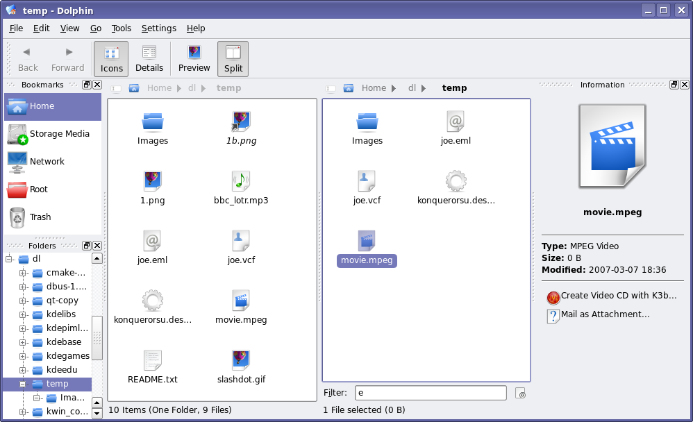
That's not the only screenshot that needs updating. After the Dolphin article, there were many requests for a tree view in Dolphin. Well, Peter Penz, the lead developer of Dolphin listens to feedback, and within hours, there was a preliminary tree view checked in to KDE SVN. After a few weeks of development, here's what the work-in-progress tree view looks like in Dolphin (this is also a good opportunity to show off some Oxygen icon artwork improvements as well):
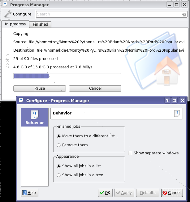
And one more shot: back in January, I wrote about some of the work being done on KDE's Job Progress improvements. This section has seen much work since the very initial code I showed off back then, with much of the user feedback to that article helping shape its development. It now has support for pausing downloads, storing a list of finished tasks, searching for keywords among the active tasks (useful if you have 30 tasks on the go), has a simple configuration dialog, and more. The backend that powers this whole system has seen a lot of work, with more discussion with the GNOME folks on standardizing the mechanism so that applications using this progress reporting will run seamlessly on either desktop. Here's a shot of the job monitor and its configuration dialog (see note 2):
okular has received preliminary support for PDF forms, thanks to improvements to the Poppler backend. okular is the first Poppler-based viewer to add support for forms, but more are expected to follow. The implementation isn't particularly useful at the moment, and looks too ugly for screenshots, but the initial support is there. There has been a lot of development happening in okular - which, alongside other KDE developments, you can read about in the weekly KDE Commit-Digest - including support for additional formats, reworked text searching, and more.
Work on Kalzium powers forward: artwork for a student-friendly view is being developed; a better use of the empty space in the center of the table is in place; and work on libavogadro-based 3D molecule viewer is making steady progress.
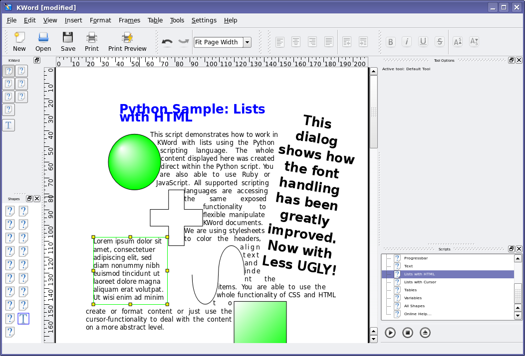
The rendering in KOffice with regards to text and shape rotation has improved. Part of the problems with the screenshots in my original article is that I was using a bad default font that was shipped by my distribution. Here is a shot of a similar document, but you can see what a difference 2 months can make. In this shot, you'll see a number of new things, including a new 'default text' feature. Where you see the famous 'Lorem ipsum' text, clicking onto the text clears the widget of text, leaving your cursor on a blank text shape. Also shown is content generated automatically using the Kross scripting features, and several Flake shapes also inserted using Kross plugins. The user interface also has seen a lot of improvements, however there is still work to be done: missing icons, font and widgets sizes, and so on.
There were many more changes made to KDE since these articles have gone live, and unfortunately I've only had a change to cover a small handful of them. Of course, for a real look at all the work that's being done, you would need to build the sources yourself on a regular basis. In the meantime, I'll return with more new articles so you don't have to build the sources (though I certainly won't discourage you from doing so!).
1Bug Alert: There is currently a nasty, unsolved bug where KRunner stops responding to ALT-F2 after a period. Fear not, this sort of bug will not be present by the time KDE 4.0 hits the streets, as it would be considered 'show stopper' bug. If, however, you need an excuse to get into KDE 4 development, here's a point of entry that will quickly get you accustomed to KDE and Qt programming.
2Power User Tip: This uiserver screen is usually hidden by default when nothing is happening. If you are running KDE 4, you can make it visible at any time by calling the following command:
qdbus org.kde.uiserver /kuiserver/MainWindow_1 com.trolltech.Qt.QWidget.show
Comments
Hi mogger,
This is what the process list currently looks like:
http://commit-digest.org/issues/2007-03-18/files/designer_processes1.png
I might even need to add another column for niceness.
I'm welcome to suggestions for making it smaller/nicer.
Hi John,
I apologize for mixing things; what I meant with "Process Manager" is the one shown in the artivle, the job process manager: http://static.kdenews.org/dannya/vol13_4x_kuiserver.png
It's the Job Process Manager that I think shows too much information at the moment, not the process manager.
Hi,
First let me congratulate all of you for the great work. It's nice to see how the things are progressing...
But I have one question about the visual style of KDE 4: which way do you plan to follow, one more clean, MacOS like, or just improve the current style (Plastik)?
One good example of a clean style is this mockup below. It's very pleasant to look, all the elements are easy to find, there are no divisions between the parts of the window (frames?):
http://www.kde-look.org/content/show.php/Kde4+Mockup?content=28476
I really hope that you go in that direction. ;-)
Thanks.
I loved that mockup, too - really hoping that kde4 could look just like that. Plastik is great, but what i've seen to that point from kde4 doesn't blow me away... the style of the mockup certainly would. So pleeeease kde-folks, don't forget your promises about "breathteaking beauty"!
yes, there will be a new style, and a very good one.
Will the style be cleaner than the ones in KDE 3? By cleaner I mean;
* Less (visible) handles, as is currently possible with the lipstik-style.
* Less frames. Attached is a screenshot of what I mean when I say frames. In my opinion, they make the GUI seem a bit bloated.
Will the style be cleaner than the ones in KDE 3? By cleaner I mean;
* Less (visible) handles, as is currently possible with the lipstik-style.
* Less frames. Attached is a screenshot of what I mean when I say frames. In my opinion, they make the GUI seem a bit bloated.
Regarding frames, Qt now supports a CSS-like styling mode, which means it's really easy to remove things like frames with very little code. Making styles much easier to code and look nice... :)
Hip hip hurray!
I Can't wait! ;)
Really things are progressing, and the whole team is putting a lot of effort. But I was wondering about digikam, will it be present in KDE4? It is really one of the best app of kde.
I have seen some news about digikam, particularly regarding sharing image manip plugins between it and a few other applications. I'll add it to my list of topics to feature, but can't guarantee I'll feature it anytime soon :) I have quite a lineup :)
I don't think a any maintained is not going to be ported to KDE4.
But before a stable release is done, don't expect everything to be ported already. Not every application developer will target things he doesn't himself get easily.
KDE4 will certainly also run KDE3 applications.
That said, my prediction is that Digikam will certainly be ported. I agree its one of the best applications there are for KDE.
Yours, Kay
Looking at the commit comments at: http://websvn.kde.org/trunk/extragear/graphics/digikam/
It seems that digikam is already in the process of being ported. It can benefit from a number of KDE and Qt 4 features... (solid, kipi, and more...)
KDE 4 will indeed still run KDE 3 applications /assuming you have the KDE 3 libraries still installed/ and that there are no configuration file problems :)
These commits is not a real port, but just a source code polishing before to port implementation. We have planed to do it later 0.9.2 release, during this summer.
Gilles Caulier
I normally don't comment on such stuff but this time you're asking for it:
http://static.kdenews.org/dannya/vol13_4x_kword.png
WTF? The font handling's been improved? Really? Could have fooled me.
The kerning's still a disaster:
This sc-ript d-emonstrat-es...u-sing the Pyth-on...and so on.
In fact the rotated text telling us about the improved font handling is jumping all over the place.
If there's an improvement compared to the last screenshot, I fail to see it.
Once again, I understand that development screens won't be perfect but in this case, if you really believe that this is "greatly improved", you're either talking strictly about internals or you're delusional. (Or that last screenshot was vastly more hideous than I can remember :P)
The last screenshot was worse than your remember. I agree it's not yet perfect, but at least in this one they look somewhat aligned :)
That said, it wasn't the sole point of the kword screenshot :)
After looking at the old screens once more, I'm still not convinced (they're a bit blurry, perhaps that hides the imperfections =P) but I'll take your word on it. =)
Oh and Troy, thx for all the great articles.
How many times will we hear that kerning has been improved, only to find out that it is still no good? Isn't there a correct way of doing it? Can there be only incremental hacks that don't seem to approach the target?
I would like to see "kerning now correct", not "kerning now better" once again. Please explain why I am wrong!
and heres me thinking the "Ok", "Apply" and "Cancel" buttons would be the same size in KDE4, the openusability fails.
Umm, that has nothing to do with anything that the usability folks are doing... it's simply the way Qt handles the buttons by default. That said, is there any particular reason why they should be the same size?
If Windows, OSX, and Gnome can do it, why not KDE?
I didn't say it couldn't be done. I asked why it should be done...
Confusion maybe? The user interprets size to have meaning?
Why shouldn't it be the same size?
It's really wonderful.
And nice to see how hard working there on kde4. I can't wait, speed up guys!:)
Hi Troy,
Thanks for answering my question about digikam.
I have another request, I kept looking at some early screenshots of plasma or some plasmoids, but I found none. What is the state of art, I mean the progress state, of these important new parts of kde?
Hi, I think the space between "c" and "r" in word "script" is way too big. Same for "l" and "a" in "languages". I wonder whether this a font-specific issue, or a Qt issue?
Again, probably fonts. *sigh* I use the default fonts whereever possible when I take my screenshots, but the defaults vary greatly from distro to distro... you can probably blame *ubuntu for my defaults. It really does look a lot better when using the webfonts released by microsoft, but of course I can't use them in my screenshots since no distro is legally allowed to include them by default.
Fonts are in sad shape, and there's been a few discussions among the kde artists about making KDE depend on a few specific fonts, to ensure that distros ship decent fonts... However there are many issues to discuss still, including licensing, where these fonts would live, whether we can ship fonts from other sources, and which fonts fit these guidelines but don't look like crap :P
Discussion is ongoing, but it's not likely something to happen for KDE 4.0 (later in the 4.x series, maybe...)
If you run a shop that produces fonts that look good and include all of unicode, and would consider licensing it under an opensource license, the whole free desktop world would bake you cookies :)
What about Lbertine Open Fonts (http://linuxlibertine.sourceforge.net/)? That is a high quality open font.
That's indeed a really good font -- very impressive.
Yes really it is very cool
No. I'm sorry to say this, but only Microsoft's Times New Roman works on a screen.
I found it impossible to use any other font for reading running text.
> Again, probably fonts.
Not exactly true. In this case I also don't exactly see the MS fonts behaving any better (have to see it before believing it). The fonts just cannot do anything about this issue here.
The spacing is sometimes wrong due to the screen not having enough dpi and the program having to emulate what will come out of the printer. It has to add or remove some spacing sometimes or the letter on your screen would be way off compared with what you get on paper. And luckily Latin has spaces between letters, imagine what would happen with Arabic or Devanagari with extra spaces in between letters. Take any word processor and type a full line of "i"'s, you'll see that the spacing will be different sometimes, depending on font size/zoom, and that will happen with every font you'll find.
I doubt there's a real solution to this. You could either have very fuzzy fonts, or have irregular spacing, or have your program change the glyph shapes to keep the spacing ok. Maybe it could be a bit improved by only allow changing spacing between words instead of glyphs, I don't know. In the end it has to compromise somewhere, and I think only 300dpi screens could "solve" this by making the spacing differences invisible...
What version of FreeType were the screenshots done in?
Freetype 2.3.2 is the most stable version:
CHANGES BETWEEN 2.3.2 and 2.3.1
I. IMPORTANT BUG FIXES
- FreeType returned incorrect kerning information from TrueType
fonts when the bytecode interpreter was enabled. This happened
due to a typo introduced in version 2.3.0.
- Negative kerning values from PFM files are now reported
correctly (they were read as 16-bit unsigned values from the
file).
- Fixed a small memory leak when `FT_Init_FreeType' failed for
some reason.
- The Postscript hinter placed and sized very thin and ghost stems
incorrectly.
- The TrueType bytecode interpreter has been fixed to get rid of
most of the rare differences seen in comparison to the Windows
font loader.
II. IMPORTANT CHANGES
- The auto-hinter now better deals with serifs and corner cases
(e.g., glyph '9' in Arial at 9pt, 96dpi). It also improves
spacing adjustments and doesn't change widths for non-spacing
glyphs.
- Many Mac-specific functions are deprecated (but still
available); modern replacements have been provided for them.
See the documentation in file `ftmac.h'.
Stay away from FreeType 2.3.2 for now, and go directly to 2.3.3 instead when it is released. 2.3.2 has some serious hinting issues. It mentions it on its news page at http://freetype.sourceforge.net/index2.html#release-freetype-2.3.2 -- see this thread http://lists.nongnu.org/archive/html/freetype/2007-03/msg00028.html
To get an idea how bad it is, see for example this screenshot http://666kb.com/i/amj20dveeaqvvgtx4.jpg
Yes that definitely is a problem one would expect to be caught during QA cycles.
Hm. I help out on the DejaVu fonts*, and from what I've seen reported most spacing issues result from renderer bugs; the hinting/kerning for DejaVu Latin characters being largely a solved problem.
What really jumped out at me as being wrong in the KWord screenshot is the non-straight baseline on the rotated text. Since the plain text looks fine in that regard, I would guess there is some subtle mis-calculation taking place in the renderer when handling rotated text.
The screenshot would also be helped a lot by hyphenation to prevent the text from being stretched so much in justification. Though thats an entirely separate issue.
* latest 2.16 RC snapshot, please try it out, report bugs on bugs.freedesktop.org: http://dejavu.sourceforge.net/snapshots/dejavu-ttf-20070327-1710.tar.bz2
the logout dialog looks sort of bad, however. very last-generation with the square edges (needs more round!) and dotted focus-thingie (continuous and light, perhaps colored, would be better, I think). it looks like a standard button-widget was transparently overlayed onto a background, and especially with the colorswitch in the background near the bottom, the effect is rather jarring.
Hi,
is it a good idea to have an Arrow to the left as logout icon ?
Normaly it means undo or go back. Sure I go back, since I came from console or a display manager. But this can be some hours, days, weeks or even months ago.
I would suggest the power off button or a arrow to the bottom. The left button could be used for the cancel action.
Greetings
Felix
I must confess I'm quite happy somebody else dare to tell it !
These buttons are quite confusing, and IMHO, deserve a correction.
For instance, the Gnome symbol for exiting a sessions, an half open door is much clearer (uglier maybe but clearer!).
The power-off button is a good hint (as in KDE 3.5.x, let's be conservative some times !) and in second rank the Gnome idea.
BTW, if you could change your mind about vertically oriented words, it's quite...cheesy, actually. Well, that's a lousy comment too, I suppose :-(
I'm not a psychological expert but I think people who're achieving a great deal of work to create a whole new KDE "experience" (sic) do want some visual difference to show that something happened, that they accomplished something big, something really new. It's only I'm not sure it's always good to change for the sake of changing...
Feeling as ugly as an "inspecteur des travaux finis" (in French, that means "reviewer of completed works" : the guy who did nothing, arrives after the hard work is done and tells everybody, with a despising tone, how bad is all the stuff they've done !) but feedback is something you might consider, isn't it ?
Thanks for all & take your time, 3.5.6 will be fine enough for months !
Yojik77