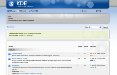
During this weekend (and after almost 24 hours of work), the KDE Community Forums have undergone a complete overhaul, resulting in a much improved look and additional features. The first and most user-visible change is the new forum theme. It is heavily inspired by "Air", the default Plasma theme in the soon to be released KDE 4.3.

Also, the board is now powered by the phpBB forum software and has gained a number of extra features, including but not limited to:
- Improved KDE Brainstorm section, with a new user interface;
- A "friends connection" system that enables people to mark other users as
friends and easily interact with them;
- Improved user reputation system;
- Topic tagging;
The changes are quite numerous and deep, so some bugs may have slipped through our tests. The whole KDE Community is encouraged to visit the forums and report issues.
As a final note, thanks go to the people who made this possible: the KDE Community Forums administrators (Ben Cooksley, Ingo Malchow, Sayak Banerjee), the phpBB developers Chris Smith, Ashley Pinner and Nils Adermann for their continued assistance and support and to the entire phpBB team.
Comments:
Link - Haakon - 2009-06-29
We seem to be missing <a href="http://forum.kde.org">a link to the forum itself</a> :-)
Good point, added! - danimo - 2009-06-29
Good point, added!
and brainstorm.forum.kde.org - chris - 2009-06-29
and brainstorm.forum.kde.org isn't working any more as well.
the page looks really amazing. the forum was a really great idea.
Great job guys - indishark - 2009-06-29
New UI looks fantabulous...great job
and brainstorm.forum.kde.org - neverendingo - 2009-06-29
This is fixed now, address is working again.
Can we have a mobile-devices layout? - zander - 2009-06-30
The new design has a fixed-with layout which makes it impossible to use on a mobile device (since I need to scroll for each line). I'm getting used that KDE websites consistently fail on that part, but at least I can bring it up again ;)
Good point! Will suggest it - einar - 2009-06-30
Good point! Will suggest it to the rest of the team.
Forum software - Mark Ziegler - 2009-07-01
Hello,
when forum was launched last october you have been very enthusiasic about MyBB.
Why did you change the forum software?
Cheers,
Mark
Btw: Pretty nice style
Lovely - NabLa - 2009-07-01
Very very smart design :)
There's one thing though, the list of topics can do with a bit of love. The most important bit of it are the topic names of course because that's what you use to identify threads *and* access them as they're also links. They're not highlighted in any way other than a blue font.
I also think the grey box at the top is far too big for the content it has (at least when not logged in).
I have done some css tweaks to illustrate my point:
<ul>
<li><strong>Original:</strong> http://img43.imageshack.us/img43/1499/originalb.png</li>
<li><strong>Modified:</strong> http://img43.imageshack.us/img43/4840/modified.png</li>
</ul>
Bodge stylish css:
<blockquote><font face="courier" size="1">@namespace url(http://www.w3.org/1999/xhtml);
@-moz-document domain("forum.kde.org") {
a.topictitle { font-weight: bold !important; }
ul.linklist li {display: inline; margin-right: 2em !important;}
ul.linklist li a {font-weight: bold !important; }
.linklist {position: relative; float: right;}
.linklist {position: relative; float: right;}
.panel-mid { min-height: 3em; }
}</font></blockquote>
Of course it would need proper styles but hope you catch what I mean :)
Team change - einar - 2009-07-01
The main reason is the change in the team. When the forums started there were just Ingo and Rob (which later retired from admining).
Now we're a lot more, so needs and workflows changed: there was also a theme change planned so we took the opportunity to switch to a system most of the team was more comfortable with.
Thanks - neverendingo - 2009-07-01
... for the suggestion. Indeed it looks nice, and i will integrate it into the next rollout.
About bold topictitles, not sure, though. That is used to highlight updated or new topics.
Good point... maybe can be - NabLa - 2009-07-02
Good point... maybe can be had both ways? how about bold for topic titles, and a different (darker?) row colour for new/updated topics?
