Plasma Next: familiar yet polished
KDE today releases the
first Alpha version of the next-generation Plasma workspace. This kicks off the public testing phase for the next iteration of the popular Free software workspace, code-named "Plasma Next" (referring to the 'next' Plasma release-see below "A note on versioning and naming"). Plasma Next is built using QML and runs on top of a fully hardware-accelerated graphics stack using Qt 5, QtQuick 2 and an OpenGL(-ES) scenegraph. Plasma Next provides a core desktop experience that will be easy and familiar for current users of KDE workspaces or alternative Free Software or proprietary offerings. Plasma Next is
planned to be released as 2014.6 on the 17th of June.
The converged workspace
Modern day computing device abilities are starting to blend with each other. Tablets can be used with a keyboard, phones can stream their screen contents to a television, laptops have gotten flip and touch screens. To deal with this, Plasma Next has been designed as a
converged workspace shell. It will be able to switch on demand between workspaces optimized for these different form factors, like a tablet user interface turning into a traditional desktop workspace when paired with a keyboard and a mouse. Plasma will be easily extensible as new form factors emerge.

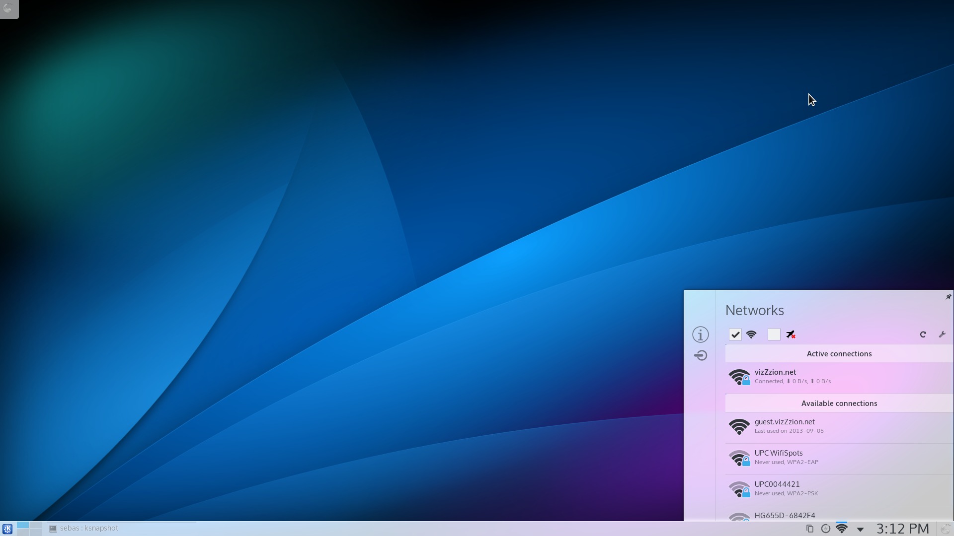
Smoother Kickoff menu
The mechanism to adapt to different form factors is fully implemented and functional, but, as there is only one workspace available right now, it is not useful at this point. In the months to come, the Plasma team plans to make available additional workspaces, such as the tablet-oriented Plasma Active user experience, and the media-consumption-targeted Plasma Mediacenter.
A note on versioning and naming: The code name "Plasma Next" always points to the upcoming release of Plasma, KDE's end user workspace. The current Alpha will become 2014.6, to be released in June of this year. If the team opts for a 6 month release cycle (still to be determined), Plasma Next will refer to the 2014.12 release once 2014.6 is out.
Ready for testing, not production
The workspace demonstrated in this pre-release is Plasma Desktop. It represents an evolution of known desktop and laptop paradigms. Plasma Next keeps existing workflows intact, while providing incremental visual and interactive improvements. Many of those can be observed in this technology preview, others are still being worked on. Workspaces optimized for other devices will be made available in future releases.
As an Alpha release, this pre-release is not suitable for production use. It is meant as a base for testing and gathering feedback, so that the initial stable release of Plasma Next in June will be a smooth ride for everybody involved and lay a stable foundation for future versions. Plasma Next is intended for end users, but will not provide feature parity with the latest 4.x release (although this is expected to be accomplished in a follow-up release). The team is concentrating on the core desktop features first, instead of trying to transplant every single feature into the new workspaces. The feature set presented in Plasma Next will suffice for most users, though some might miss a knob here and there. This is not because the Plasma team wants to remove features, but simply that not everything has been done yet. Of course, everybody is encouraged to help bringing Plasma back to its original feature set and beyond.
For developers
Plasma Next builds on top of Qt 5. With this transition, all QML-based UIs—which Plasma is built exclusively with—will make use of a new scenegraph and scripting engine, resulting in huge performance wins as well as architectural benefits, such as being able to render using available graphics hardware.
Plasma Next is the first complex codebase to transition to KDE Frameworks 5, which is a modular evolution of the KDE development platform into leaner, less interdependent libraries.
For users
Users testing this Plasma pre-release are greeted with a more refined visual appearance. The new Breeze Plasma theme debuts in this pre-release with a flatter, cleaner look. Less visual clutter and improved contrast make Plasma Next a noticeable improvement over the current stable Plasma workspaces. There has been some polish to much of Plasma's default functionality, such as the system tray area, the notifications, the settings for the compositor and window manager, and many more. While it will feel familiar, users will notice a more modern workspace.

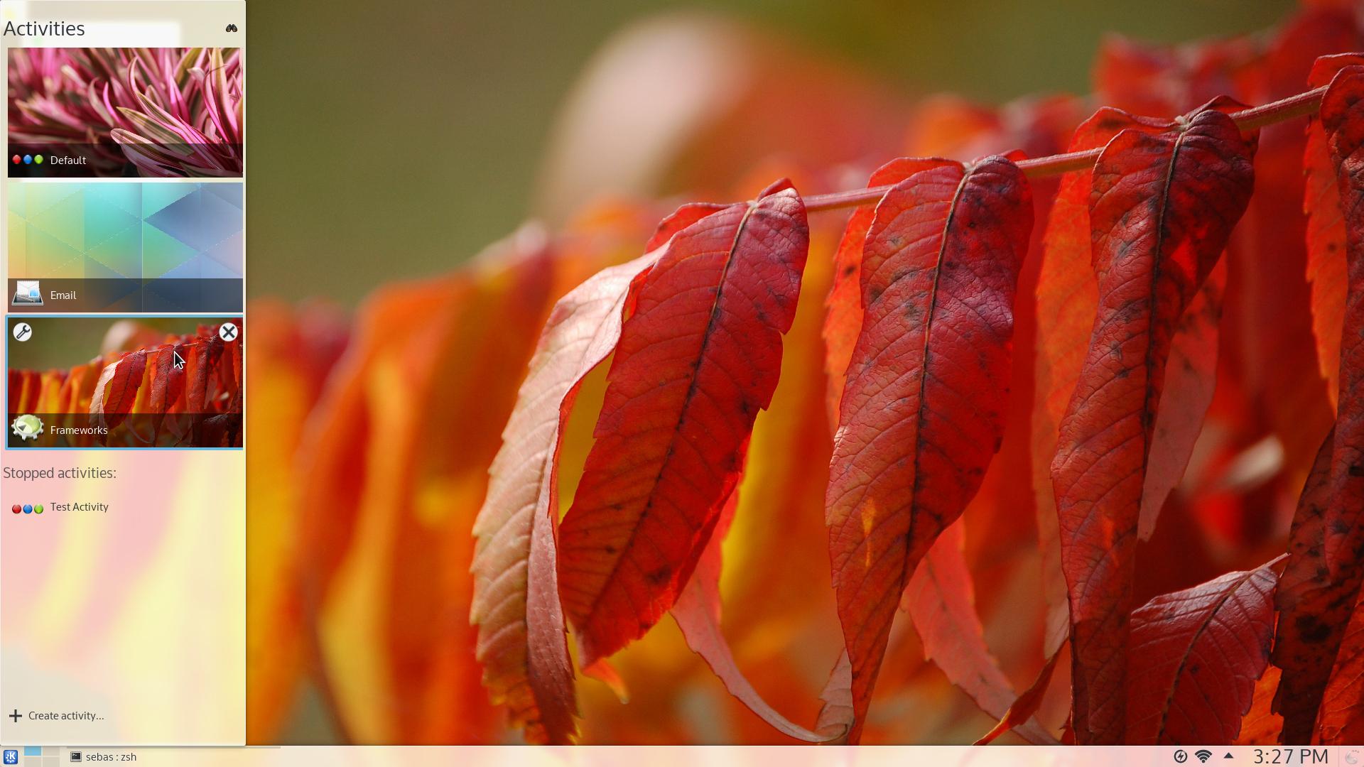
New Activities chooser
Installing and providing feedback
You can install Plasma Next directly from source. KDE's community wiki has
instructions. Some distributions have created packages; for an overview of Alpha 1 packages, see
this page. You can provide feedback either via the
#Plasma IRC channel,
Plasma-devel mailing list or report issues via
bugzilla. Plasma Next is also
discussed on the KDE Forums. Your feedback is greatly appreciated. If you like what the team is doing, please let them know!
Comments:
What about a new look? - Josh - 2014-04-03
Is there any plan to have a new icon/widget theme?
Oxygen has served us well, on both fronts, but isn't it time to refresh the look a bit? To something more modern and polished?
Except oxygen, there is currently no polished widget theme available. At all. It's all a qtcurve based mess :(
suggestions - Andrea Z. - 2014-04-03
as a kde user since kde2 please accept an humble suggestion:
damn, still wobbly windows and blue leds as default?
please do a more sober default setup, that is the most abused criticism on kde by so many people!
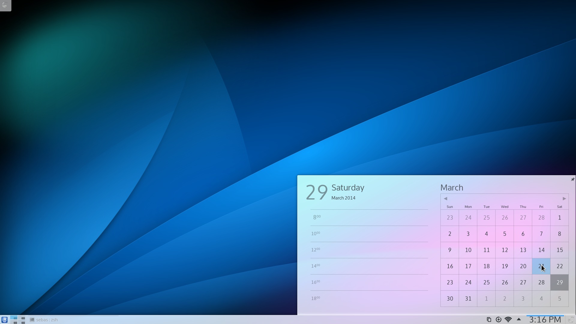
Week numbers in the calendar - JW - 2014-04-03
Looks great.
There are no week numbers in the calendar!
Looks awesome! - Erik - 2014-04-03
Looks awesome, keep up the good work!
Congratulations! - pedrorodriguez - 2014-04-03
Congratulations! You guys are doing a terrific job
Wobbly windows the default? - bluelightning - 2014-04-03
If so this is news to me - which distro is that on?
KDE is still inconsistent - Aleksandar Petrinic - 2014-04-03
Hi to all! :) I'm kde user since years and I really apreciate the work devs and designers did on kde. What I don't understand is... am I the only one who thinks the integration between "plasmoids" and other apps(qt apps) is inconsistent ? Why we can't try to have plasmoids' look even for the qt? This will bring kde to be one piece insted of various(not always visually integrated) components.
Let me know what do you think. Thanks :)
icons theme - Walid - 2014-04-03
Please, change icons to this (as suggested by KDE's visual design group)
http://wheeldesign.blogspot.fr/2014/03/monday-report-7-beach-edition.html
matching flat widget and window theme for Breeze Plasma theme - anonymus - 2014-04-03
It would be nice if a matching flat themes for widget and window decoration is also made available( a more complete flat themeing)
oxygen transparent - shaurya - 2014-04-03
Can there be default support for oxygen transparent. Would look good with the more refined desktop
agree - keopsis - 2014-04-03
Yeah,
to be honest I have some friends that says they prefer the kde philosophy, but they run under gnome 3, because the kde theme, is really from an other age, and when you spend 8h a day in front of an interface you don't like, it's not pleasant.
Do it as beautifull as gnome with the same perfectionism, but not their #*@ workflow, and you'll get a lot of new supporters...
My advises : sober and clean is the way to go (gnome/osx), and window 8/tablet is the way to not go...
good - joe - 2014-04-03
this looks great.
It's coming, it's coming. - Jens Reuterberg - 2014-04-03
The thing is these things take time. Right now we're working on a new widget as well as a new window decoration and icon theme. But we got in fairly late in the game so it hasn't gone through yet. But it will.
Looks very edgy - Cheesy_popcorn - 2014-04-04
Any way to have smooth corners with the start menu?
...
Course they'll.
Wobbly Windows is not enabled by default - mgraesslin - 2014-04-04
Wobbly Windows has never been, is not and will never be enabled by default. It's used in the video as it got recorded by a developer who likes using Wobbly Windows.
What about activities? - Nuno - 2014-04-04
Nice and elegant but... For some time Activities has been one of the flags of the Plasma workspace and the new Activities chooser looks cool. The usage and usefulness of Activities, however, introduces a new concept to the users that has not been well promoted and demonstrated. The video above shows some activities but completely empty: what is the shown "email activity" usefull for? in what is it different from, ex organizing applications in different screens? I am affraid that unless there is some investment in promoting the concept and practical use of Activities, this will be just an "interesting concept" but underused.
Great look with some room for optimizations - Till Schäfer - 2014-04-04
I like the new calendar and notifier a lot and i would like to thank you for your awesome work with kde.
However, the inactive tasks do have a very low contrast, so it is hard to read the title, I do also like the old kickoff menus indicators of the current active category more than the new one. The small line above the category (in the screen shot: favorites) need some more attention to get the current state of the menu. So while this is very shiny. keep in mind the "contrast" / "readability" / "easy to capture" aspect of the gui
*sigh* still same problems as 10 years ago - Janne from the past - 2014-04-04
At 30 second mark, the user has to make the window horizontally bigger, as the content of the window doesn't fit it properly at it's default size. I think it has now been about 10 years when I was talking about these exact same problems in various KDE mailing-lists, bug-reports and the like, and it seems that they are still not fixed.
These are tiny things, easy to fix. And requiring the user to deal with these issues just leaves a bad taste in users mouth.
Where is the blur? - rich ard - 2014-04-04
This is all very nice and I like it very much, ... but weren't we promised with more blur instead of more "white" on transparent menus?
The panels don't have to seem enough blur for a non-white theme and also in the activity manager, you can see there is no blur at all behind the activity name (which will make it unreadable with a relevant wallpaper).
So pleeeaase keep the blur in mind.
Where are your patches? - mgraesslin - 2014-04-05
If it's easy to fix I'm wondering why you don't submit a patch? For the record I fix thus an issue a week ago and I didn't find it an easy to fix but quite some work.
It's up to the user - mgraesslin - 2014-04-05
The power of activities is that it will look different for each user. We as the developers cannot know what possible activities will look like for the user. It's a tool to work in a more productive way. So of course it's valid to use an activity for emails as that will hide the mails from other activities and provides a more distraction free work. But if it suits a user better to have the emails always visibile on another screen (if available) or on a virtual desktop that is equally valid and supported.
Not suited for default - mgraesslin - 2014-04-05
Oxygen transparent is still not suited for default due to technical reasons.
Separation between Desktop Shell and Applications - mgraesslin - 2014-04-05
There is a visual separation between the elements belonging to the Desktop Shell and the Applications. This is nothing special to our software stack but can also be seen in other environments, e.g. GNOME Shell.
Do you realize that now some of us are dying of anxiety, do you? - msx - 2014-04-05
Please, please, please show us something as soon as you can!
And of course, thanks a lot for what you do :)
But, not 9 years ago. - Morty - 2014-04-06
Most of those isses you remember, was actually fixed 9 years ago. For the KDE 3.4 release a lot of size tweaks was made by Waldo Bastian, cleaning up the initial size of most applications.
Unfortunatly it's a reappearing problem, both because of changes made since then and applications becomming replaced. And to make the problem worse, it's common with varius relsolutions. Real high resulution display is becomming more common and there also are users using larege screens with lower resolutions(TVs). This combined with different font sizes tend to make the issue more noticable. Back when almost everyone did 96dpi, it was simpler to handle. Applications also tend to use some dynamic size tricks, unfortunatly not always with luck. In the end, it makes it less easy to fix.
Regardless, a good start would be to check out all applications from a fresh user and identify the missbehaving applications. It's probably not a thing developers test often, and it's a trivial detail to notice compared to other more complex issues they work on. But first impressions count, and making the developers aware gives a bigger chancce the issue will get resolved.
Why didn't I? - Janne from the past - 2014-04-06
Why didn't I submit a patch? Because I'm not a coder, that's why. But for someone who can code, fixing issues like proper default size of windows is probably very easy thing to fix. Or are you saying that increasing the default size of the app-window is very hard to do?
This attitude is one if the reasons I was sot turned off by KDE and free software in general. If you don't code, you are basically dead weight. Useless, unneeded, unwanted. If you point out a shortcoming or something, the answer is always "fix it yourself".
Your comment; Martin's reply - kallecarl - 2014-04-07
You wrote that "These are tiny things, easy to fix." Martin replied appropriately. He also wrote that fixing it took quite a bit of work. In other words, you did not know what you were talking about, even though you gave the impression that you did know.
Now you've turned this into an unjustified complaint, unrelated to what Martin wrote. Check the KDE forums and the distro forums...it's simply not true that "the answer is always 'fix it yourself'".
bart.otten85@gmail.com - BartOtten - 2014-04-07
Showing the concept does not force anybody to setup the same activities. Yet, it DOES show the idea behind it.
As I speak for myself: I once created some and never used them as I did not find a benefit over virtual desktops. Yet, there is a huge difference between them that I (and a lot of other people) just don't know. Like energy saving modus being set per activity (and probably much more...but how to know?)
Idea: Send feedback widget - BartOtten - 2014-04-07
As I am not a developer, I have no idea how hard it is to do the following:
- Create an widget which on click
-- captures the screen
-- saves the clicked app-name
-- gives you a field to add a comment
This way it would be easy for novice testers to send in feedback. Not devs using Bugzilla, not nerds using the forum, not geeks using a Wiki. That way I could give my mom a copy and she could easily report what whe thinks should be improved or what is unclear.
Enable the widget by default on Alpha and Beta and voila.....
+1 to matching flat theme - travis - 2014-04-15
+1
Agree - Jinesh - 2014-05-02
+1 for Qt app looks
Not terribly hard, I think. - Anonymous - 2014-05-14
Not terribly hard, I think. We even have something similar - likeback. It is used by Amarok. Downside is that it creates a lot of feedback you have to go through... Time you could spend on coding. The issue with these things is always that it is a trade-off :(