The Road to KDE 4: Updates and Addenda
Thursday, 22 March 2007 | Tunrau
Well, so far I've published a dozen articles about KDE 4 over the last 12 weeks. A lot of content has been covered, but there is rapid progress still being made on those topics. So, in no particular order, this week's issue deals with addenda and updates to the last 12 articles, so that you can see some of the rapid progress happening as KDE races forward. Read on for details.
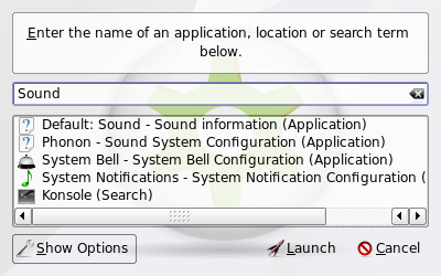
First, when I demonstrated KRunner back on January 2nd, it was barely useful, contained temporary artwork (it still does), and looked pretty basic. Since then, it's seen a lot of work. It is now installed by default, sounding the final death of many of the elements that previously belonged to KDesktop, one of KDE's oldest components. It (mostly) works, pops up when you press F2 (see note 1), handles CTRL-ESC to pop up the task manager, handles CTRL-ALT-DEL to pop up the logout dialog, loads the screensaver and screen locking routines as expected, and behaves in a very useful and beautiful fashion. Below is a shot of the new KRunner in action:
There's also this short movie (a week or two old) showing off how KRunner works when searching for commands to run. The interface is not yet final, but it's getting closer to completion. When it is further along, you will certainly get more updates.
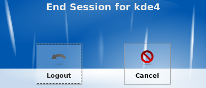
Speaking of artwork, during the Oxygen article, I showed off KDE's new logout screen. At the time that was using temporary artwork that was a proof-of-concept placeholder. It's been updated somewhat, and now looks like this:
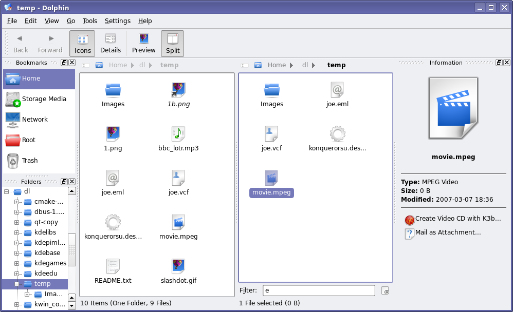
That's not the only screenshot that needs updating. After the Dolphin article, there were many requests for a tree view in Dolphin. Well, Peter Penz, the lead developer of Dolphin listens to feedback, and within hours, there was a preliminary tree view checked in to KDE SVN. After a few weeks of development, here's what the work-in-progress tree view looks like in Dolphin (this is also a good opportunity to show off some Oxygen icon artwork improvements as well):
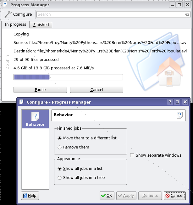
And one more shot: back in January, I wrote about some of the work being done on KDE's Job Progress improvements. This section has seen much work since the very initial code I showed off back then, with much of the user feedback to that article helping shape its development. It now has support for pausing downloads, storing a list of finished tasks, searching for keywords among the active tasks (useful if you have 30 tasks on the go), has a simple configuration dialog, and more. The backend that powers this whole system has seen a lot of work, with more discussion with the GNOME folks on standardizing the mechanism so that applications using this progress reporting will run seamlessly on either desktop. Here's a shot of the job monitor and its configuration dialog (see note 2):
okular has received preliminary support for PDF forms, thanks to improvements to the Poppler backend. okular is the first Poppler-based viewer to add support for forms, but more are expected to follow. The implementation isn't particularly useful at the moment, and looks too ugly for screenshots, but the initial support is there. There has been a lot of development happening in okular - which, alongside other KDE developments, you can read about in the weekly KDE Commit-Digest - including support for additional formats, reworked text searching, and more.
Work on Kalzium powers forward: artwork for a student-friendly view is being developed; a better use of the empty space in the center of the table is in place; and work on libavogadro-based 3D molecule viewer is making steady progress.
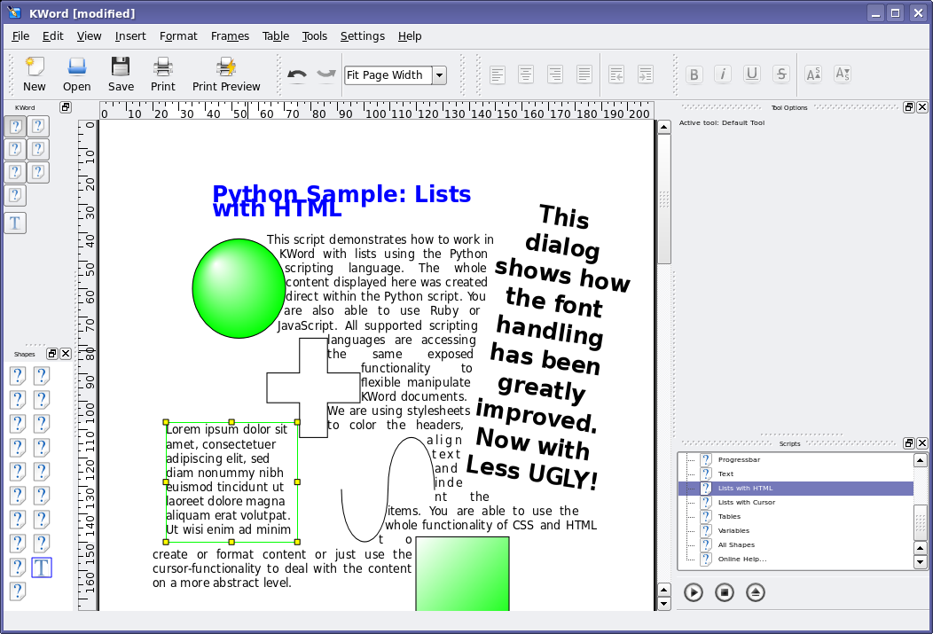
The rendering in KOffice with regards to text and shape rotation has improved. Part of the problems with the screenshots in my original article is that I was using a bad default font that was shipped by my distribution. Here is a shot of a similar document, but you can see what a difference 2 months can make. In this shot, you'll see a number of new things, including a new 'default text' feature. Where you see the famous 'Lorem ipsum' text, clicking onto the text clears the widget of text, leaving your cursor on a blank text shape. Also shown is content generated automatically using the Kross scripting features, and several Flake shapes also inserted using Kross plugins. The user interface also has seen a lot of improvements, however there is still work to be done: missing icons, font and widgets sizes, and so on.
There were many more changes made to KDE since these articles have gone live, and unfortunately I've only had a change to cover a small handful of them. Of course, for a real look at all the work that's being done, you would need to build the sources yourself on a regular basis. In the meantime, I'll return with more new articles so you don't have to build the sources (though I certainly won't discourage you from doing so!).
1Bug Alert: There is currently a nasty, unsolved bug where KRunner stops responding to ALT-F2 after a period. Fear not, this sort of bug will not be present by the time KDE 4.0 hits the streets, as it would be considered 'show stopper' bug. If, however, you need an excuse to get into KDE 4 development, here's a point of entry that will quickly get you accustomed to KDE and Qt programming.
2Power User Tip: This uiserver screen is usually hidden by default when nothing is happening. If you are running KDE 4, you can make it visible at any time by calling the following command:
qdbus org.kde.uiserver /kuiserver/MainWindow_1 com.trolltech.Qt.QWidget.show
Comments:
Keep it up! - T1m - 2007-03-22
Great job! KDE is going to blow my shoes away! :D
Thumbs up! - winter - 2007-03-22
Very impressive! Good work!
Alt+Esc in Games - pascal - 2007-03-22
I would like to have a feature in KDE(krunner) that overrides the game you are playing so that you can exit a fullscreen game at any time and go to the desktop by pressing Alt+Esc (Similar to how it is done in windows). This IMHO is a great feature that I've missed several times in KDE. Also, great article! These articles really help to keep the community on the edge.
Re: Alt+Esc in Games - Stalwart - 2007-03-22
It's not a KDE problem, but SDL. Vanilla SDL allows game to grab keyboard. Some distros like ubuntu have SDL patched to prevent this
Re: Alt+Esc in Games - pascal - 2007-03-22
What is SDL?
Re: Alt+Esc in Games - Troy Unrau - 2007-03-22
The Simple Direct media Layer or similar acronym. It's a graphics and sound layer designed for making games, visualizations, and so forth. Not part of KDE, but used by KDE applications on a few occassions. What is happening is that SDL is telling X that all keystrokes have to go to SDL instead of other programs. This effectively locks other programs out of receiving these keystrokes - which is good when you're trying to hit F2 to change weapons at the same time as pressing ALT to jump... You don't want the run dialog popping up :) That said, certain key combos should still be able to be passed through to X... CTRL-ESC and CTRL-ALT-DEL come to mind. (I'm not sure how SDL treats CTRL-ALT-BKSP... anyone know?)
Re: Alt+Esc in Games - Carlo - 2007-03-23
The real problem is that there's no common, configureable shortcut system, applications have to obey to. One of the big usability issues of the Linux desktop.
Re: Alt+Esc in Games - f00fbug - 2007-03-23
Hmm... I think I'll email the freedesktop guys about this, there should be a way in X to configure key combos to be passed through to the WM.
Re: Alt+Esc in Games - Carlo - 2007-03-23
The question is not X, but abstracting the actions from the key combinations and mapping those via a chosen config (so e.g. KDE apps would use Gnome shortcuts in a Gnome desktop and vice versa). This is everything else than simple, since you need to provide fallback shortcuts or even generate them (or ask the user to chose ones) in rare cases for applications, which use shortcuts for actions that are not available in such a common desktop action-scheme. Also getting all and every application support such a change, will take time.
Re: Alt+Esc in Games - Martin - 2007-03-22
A similar question: In some situations in KDE 3, such as when you have a menu (e.g. K menu or Konqueror menu) open or when you have dropped down a "combo" box (e.g. the address field in Konqueror), global keyboard shortcuts are somehow grabbed and do not work. This means for instance that the volume -/+ keys on my notebook are inoperative. It would be very nice if this were resolved for KDE 4. I would be happy to file a bug (if one does not exist) if someone just told me which component of the system is responsible for this behaviour.
Re: Alt+Esc in Games - Henry S. - 2007-03-22
I've always placed bug reports using my intuition. The bug "handlers" can then re-assign them if they feel they belong somewhere else. It is better to have a misplaced bug report than none at all.
Re: Alt+Esc in Games - superstoned - 2007-03-22
True, this is an annoying problem. I must admit I never thought about reporting it...
Re: Alt+Esc in Games - panzi - 2007-03-23
Same situation here.
Re: Alt+Esc in Games - Niels - 2007-04-22
Oh. That explains this problem I've had with KDE locking up completely when a program starting pops up the KWallet password prompt while I'm typing in Konqueror's address bar. Ctrl+Alt+Bksp has been the only solution :-( No, I never filed a bug report since I'm using "ancient" 3.4.2...
Drop the + and - in TreeView, use triangle arrows - AC - 2007-03-22
Mac OS X, Windows Vista, and GNOME have stopped using + and - for expanding and contracting folders in the TreeView, and are now using triangle arrows pointing either sideways or down. I think triangle arrows are more intuitive because they actually point in the direction of the folder contents. The + and - are just too cryptic and geekish.
Re: Drop the + and - in TreeView, use triangle arrows - Troy Unrau - 2007-03-22
This appearance is a function of the widget style. I took my screenshots with what are currently the KDE 4 default widget style, but it will not be the final KDE 4 widget style. The final style for KDE 4 is still a work in progress (hence why it hasn't been made the default yet) but this is definitely the sort of change that can happen there. That said, I don't see anything particularly wrong with the current form, as + and - intuitively mean 'expand' and 'collapse' to me. And changing it just because OS X and/or Gnome have changed it is not a great argument. That same argument would suggest that we change our button orders, and various other things as well, which is not going to happen. That said, I am under the impression that this is not really a ease-of-use issue, and if it does get changed in a given style, it'll be because the artists who are writing the style think that it looks better :) Which is more valid (in my opinion) than the other arguments :)
Re: Drop the + and - in TreeView, use triangle arr - reihal - 2007-03-22
"And changing it just because OS X and/or Gnome have changed it is not a great argument." It have already been changed once, so why not twice? KDE 1 rules. Nice clear small icons, too!
Re: Drop the + and - in TreeView, use triangle arr - Debian User - 2007-03-23
Yesh, KDE was only good until KDE2 ;-) That said, the minimalistic style of the days had its appeal.
Re: Drop the + and - in TreeView, use triangle arr - Erik - 2007-03-23
I notice KDE used to have nice fonts :-)
Re: Drop the + and - in TreeView, use triangle arr - Troy Unrau - 2007-03-23
Well, the fonts depend on the distro... but nonetheless, those fonts are not using anti-aliasing. You can turn anti-aliasing off and have the fonts look somewhat like that still -- they are much more readable in lower font sizes that way, as well as quicker. X and fonts is still a big problem, after years of work...
Re: Drop the + and - in TreeView, use triangle arr - Ben - 2007-03-22
Speak for you're self, I like + & -
Re: Drop the + and - in TreeView, use triangle arr - Carlo - 2007-03-23
++
Re: Drop the + and - in TreeView, use triangle arr - zonk - 2007-03-22
The TreeView widgets are not drawn by KDE apps directly, but by QT (more specifically, by the QT style plugin you use). Thus, some widget styles will have +/- icons in TreeViews, some will have triangle arrows, some will have something totally else :). It's your choice which widget style you use. And some, like the default KDE3 Plastik style, have this configurable. Just run Control Center (why isn't it named "Kontrol Center"?), go to the (Appearance&Themes | Style) applet, and click on the "Configure" button beside the style selector combobox. In the Plastik style the option is named "Triangular tree expander". Enjoy :).
Will KDE 4 eyecandy be fast? - Batonac - 2007-03-22
Real-time effects are something I'm really looking forward to in KDE 4. I'm sick and tired of fake transparency, etc. The video of krunner was really neat show of the power of QT4 because the text, which was scrolling quite fast in the background was showing trough the krunner window in real-time. This is what I'm wondering, however, I recognize that QT4 is supposed to be faster, but will it be faster while doing chores that were never done before in KDE? Is real-time transparency with QT4 just an optimization of code which should have been done a long time ago, or will it require a new graphics card and CPU running with aiglx, etc.? It would be nice if i could boast that all this Vista/OSX technology will be available for even old Pentium IIIs with KDE 4, but is that really true?
Re: Will KDE 4 eyecandy be fast? - Troy Unrau - 2007-03-22
Actually, that video is showing off a feature I haven't yet talked about for KDE 4 (mostly because it hasn't been merged into trunk yet). It's using kwin_composite, a GL accelerated kwin which does the real transparency at the video card level. I've briefly talked to the kwin_composite dude (Seli), and he informs me that it will make it into KDE 4.0, barring any unusual problems. It's a good solution for KDE to appeal to those wanting a pretty desktop (like Beryl), but at the same time it has a great fallback mechanism whereupon those without GL acceleration can use some effective software rendering, or have all effects turned off. Basically, it's all about adding bling, while maintaining KDE 3's level of performance (or actually improving it where possible). When it merges into trunk, I'll feature it here :)
Re: Will KDE 4 eyecandy be fast? - batonac - 2007-03-22
OK, so let me get this strait. The transparency in that video had nothing to do with the QT4? It was just done through a beryl/compiz like setup? If this is true, what is the advertised QT4 real-time transparency good for then?
Re: Will KDE 4 eyecandy be fast? - Troy Unrau - 2007-03-22
Take a closer look - there are two transparencies happening: One is showing a widget that you can see part of the background image from. It is shown off in the still screenshot I posted above, which does not use any beryl/compiz-style transparency. You will notice that the run dialogs' background is showing even in the line-edit. This is an application-internal type of transparency, possible because Qt controls the whole widget stack. It's quite slick... But Qt doesn't control X, so when doing transparency between windows, X methods need to be used. This beryl/compiz like window tranparency is handled by kwin_composite and relies on Qt, GL, and the X Composite extensions. This video is not using beryl/compiz, but uses a similar implementation found in kwin_composite. It uses Qt for some effects (such as blurring/recolouring the background) and Qt-driven GL calls for others (such as wobbly windows, no demonstrated in the video) where appropriate.
Re: Will KDE 4 eyecandy be fast? - batonac - 2007-03-23
Hey thanks troy for keeping up with me, I understand now. You gave me an idea though, we really should build an X replacement that's completely controlled by QT, a QT accelerated graphics display system for Linux, where QT can control all elements of the display, not just the internal parts of QT programs. That would be talking. Its unification like this that's needed in order for Linux to take over the desktop.
Re: Will KDE 4 eyecandy be fast? - Frogstar Robot - 2007-03-23
That's all well and good but what happens when I want to run a non-QT app? There are several here and there that are pretty good......
Re: Will KDE 4 eyecandy be fast? - batonac - 2007-03-24
A display system that supported only QT would force the KDE community to create KDE programs that provide ALL computing needs. This would be a good thing since it would provide complete unification of the Linux desktop. Think about it.. ALL programs would use the same file save and open dialogs. ALL programs would use the same color scheme/widget style. ALL parts of the display would be powered by the SAME graphics engine which means LESS CONFIGURATION and LESS CONFUSION. KDE taskbars should be able to have true real-time transparencies just through QT 4, but NO, in order to do this, we have to write additional 3d extensions to kwin which will be working IN ADDITION to the new QT Arthur paint engine, instead of being powered by it. Arthur is probably powerful enough to do this, but QT doesn't control X, so it can't be done. I'm really sick and tired of X windows actually. X doesn't have native SVG render support so all SVG used in QT programs have to be rendered and cached before they can be displayed by X. If the graphics system was controlled by QT, as QT would improve, so would the graphics system, new versions of QT wouldn't have to constantly maintain backwards compatibility with an out-of-date graphics system.
Re: Will KDE 4 eyecandy be fast? - Vide - 2007-03-25
Go buy a Mac, you really want one of those.
KDE should be better than Mac OS X - batonac - 2007-03-26
Ha! You're probably right, I probably should just get a mac, but Mac OS isn't completely opensource. KDE Linux really should be a complete Mac OSX replacement, but currently, it doesn't quite cut it.
Re: Will KDE 4 eyecandy be fast? - me - 2007-03-23
Does the fallback include using 2d compositing/EXA? I much prefer this as it is, at least on my machine, considerably faster and nicer to look at than all that Beryl crap, which runs slow and looks dumb.
Re: Will KDE 4 eyecandy be fast? - Troy Unrau - 2007-03-23
You'd have to ask Seli about who the fallback mechanism works in more details... or, once it's merged back into trunk, I'll do the research and write about it. *puts on a fedora with a press card on the front*
KWin OpenGL fallback - Duncan - 2007-03-24
This subthread is of concern to me as well, as I've presently a now aging but until very recently "best freedomware 3D support available" ATI Radeon 9200 series card. The native xorg Radeon driver in merged framebuffer mode supports accelerated OpenGL on this thing up to 2048x2048, but I'm running two monitors at 1600x1200 resolution, stacked for 1600x2400, so there's 352 lines' resolution unaccelerated at the bottom of the combined display. With KDE3 (3.5.6 currently, on Gentoo/amd64), running xorg (now the 7.3-rcs), I've found EXA works waaayyy better than XAA, with composite and composite effects (only the transparency, fading takes time, and shadows just don't add anything to my experience, maybe because I run light foreground on dark background by default, so I can't see them in many cases, unless I reversed them of course, which is just... weird) turned on. It works quite well, actually, with the single exception being OpenGL apps go blank when moved partially into that zone... not so great when that's my main work monitor. I'd hope that before the entire desktop goes OpenGL, xorg would kill that 2048 max height/width acceleration issue -- and of course the xinerama OpenGL accel issue if it still exists as well. That's not under KDE's control of course, but a decent fallback to 2D EXA would be fine, as long as it remains a viable option. Of course, if there's one thing KDE two and three have been good at -- one of the main reasons it's my desktop of choice -- it's giving people reasonable options, and I'm reasonably sure that's going to continue with four as well. I'm just commenting here in the interest of ensuring it does. =8^) BTW, here's a now dated (a bit over a year old, Feb 2006, KDE 3.5.1) screenshot (1/3 size). Astute KDE users will likely recognize the layout of the page as modified from one generated by the Konqueror Create Image Gallery tool. =8^) http://members.cox.net/pu61ic.1inux.dunc4n/pix/screenshots/index.html Duncan
Will Dolphin be fixed? - Nach - 2007-03-22
Will the Dolphin style of navigation become the default file open/save dialog? Will Dolphin have easy navigation? I read this article here: http://insanecoding.blogspot.com/2007/03/file-dialogs.html And it made me a bit disturbed to hear about the planned changes and what Dolphin is like. Will Dolphin end up getting proper inputting of paths, and not have annoying "virtual directories" ?
Re: Will Dolphin be fixed? - Troy Unrau - 2007-03-22
Okay, since this question keeps coming up over and over... The KDE File Dialog is part of kdelibs. The icon views and so forth that Dolphin is using are part of Dolphin but anything that would be useful to other programs are being sent down the chain into kdelibs as well. So anything sent down can be shared between Dolphin and the File Dialogs (and Konqueror, and any other program using icon views, like K3B, for instance). That said, the only thing they are complaining about in that blog is the breadcrumb. And it is indeed *configurable* to have the old style selector in Dolphin as the *default*, and no, the KDE 4 File Dialogs do not use the breadcrumb (nor have I heard any rumblings that anyone plans to make that change). The keywords here are _configurable defaults_, as KDE tends to be. The other thing they are complaining about is Qt4's dialogs (in a non-even-beta-release version of Qt 4.3), but since KDE implements it's own dialogs, Qt's changes here will not affect KDE. So really, no need to worry...
Re: Will Dolphin be fixed? - Nanaky - 2007-03-22
He also noted the lack of renaming possibility (at least for KDE 3), which is a feature I found particularly useful (in fact like every basing file management you can do in the file dialog). If it would come with KDE 4 it will be great (and unobtrusive: right-click or F2 press). For everything else, as long as it's configurable it's okay. The file dialog is something quite important, given how often it is used, making it feature complete spares time. (I think it is the thing in Gnome I dislike the most, given how unusable it is.)
Re: Will Dolphin be fixed? - Troy Unrau - 2007-03-22
I've used a bit of a workaround for the lack of renaming before: choosing properties and then renaming from within that dialog. I agree though, adding rename on F2 (or whatever the user has configured for keypress) and/or in the context menu would be useful (and less clicks than my workaround).
Re: Will Dolphin be fixed? - Leo S - 2007-03-22
Well, F2 would be good shortcut to support, but your workaround is the exact same number of clicks as if we had a rename action in the right click menu. In both cases it is: Right click the file Choose Properties/Rename Type the new file name Hit enter/Click Ok. The file name is highlighted by default when you open properties, so its not any slower.
Re: Will Dolphin be fixed? - Thomas Zander - 2007-03-22
Placing rename as a top-level function in the open/save dialog is mixing concepts and growing context menus while not providing anything extra, as troy showed you can still rename if you need to. The thing is, while you are working in a file save dialog filesystem manipulation is not one of the things that is on the feature list for almost all cases. If you want to do filesystem manipulation, start your Dolphin to do so. People that cry 'feature creep' or 'bloated' tend to point to the amount of features available in a given UI. Getting the amount of features right is a case of balance. And discussions we had over the last 2 years made us decide that the balance is kept by not providing filesystem operations in the file dialog itself. Hope that explains it.
Re: Will Dolphin be fixed? - Jono - 2007-03-22
What if I want to save a file with a specific name, but a file with that name already exists that I want to keep? Or what if I have just created a new folder and want to change its name? Both of these circumstances are helped by the presence of a top level rename option. Yes, I could go via a Properties... dialogue, but they seem to be fundamental enough to the operation of saving files that it deserves its own entry.
Re: Will Dolphin be fixed? - superstoned - 2007-03-22
You do have a point here, imho. I use the properties dialog for renaming, and just being able to use F2 or a click to rename a file would make sense. Having to start konqueror/dolphin, go to the location in the filedialog, just to rename a file - not really efficient. Besides, you can create new folders, why not rename a file?
Re: Will Dolphin be fixed? - Leo S - 2007-03-22
Like I already posted, your aversion to the Properties option is purely psychological. It is the same speed as a dedicated rename action. Think about the actions involved. Try it. Click to rename is a horrible feature in windows. Ever watch a newbie trying to double click? Half the time they rename by accident. F2 would be nice to have though.
Re: Will Dolphin be fixed? - Vlad - 2007-03-23
The problem with the Properties dialog is that it is not obvious that you should open it if you want to rename a file. It already occurred that I wanted to change a filename in a dialog and then it did not pass my mind to have a look in the Properties dialog for that feature (by the way, thanks for pointing it out). I agree that click to rename is a horrible feature. Failing to double click properly is something that happens all the time to me, and I am double clicking already for more than ten years. No need to say that I hate double clicking and programs that force me to double click.
Re: Will Dolphin be fixed? - John Tapsell - 2007-03-22
Was it the usability experts that said to remove these features? Or was it something random that you decided?
SCREW the simplicity attitude! Go for EFFICIENCY! - eMPee - 2007-03-22
Well, I always thought KDE was the UNIX desktop from the professionals for the professionals, and we very much expect filesystem manipulation from the file dialogs. Heck, even Windows has it, screw the 'rather not confuse the user mentality'. I love KDE because it lets you do things the way you expect them to work, and I and many others (http://insanecoding.blogspot.com/2007/03/file-dialogs.html) do expect a renaming in the file dialogs to work. Troy's workaround is just that, an inefficient glitch and not the solution. All people on the KDE team please note: do not sacrifice any power features for an assumed 'ease of use' for the masses, many avid KDE users who promoted it for years are very pissed off by moves like this. I for one am, and Aaron 'knight of ui' himself has first induced this feeling by acting like a gnome robot on this: http://bugs.kde.org/show_bug.cgi?id=96570 Quotation from the first link: "I always found that feature useful if you wanted to save a file as the same name as something existing, but wanted that old file to be backed up. Perhaps some KDE developers have been spending too much time with GNOME/GTK devs. Speaking of which, I've been previewing some stuff for KDE 4. Now while I have no idea what the final product would look like, some changes as they currently stand are a bit disturbing.[...] I don't know why KDE devs are adopting stupid GNOME ideas, or taking a step backwards to design mistakes and oddities from Windows, but I sure hope someone knocks some sense into them soon. [...] The copying of stupidity is uncanny. It seems they removed features and changed defaults to make it resemble GTK more, for some absurd reason. [...] I don't know what's becoming of KDE and Trolltech these days, they seem to be taking the bad from GTK/GNOME and throwing away their own good technology. [...] I can't even begin to describe what a major step backwards it is. What happened to the sanity? Where's the intelligence? Where's all the good stuff? Why am I looking at garbage from a lesser API, in the best cross platform one available?!?"
Re: SCREW the simplicity attitude! Go for EFFICIENCY! - Troy Unrau - 2007-03-22
Chill :) We have no plans to remove any features from the file dialogs.
Re: SCREW the simplicity attitude! Go for EFFICIENCY! - eMPee - 2007-03-22
cant chill right now have a very important exam tomorrow X==P anyways what i said not only applies to file dialogs but everything in kde, that's why i quoted out of context ;)
Re: SCREW the simplicity attitude! Go for EFFICIENCY! - Debian User - 2007-03-23
You know, KDE4 is not even Alpha yet. For these detail levels, a review is not yet appropriate, I believe. Arguing about what's not yet there is NOT the point of the previews.
Re: SCREW the simplicity attitude! Go for EFFICIENCY! - MamiyaOtaru - 2007-03-26
Yes it is. Better to talk about stuff now than when things are set in stone. Reminds me of the Deus Ex 2 dev cycle. There was stuff I didn't like and said so, and people told me to chill, it wasn't done yet. When the demo came out, the same stuff was there and I expressed my dislike and (other) people said "I didn't hear you complain about that (loss of) feature when it was talked about before the demo." Thing is, by then it was too late. KDE4 is looking more and more like Deus Ex 2, with stuff being cut out and people saying not to knock an alpha. Yeah, like any changes people might like will magically happen before final when development up to this point indicates strongly that they won't. I'm just ignoring Dolphin for now as it just gets me too worked up. I'd rather not ignore KDE4, but I suppose I should do that too.
Re: SCREW the simplicity attitude! Go for EFFICIEN - Richard Van Den Boom - 2007-03-23
I admire your dedication to calm thigs down. :-D One thing I'd like to point out : it seems to me that every feature that's in KDE is there because some user at some point requested it and because many users actually like it. That's open source after all. So when you decide that any type of feature is not right because it's not consistent with a "concept" (OK, I know that no change is planned, I speak in general ;-)), you'll sure to piss off many users. So it really seems to me that any change that may impact the way people work should be pondered and not really discarded just because of "concepts". There are already a lot of desktops with "concepts" and this usually means you like them or not because you digg in their concepts or not. I think that a lot of people liked KDE because the whole concept seemed to be : "Do as you like it". So when there is a feeling that a way of working, considered the best for unclear reasons that look more like personal likings than argumented and statically supported choice, is forced down the users, it is not surprising to see uproars. Of course, many posts are too harsh or make too many asumptions (mine included), but when a real uproar occurs, it should be taken seriously, I think. Anyway, I still like to thank all the KDE developpers for their involvement in this projet, I'm sure that in the end, the whole thing will be great. I just hope there won't be too much friction in the process.
File dialog (and manager) context menus - Duncan - 2007-03-25
This is one of the few things I've found myself missing from MSWormOS (which as you can tell I don't miss very much!). Not just renaming, but fully working context menus (delete, run, move, rename, specific file-type sensitive actions like extract, etc), both within the file dialog, and within Konqueror itself, when clicking on the directory one is actually /in/ (as opposed to something in it). Back on MSWormOS, one "power user" trick I used to use /very/ frequently, was popping up the Open/Run dialog, then hitting the browse button, and using what was in effect a mini-file-manager-app. This was faster and easier than opening up a full Explorer (or alternate file manager), just to view or alter some facet of a file or directory (name, attributes, maybe just get a graphical dir listing complete with icons) somewhere, or even move or open/run it, not from the run dialog, but directly from the fully functional context menu directly in the file dialog. This doesn't seem to work in KDE (3), but I'd sure like it to. =8^) Similarly, when I right-click on a blank spot in a Konqueror dir listing, I expect to see the context menu for the dir itself, NOT some item that happens to be selected, possibly by default as the first item in the listing, even if it's not even displayed because it is scrolled out of the display window somewhere. If I want the context menu for an item, I will right click on it, using shift and ctrl if necessary to get the menu for a compound selection. If I simply right-click on a blank space in the listing, that's NOT clicking on an icon, but on the displayed directory itself, so that's the context menu I want, NOT the one for some icon that might not even be on screen! Of course, I'm only using KDE because it's the desktop that already best meets my needs for power and customizability, so these complaints are only in the interest of making the best even better, but I still hope the functionality can make it into KDE 4. =8^) Duncan
Re: Will Dolphin be fixed? - Darkelve - 2007-03-22
Just a quick question: is it possible to run a search for files/folders within Open/Save dialogs? Sort of like Suse has integrated Beagle into Konqueror search field.
Re: Will Dolphin be fixed? - superstoned - 2007-03-22
Yes, at least using KIOslaves. Maybe they will improve the dialog and make it more visible, though.
Re: Will Dolphin be fixed? - Troy Unrau - 2007-03-22
Nepomuk (under a new name, not sure which name will be the final name) and strigi should do this. However, they are not 100% implemented yet. This would be an ideal dialog to take advantage of searching features, especially for the Open dialog. Cheers...
Re: Will Dolphin be fixed? - Morty - 2007-03-23
If you install the kio-locate IO slave, you can type locate: in all file dialogs. Of course you'll have to install and set up locate, not all distributions do this by default.
Re: Will Dolphin be fixed? - mutlu - 2007-03-22
One click in the Control Center enables Konqueror instead of Dolphin as the default file manager. Not reason to worrry for those who do not like Dolphin the way it is when KDE4 gets released.
Re: Will Dolphin be fixed? - MamiyaOtaru - 2007-03-26
Except that using Konqueror means not getting any of the fixes Dolphin was intended to bring vis a vis having the same app for web and filebrowsing (huge options dialog, mixed bookmarks, unable to have differnet sized toolbars etc etc). It's like saying "We'll fix that! Don't like the other changes it brings? Don't use the fixed then!" Thanks.
Re: Will Dolphin be fixed? - MamiyaOtaru - 2007-03-26
damnit I told myself I was going to ignore Dolphin. Oh well, as long as I am replying to myself, the line should be "We'll fix that! Don't like the other changes it brings? Don't use the fixe<b>s</b> then!" Fixes, not fixed. need edit.
Re: Will Dolphin be fixed? - KDE User - 2007-03-22
My god, thank you for posting this. I pray that the people pushing Dolphin and GTK style file dialogs will have some sense knocked in to them.
Re: Will Dolphin be fixed? - Sutoka - 2007-03-26
Dolphin is NOT a gtk style file dialog. No one is pushing a GTK style file dialog. Who would have thought a SINGLE widget would get so many people all freaked out (that you can change to the normal line edit!).
User Interface Suggestions - Bill - 2007-03-22
Here are some user interface suggestions: 1) Don't use ellipses (...) to signify overflowing text. Instead, progressively fade the final three characters. This is already implemented in Kicker's taskbar for window titles that are too long (see attached screenshot). It would be nice if the fade-out approach was automatically available on all GUI items whose text might overflow and get cut off: drop down menus, tabs, text fields (URLs, search boxes), tooltips etc. Fading the last couple of letters is analogous to but more space-efficient than the ellipses (...). Ellipses also have a completely different meaning in a menu item or button label: to tell the user they must provide information before completing their task (see http://weblog.obso1337.org/2006/kde4-hig-request-1-the-ellipsis/). So we should avoid using ellipses to signify shortened words so as not to dilute its original meaning. 2) Dolphin: The Usability Team should take a look at the interaction of the Bookmark panel and the main panel(s) to the right. When I saw "Home" highlighted purple in the bookmark, I expected the contents of the Home Folder to be displayed, instead of Home/dl/temp. 3) In the Progress Manager search field (and for all other text fields, for that matter), there should be a dropdown containing previous searches. The magnifying glass should be a button to the left of the field that users can click. Some users aren't used to the command prompt, so you can't expect them to know that pressing ENTER executes the text -- they expect a clickable button. 4) Progress Manager: Is there really a need for a horizontal separator between the Configure button/Search field and the In Progress/Finished tabs? Same for the vertical separator between Configure button and the Search field. 5) KWord: Given that there is plenty of vertical space on the toolbar, why not make the Bold, Underline, Italic, Strikethrough buttons two-tiered (ie. arranged on top of each other using two rows)? Same for all the other buttons that don't have text captions. 6) Kword: Some of the separators seem redundant, like the one above "Scripts" on the right side. Also, why are there are there two types of separators (dotted and straight-lined)? And why are there fat black bars on the left and right side of KWord's text area?
Re: User Interface Suggestions - TonyB - 2007-03-22
"Also, why are there are there two types of separators (dotted and straight-lined)? " You mean in the toolbar? The dotted ones indicates a toolbar that can be moved and re-docked or floated elsewhere on the screen( it's like the toolbar's "grippy" handle) The straight ones are separators between items in the SAME toolbar. That said, I'm sure there's still some refinement to the number/layout of the toolbars ( and hopefully the usabilty team will get involved, so we'll see some consistency between apps....even if only between the KOffice apps). As for stacking the toolbars - that may indeed be possible with docking toolbars (can't try it just now )... I don't know if the toolbar button size / text display options can be set on a per-toolbar basis.
Re: User Interface Suggestions - Roderic Morris - 2007-03-22
I agree with your thoughts about ellipses. Not only would that be very useful (ellipses would only be used for menu entries that require more input), but it'd also look very slick.
ellipsis - Thomas Zander - 2007-03-22
You wrote; "Ellipses also have a completely different meaning in a menu item or button label: to tell the user they must provide information before completing their task" Actually; the meaning there is the same as the meaning here. It signifies there is information missing.
Re: ellipsis - ac - 2007-03-22
but you cannot know _what_ info is "missing"
Re: ellipsis - zonk - 2007-03-22
The difference is, whether the UI is missing information that you should provide, or if you are missing information that the UI should provide. IMHO it's quite a fundamental difference.
Re: User Interface Suggestions - Tiberiu Ichim - 2007-03-22
The fadout effect was the first thing I've tried to switch off when I started using the new KDEs, and the only thing I couldn't achieve. I feel that it stresses my eyes, as I'm struggling to read the fade out text. Wouldn't it be possible to have this effect configurable?
Re: User Interface Suggestions - Vlad - 2007-03-22
> I'm struggling to read the fade out text. Actually the fade out effect lets you see more text than the ellipses do. With ellipses, the last three letters are completely replaced with three dots, which are not very informative. I'd rather have three slighly faded letters than no letters at all. > Wouldn't it be possible to have this effect configurable? Yup, I agree that it should be configurable.
Re: User Interface Suggestions - Matt - 2007-03-22
I would be very interested to hear what options are currently on the table for point 5. The mix of text under icon and icon only for toolbars is very bad aesthetically and from a space efficiency point of view. I've not seen any changes to improve this layout since KDE4 screenshots started coming out, so I'm wondering if anything is planned yet? I like the idea of toolbars of different heights existing simultaneously, this is not possible with KDE3. You could save a lot of space by stacking 2 thin toolbars alongside a thick one. Of course I would turn off the text under icons anyway ;) If I had to have text then text to the right is a lot better and saves more space in my opinion. Gwenview defaults to a mix of these two styles quite nicely with the text only on the less obvious icons.
Re: User Interface Suggestions - Debian User - 2007-03-23
Compliment for your well done comments. I esp. like the fading stuff. Now that you said I noticed that my Kicker does it. It's really very intuitive in meaning. That's great usability. Yours, Kay
Ellipsis vs. fading - StormReaver - 2007-03-23
I truly hope fading of text is NOT used (or an option is provided to revert to ellipsis). The fading text on the task bar makes it look like my monitor is smudged in multiple places.
Re: User Interface Suggestions - Christopher - 2007-03-24
>> 2) Dolphin: The Usability Team should take a look at the interaction of the >> Bookmark panel and the main panel(s) to the right. When I saw "Home" >> highlighted purple in the bookmark, I expected the contents of the Home Folder >> to be displayed, instead of Home/dl/temp. What about the overall placement of the bookmarks? They seem to be wasting quite a bit of space in their own panel; why not move them up in to the main taskbar next to the view change options, or in with the information tab like in Windows Explorer?
Re: User Interface Suggestions - Andy - 2007-03-26
Browser sidebars are ugly usability wise Bookmarks should be in the main window or tab, same goes for history
Oxygen icons? - reihal - 2007-03-22
The icons shown in Dolphin are just bad. They dont't workat all in that small size. That dog-eared paper symbol for files other than text based documents is just wrong. At least remove the paper symbol for the multimedia type files. Where is Everaldo? (And Mosfet?)
Re: Oxygen icons? - Troy Unrau - 2007-03-22
Mosfet never drew icons - he did widget themes and so forth, in the KDE 2.x series. Coding, not drawing. He had gotten married and moved on, as far as I know. I don't know about Everaldo, but the crystal icon set has not been updated in a long time. (It still lives in KDE 4 in the kde-artwork module for those who prefer it... Actually, the hi-color icon theme is still there from KDE 2.x as well, if anyone cares :P ) KDE has a constant but slow turnover of developers, artists, translators, and so forth. The biggest causes being university graduation; marriage/children; and new jobs with high time commitments. Uni graduation is the worst though, as many of our most prolific coders are also students. Unless they get jobs at Trolltech, graduation usually seriously hinders their KDE time. I myself may fall prey to that one within the next while :) Anyway, you can resize the icons to fit your needs. In the Dolphin config dialog, there's a slider for icon size... the icons are SVG, so they look decent at just about any size you'd like, except perhaps really small sizes :) Still a work in progress though folks :)
Re: Oxygen icons? - Beavis Christ - 2007-03-22
I agree. The icons in these screenshots look positively horrid. They're much too detailed for a small icon size.
Re: Oxygen icons? - Henry S. - 2007-03-22
I think they look fine at this stage. I like the photo-realistic direction it is going. Perhaps there will be further improvements as we approach KDE 4.0 that may please more folks. As a programmer, I don't like to be overly critical of works-in-progress.
Re: Oxygen icons? - superstoned - 2007-03-22
Indeed, I like'em too, and they're still working on them. What I don't like, though, is the shadow: it sometimes looks really silly and out-of-place. Check the dolphin screenshot, where there is a shadow beneath the little button which can turn the breadcrump into a lineedit... Looks really weird.
Re: Oxygen icons? - pinheiro - 2007-03-22
Not intirly oxygen foult there, kde tends to miss use icons were they are not suposed to be, like action icons as mimetype icons and so on. This is beeing worked out.
some criticism here, 2-- - eMPee - 2007-03-22
first of all, glad the code is coming along and we'll finally have the desktop revolution by late autumn, thanks for anyone contributing to this great project. I have some issues with the present state as shown in the screenshots here, one of them, yes, being the icon set. Current Oxygen icons - do have too little contrast around the *border*. There is some sort of shadow thing in the SVG files, which would have to be increased quite a bit to make the icons easily recognizable using light window styles. Crystal is great not only because it has colorful icons with a nice color palette but _great contrast_ of the icons (mostly).. - the folder icon looks mashed up in the tree. The KDE3 one is much much better, have a look and see for yourself someone. - the view angles are problematic for me. Some icons (printer, scanner,...) need more 3d imho (=> tilt them a bit?), some less (folder icon..). That is of course only my highly subjective point of view. - The screenshot of the progress manager shows one most ugly thing: the 'file://' in front of local paths. That is WAY bad. Please make it go away everywhere by default. We never needed it the decades before and it is not a feature. Them escaped sequences (%20) look not good too. - Considering microtypographic standards, text kerning in Koffice is just not good enough right now. Perhaps the output of LaTeX would be a good reference target to aim for, kinda. Except from the last, those are all minor things though and I know they'll be fixed when stuff gets on air. Thx for that already ;)
Re: some criticism here, 2-- - Manabu - 2007-03-22
Agree with all! That is why everyone is talking about the icons being washed out.
Re: some criticism here, 2-- - MamiyaOtaru - 2007-03-26
The kerning is indeed as awful as it always was. The standard response was always "it will be fixed with Qt4." Is the answer actually "never" then?
Keep small icons, but better ones. - Manabu - 2007-03-22
The icons sizes are more sane this time. I don't like big icons, and they are realy unusable in 800x600 screens. Remember: these screns are 10% of all computers surfing the web, and probably more if you count the ones not connected. I was in one of those some time ago, and Windows 2000, and even Windos XP desktops were much more usable than KDE and especialy Gnome. I hope it at least don't get worse in KDE4.
Re: Oxygen icons? - David Vignoni - 2007-03-22
Ha. So I see many comments here that means nothing to me. Really. @reihal: have you tryied the theme or you are just guessing that the icons shown there won't resize well? FYI there are small version of almost every icon. Everaldo is here: www.everaldo.com @all: the size shown there is 32x32. Dolphin is loading an action icon called folder.svg instead of the real folder in "places" directory.
Re: Oxygen icons? - reihal - 2007-03-23
. Everaldo is here too: http://www.kde-look.org/content/show.php/Crystal+SVG?content=8341 Everybody and his dog supports Crystal SVG icons, except the KDE developers. It's a mystery. .
Re: Oxygen icons? - Luca Beltrame - 2007-03-23
For a while Crystal did not have a license at all. Secondly, there were problems in getting the sources for the icons. I fully support the switch from Crystal to Oxygen (which I like better anyway).
Thanks for the article! - Darkelve - 2007-03-22
Thanks for another great article. And I must say... I love the job progress thingy
Do samething with grey colour. - misiaczkowski - 2007-03-22
Please I hate grey could you... i don't know mix it with white?
Re: Do samething with grey colour. - zonk - 2007-03-22
UI colors are configurable in the Control Center. Don't like it - use a different color scheme. Pozdrawiam :)
KDE4, quickly!! - Basic user - 2007-03-22
Please don't waste your time with dolphin! Don't waste your time with win$32, win$16, win$47! Don't waste your time with "new" icons! Don't waste your time with "better" interface for kcontrol! We enjoy ad want your wonderful work!!
Re: KDE4, quickly!! - Troy Unrau - 2007-03-22
You have a lot to learn about how KDE and open source communities work. Programmers work on whatever they feel like working on: in this case, Dolphin. Artists work on artwork, but they work on what they feel like working on: in this case, icons. You cannot simply assign them to another task - KDE is not a corporation with a bottom line and managers and so forth. So not a single developer is wasting their time, as they are working on what they prefer to work on. If they weren't, they'd be doing nothing. And given the choice between the two of them...
Re: KDE4, quickly!! - Henry Miller - 2007-03-22
There is a lot of work that MUST be done before kde4 can be released. While there is some talk that maybe kde 4.1 libraries won't be binary compatible with 4.0, everyone agrees we don't want to. (but we may discover some things that need to be redone after 4.0) There is still a lot of known library work that must be done. The people doing that work are not the people working on things like dolphin, win32, mac, icons, or userinterface. Too many chefs in the library code would spoil the broth, and anyway most developers are not ready for library work (which is harder than regular development). That isn't saying we don't need more people working on the library, we do - but the people working on the "other" stuff are not necessarily the people who would be good in the library. Icon work is something for artists, not developers - both skills rarely exist in the same person. Also, library development requires that everything be used. Dolphin (and other things that can change latter) gets help from library developers, because the library developers do something that seems interesting and they want to see it work. When you write a new library interface useful for eye candy, you want to see it, so you stop the library work for a bit to make some application use that eye candy. Last, most developers are not paid for any particular work. So if they want to do something that isn't important for kde4, we can't make them.
Re: KDE4, quickly!! - David Vignoni - 2007-03-22
That's trolling.
Re: KDE4, quickly!! - reihal - 2007-03-23
No, it's paranoia. Fear of abandonment.
Some suggestions - Mogger - 2007-03-22
Hi, It is wonderful to see the result of everyone's hard work. Thanks for the interesting reading Troy. It's great to see that you actually can contribute and affect, even if you dont know programming or have the title "usability expert". I am just a normal user, but here are some of my suggestions: 1. Eye candy for logout screen I like the updated logout screen. However, I think it would look even nicer with some small changes: a) White (transparent) border instead of the current gray and b) a shadow. Here is the result: http://img160.imageshack.us/img160/6779/img1nl0.png The left one is the "current" one, and to the right you can see my proposal. I think the dots to indicate the focused button look out of place, but I guess it has lower priority and (hopefully) will be fixed later. 2. Krunner "alt+F2" interface I like the mockup of Leo Spalteholz on KDE-look. You can find it here: http://www.kde-look.org/content/show.php/TBC+-+Run+Dialog+Mockup?content=53576 Why? Because it feels less "cluttered", and you see directly what the commands do. I have made a new mockup, based on Leo's. Please note two things: I haven't included the buttons, and the fonts look horribly. http://img262.imageshack.us/img262/9200/img2lb9.png This way, with the information divided into two lines, I think you get a better overview. Again, please ignore the ugly fonts. A Horizontal scrollbar should in my opinion be avoided and (almost) any cost. And I wonder if the text "Enter the name of an application ---" [let's call this the help text] really is necessary? If it is, a solution could be to show this text in the "result" list below the text field, if the user hasnt typed anything in the text field. The problem is what's shown in the list by default, when the text field is empty? I think showing the last 5 used commands [now called history] or something similar would make sense. If that's the case, maybe you could shown [help text] by default, and if the user presses the up/down arrow keys on the keyboard, then show [history]. If s/he starts typing, show the result as always. I also think that the Launch and Cancel should look like buttons. 3. Process Manager I hope the interface gets some love (too much information / takes too much space right now in my opinion), but it's really good to see the improvements! And a comment to Bills' suggestion, >> The magnifying glass should be a button to the left of the field that users can click. Some users aren't used to the command prompt, so you can't expect them to know that pressing ENTER executes the text -- they expect a clickable button. I don't know if it's a search field of filter field, but its probably the latter. Then it filters as you type, no need for a button. 4. The :::: Toolbars :::: Sorry, I don't know what to call them. But they appear in e.g. Dolphins "Bookmarks" panel, "Folders" etc. First, I really dislike the dots. I know they indicate that they are movable, and that it depends on the style you're using. And what does the "Restore" button do? If it just undocks the panel, then I see no reason for it - you can as well just drag it, can't you? I like Adobe's solution, for example in Premiere: http://www.thg.ru/video/sony_hdr-hc1e/images/sony_premiere1_big.jpg They appear as tab-like things, and you can group panels if you want. I don't know if the grouping is necessary, but it could be useful in for example KOfice, I think. Not quite possible to see this in KDE4 though. However, cant you make the drag able space smaller, for example have the text left aligned and the dots just to the left of the text? :: Example [x] 5. Some side notes a) The folder icons look like they are floating - maybe remove the shadow underneath? b) Bill (again) wrote about ellipses. I like the fade effect, but it's sad that it distracts some people. Finally, I just want to say: thanks for reading this, and keep on with the great work!
Re: Some suggestions - Troy Unrau - 2007-03-22
Thanks for all the constructive feedback :) 1) The logout screen is composited on the fly based on a background SVG and some button SVG's - so it's a really simple change to make. What I suggest is that you grab the SVG's in question, and play with them. I'm sure the artists would appreciate any improvements. That said, the button SVG's got updated a few hours after I took my screenshot. Not sure how the new one looks, side-by-side... 2) The KRunner interface is still seeing a lot of work, and what the still shows is not the whole interface. The list is going to be replaced (eventually) by something better :) The mockup looks nice though: maybe you should pop into #plasma on irc.kde.org and make sure that they see it :) 3) It is indeed a filter field... 4) I think the dots and so forth that you are seeing in my screenshot are a very work-in-progress sort of appearance. Grouping is available in KDE 4 as well, and it'll automatically degenerate into tabs. So this then becomes a matter of style. The default style will be changed before KDE 4.0 launches... There's still much work happening on this widget, and I notice changes happening on a week-to-week basis.
Re: Some suggestions - Mogger - 2007-03-22
Thank you for your response. I know that these are all work in process, just thought it is better to point something out early, than complaining when the work's almost finished. :) About Krunner, I read about some "icon parade" that is going to replace the list view. However, when I read "The interface is not yet final, but it's getting closer to completion.", I thought that this view will be the one featured in KDE4. I would like to help with the development, however, I simply haven't got enough time. The series "The road to KDE 4" is really great, now I can follow (at least a part of) the development without compiling and hacking stuff.
Re: Some suggestions - Johann Ollivier Lapeyre - 2007-03-22
thanks for these comment ! For the 1), i think what you did is better than mine. I'll update soon. thanks.
Re: Some suggestions - John Tapsell - 2007-03-23
Hi mogger, This is what the process list currently looks like: http://commit-digest.org/issues/2007-03-18/files/designer_processes1.png I might even need to add another column for niceness. I'm welcome to suggestions for making it smaller/nicer.
Re: Some suggestions - Mogger - 2007-03-23
Hi John, I apologize for mixing things; what I meant with "Process Manager" is the one shown in the artivle, the job process manager: http://static.kdenews.org/dannya/vol13_4x_kuiserver.png It's the Job Process Manager that I think shows too much information at the moment, not the process manager.
Visual style for KDE 4? - kde.fan.from.brasil - 2007-03-22
Hi, First let me congratulate all of you for the great work. It's nice to see how the things are progressing... But I have one question about the visual style of KDE 4: which way do you plan to follow, one more clean, MacOS like, or just improve the current style (Plastik)? One good example of a clean style is this mockup below. It's very pleasant to look, all the elements are easy to find, there are no divisions between the parts of the window (frames?): http://www.kde-look.org/content/show.php/Kde4+Mockup?content=28476 I really hope that you go in that direction. ;-) Thanks.
Re: Visual style for KDE 4? - Philipp - 2007-03-22
I loved that mockup, too - really hoping that kde4 could look just like that. Plastik is great, but what i've seen to that point from kde4 doesn't blow me away... the style of the mockup certainly would. So pleeeease kde-folks, don't forget your promises about "breathteaking beauty"!
Re: Visual style for KDE 4? - Johann Ollivier Lapeyre - 2007-03-22
yes, there will be a new style, and a very good one.
Re: Visual style for KDE 4? - AC - 2007-03-22
Will the style be cleaner than the ones in KDE 3? By cleaner I mean; * Less (visible) handles, as is currently possible with the lipstik-style. * Less frames. Attached is a screenshot of what I mean when I say frames. In my opinion, they make the GUI seem a bit bloated.
Re: Visual style for KDE 4? - Troy Unrau - 2007-03-22
Regarding frames, Qt now supports a CSS-like styling mode, which means it's really easy to remove things like frames with very little code. Making styles much easier to code and look nice... :)
Re: Visual style for KDE 4? - T1m - 2007-03-22
Hip hip hurray! I Can't wait! ;)
Very important - Landolsi - 2007-03-22
Really things are progressing, and the whole team is putting a lot of effort. But I was wondering about digikam, will it be present in KDE4? It is really one of the best app of kde.
Re: Very important - Troy Unrau - 2007-03-22
I have seen some news about digikam, particularly regarding sharing image manip plugins between it and a few other applications. I'll add it to my list of topics to feature, but can't guarantee I'll feature it anytime soon :) I have quite a lineup :)
Re: Very important - Debian User - 2007-03-23
I don't think a any maintained is not going to be ported to KDE4. But before a stable release is done, don't expect everything to be ported already. Not every application developer will target things he doesn't himself get easily. KDE4 will certainly also run KDE3 applications. That said, my prediction is that Digikam will certainly be ported. I agree its one of the best applications there are for KDE. Yours, Kay
Re: Very important - Troy Unrau - 2007-03-23
Looking at the commit comments at: http://websvn.kde.org/trunk/extragear/graphics/digikam/ It seems that digikam is already in the process of being ported. It can benefit from a number of KDE and Qt 4 features... (solid, kipi, and more...) KDE 4 will indeed still run KDE 3 applications /assuming you have the KDE 3 libraries still installed/ and that there are no configuration file problems :)
Re: Very important - Gilles Caulier - 2007-03-23
These commits is not a real port, but just a source code polishing before to port implementation. We have planed to do it later 0.9.2 release, during this summer. Gilles Caulier
Now with Less Ugly? - ac - 2007-03-23
I normally don't comment on such stuff but this time you're asking for it: http://static.kdenews.org/dannya/vol13_4x_kword.png WTF? The font handling's been improved? Really? Could have fooled me. The kerning's still a disaster: This sc-ript d-emonstrat-es...u-sing the Pyth-on...and so on. In fact the rotated text telling us about the improved font handling is jumping all over the place. If there's an improvement compared to the last screenshot, I fail to see it. Once again, I understand that development screens won't be perfect but in this case, if you really believe that this is "greatly improved", you're either talking strictly about internals or you're delusional. (Or that last screenshot was vastly more hideous than I can remember :P)
Re: Now with Less Ugly? - Troy Unrau - 2007-03-23
The last screenshot was worse than your remember. I agree it's not yet perfect, but at least in this one they look somewhat aligned :) That said, it wasn't the sole point of the kword screenshot :)
Re: Now with Less Ugly? - ac - 2007-03-23
After looking at the old screens once more, I'm still not convinced (they're a bit blurry, perhaps that hides the imperfections =P) but I'll take your word on it. =) Oh and Troy, thx for all the great articles.
Re: Now with Less Ugly? - Bob D - 2007-03-23
How many times will we hear that kerning has been improved, only to find out that it is still no good? Isn't there a correct way of doing it? Can there be only incremental hacks that don't seem to approach the target? I would like to see "kerning now correct", not "kerning now better" once again. Please explain why I am wrong!
buttons incorrectly sized - Todd - 2007-03-23
and heres me thinking the "Ok", "Apply" and "Cancel" buttons would be the same size in KDE4, the openusability fails.
Re: buttons incorrectly sized - Troy Unrau - 2007-03-23
Umm, that has nothing to do with anything that the usability folks are doing... it's simply the way Qt handles the buttons by default. That said, is there any particular reason why they should be the same size?
Re: buttons incorrectly sized - Todd - 2007-03-23
If Windows, OSX, and Gnome can do it, why not KDE?
Re: buttons incorrectly sized - Troy Unrau - 2007-03-23
I didn't say it couldn't be done. I asked why it should be done...
Re: buttons incorrectly sized - reihal - 2007-03-24
Confusion maybe? The user interprets size to have meaning? Why shouldn't it be the same size?
Cool! - MetaMorfoziS - 2007-03-23
It's really wonderful. And nice to see how hard working there on kde4. I can't wait, speed up guys!:)
What about the state of art of Plasma? - landolsi - 2007-03-23
Hi Troy, Thanks for answering my question about digikam. I have another request, I kept looking at some early screenshots of plasma or some plasmoids, but I found none. What is the state of art, I mean the progress state, of these important new parts of kde?
KWord: Kerning or hinting not right? - Boris Duek - 2007-03-23
Hi, I think the space between "c" and "r" in word "script" is way too big. Same for "l" and "a" in "languages". I wonder whether this a font-specific issue, or a Qt issue?
Re: KWord: Kerning or hinting not right? - Troy Unrau - 2007-03-23
Again, probably fonts. *sigh* I use the default fonts whereever possible when I take my screenshots, but the defaults vary greatly from distro to distro... you can probably blame *ubuntu for my defaults. It really does look a lot better when using the webfonts released by microsoft, but of course I can't use them in my screenshots since no distro is legally allowed to include them by default. Fonts are in sad shape, and there's been a few discussions among the kde artists about making KDE depend on a few specific fonts, to ensure that distros ship decent fonts... However there are many issues to discuss still, including licensing, where these fonts would live, whether we can ship fonts from other sources, and which fonts fit these guidelines but don't look like crap :P Discussion is ongoing, but it's not likely something to happen for KDE 4.0 (later in the 4.x series, maybe...) If you run a shop that produces fonts that look good and include all of unicode, and would consider licensing it under an opensource license, the whole free desktop world would bake you cookies :)
Re: KWord: Kerning or hinting not right? - mata_svada - 2007-03-23
What about Lbertine Open Fonts (http://linuxlibertine.sourceforge.net/)? That is a high quality open font.
Re: KWord: Kerning or hinting not right? - Boudewijn Rempt - 2007-03-23
That's indeed a really good font -- very impressive.
Re: KWord: Kerning or hinting not right? - Landolsi - 2007-03-23
Yes really it is very cool
Re: KWord: Kerning or hinting not right? - reihal - 2007-03-23
No. I'm sorry to say this, but only Microsoft's Times New Roman works on a screen. I found it impossible to use any other font for reading running text.
Re: KWord: Kerning or hinting not right? - Eimai - 2007-03-23
> Again, probably fonts. Not exactly true. In this case I also don't exactly see the MS fonts behaving any better (have to see it before believing it). The fonts just cannot do anything about this issue here. The spacing is sometimes wrong due to the screen not having enough dpi and the program having to emulate what will come out of the printer. It has to add or remove some spacing sometimes or the letter on your screen would be way off compared with what you get on paper. And luckily Latin has spaces between letters, imagine what would happen with Arabic or Devanagari with extra spaces in between letters. Take any word processor and type a full line of "i"'s, you'll see that the spacing will be different sometimes, depending on font size/zoom, and that will happen with every font you'll find. I doubt there's a real solution to this. You could either have very fuzzy fonts, or have irregular spacing, or have your program change the glyph shapes to keep the spacing ok. Maybe it could be a bit improved by only allow changing spacing between words instead of glyphs, I don't know. In the end it has to compromise somewhere, and I think only 300dpi screens could "solve" this by making the spacing differences invisible...
Re: KWord: Kerning or hinting not right? - Marc Driftmeyer - 2007-03-24
What version of FreeType were the screenshots done in? Freetype 2.3.2 is the most stable version: CHANGES BETWEEN 2.3.2 and 2.3.1 I. IMPORTANT BUG FIXES - FreeType returned incorrect kerning information from TrueType fonts when the bytecode interpreter was enabled. This happened due to a typo introduced in version 2.3.0. - Negative kerning values from PFM files are now reported correctly (they were read as 16-bit unsigned values from the file). - Fixed a small memory leak when `FT_Init_FreeType' failed for some reason. - The Postscript hinter placed and sized very thin and ghost stems incorrectly. - The TrueType bytecode interpreter has been fixed to get rid of most of the rare differences seen in comparison to the Windows font loader. II. IMPORTANT CHANGES - The auto-hinter now better deals with serifs and corner cases (e.g., glyph '9' in Arial at 9pt, 96dpi). It also improves spacing adjustments and doesn't change widths for non-spacing glyphs. - Many Mac-specific functions are deprecated (but still available); modern replacements have been provided for them. See the documentation in file `ftmac.h'.
Re: KWord: Kerning or hinting not right? - Eimai - 2007-03-24
Stay away from FreeType 2.3.2 for now, and go directly to 2.3.3 instead when it is released. 2.3.2 has some serious hinting issues. It mentions it on its news page at http://freetype.sourceforge.net/index2.html#release-freetype-2.3.2 -- see this thread http://lists.nongnu.org/archive/html/freetype/2007-03/msg00028.html To get an idea how bad it is, see for example this screenshot http://666kb.com/i/amj20dveeaqvvgtx4.jpg
Re: KWord: Kerning or hinting not right? - Marc Driftmeyer - 2007-03-24
Yes that definitely is a problem one would expect to be caught during QA cycles.
Re: KWord: Kerning or hinting not right? - John Karp - 2007-03-29
Hm. I help out on the DejaVu fonts*, and from what I've seen reported most spacing issues result from renderer bugs; the hinting/kerning for DejaVu Latin characters being largely a solved problem. What really jumped out at me as being wrong in the KWord screenshot is the non-straight baseline on the rotated text. Since the plain text looks fine in that regard, I would guess there is some subtle mis-calculation taking place in the renderer when handling rotated text. The screenshot would also be helped a lot by hyphenation to prevent the text from being stretched so much in justification. Though thats an entirely separate issue. * latest 2.16 RC snapshot, please try it out, report bugs on bugs.freedesktop.org: http://dejavu.sourceforge.net/snapshots/dejavu-ttf-20070327-1710.tar.bz2
cool stuff - illissius - 2007-03-23
the logout dialog looks sort of bad, however. very last-generation with the square edges (needs more round!) and dotted focus-thingie (continuous and light, perhaps colored, would be better, I think). it looks like a standard button-widget was transparently overlayed onto a background, and especially with the colorswitch in the background near the bottom, the effect is rather jarring.
Arrow to the left as logout ? - Felix - 2007-03-25
Hi, is it a good idea to have an Arrow to the left as logout icon ? Normaly it means undo or go back. Sure I go back, since I came from console or a display manager. But this can be some hours, days, weeks or even months ago. I would suggest the power off button or a arrow to the bottom. The left button could be used for the cancel action. Greetings Felix
Re: Arrow to the left as logout ? - Yojik77 - 2007-03-27
I must confess I'm quite happy somebody else dare to tell it ! These buttons are quite confusing, and IMHO, deserve a correction. For instance, the Gnome symbol for exiting a sessions, an half open door is much clearer (uglier maybe but clearer!). The power-off button is a good hint (as in KDE 3.5.x, let's be conservative some times !) and in second rank the Gnome idea. BTW, if you could change your mind about vertically oriented words, it's quite...cheesy, actually. Well, that's a lousy comment too, I suppose :-( I'm not a psychological expert but I think people who're achieving a great deal of work to create a whole new KDE "experience" (sic) do want some visual difference to show that something happened, that they accomplished something big, something really new. It's only I'm not sure it's always good to change for the sake of changing... Feeling as ugly as an "inspecteur des travaux finis" (in French, that means "reviewer of completed works" : the guy who did nothing, arrives after the hard work is done and tells everybody, with a despising tone, how bad is all the stuff they've done !) but feedback is something you might consider, isn't it ? Thanks for all & take your time, 3.5.6 will be fine enough for months ! Yojik77