Akademy 2008 Call for Sponsorship
Wednesday, 12 March 2008 | Kduffus
The organisers of Akademy 2008 are looking for sponsorship. Akademy is the KDE World Summit, this year taking place in Sint-Katelijne-Waver, Belgium in August. Sponsorship is an opportunity to promote your company or product to the developers, users, deployers and consultants who will attend the conference from around the world.
Akademy plays a central role in KDE community, enabling contributors to give presentations, discuss and develop software face to face, allowing them to get to know the people they work with often on a daily basis over electronic communication channels. Becoming a sponsor will provide a marketing avenue for your company to the hundreds of attendees and thousands who read our website and publications. Most importantly, it gives vital support which ensures that hundreds of KDE contributors can meet together to plan the future of the free desktop.
If your company would like to sponsor Akademy please contact us at akademy-sponsoring@kde.org. If you know of any companies in your local area who could also be potential Akademy sponsors, please let us know too.
Comments:
akademy2008 logo sucks. - andre - 2008-03-12
It really does. :(
Re: akademy2008 logo sucks. - mike - 2008-03-13
Not only does the logo suck, the whole brochure looks horrible. Seriously people! It looks so bad! Next time put a call out for people skilled in making these things to do it.
Re: akademy2008 logo sucks. - Aaron Seigo - 2008-03-13
hm. when did the f/oss community turn so ... sour? no, i can't believe you two represent the general populace. the negative nellies have become more and more brash and confident in speaking out needlessly, and it's really unbecoming. but i still meet, online and off, far more interesting, honest and positive minded individuals. it's unfortunate we hear them less. as a reality check: how many years have we had sponsorship brochures at all? the project as a whole continues to achieve things that have not been achieved before and what is the repayment? not much from you two above. given that it's mostly volunteers doing the work, i think their efforts speak louder than whatever gloss this may or may not be lacking. given that everyone involved is doing it out of passion (or, if you prefer the term, personal conviction), it is a great thing that is being achieved. and honestly, i don't think it's half bad at all. i think that the pdf certainly shows how we continue to have font issues when it comes to things like pdf creation (i'll bet the font isn't embedded in the document and isn't a commonly installed one). but it certainly doesn't show a lack of effort or accomplishment on behalf of those who put time and effort into it. to you who have nothing but negativity to bring to this: please go find something productive to do with your time. you obviously have excess energy, and i'll bet you could put it to better use than such inane and useless criticisms. you are simply erecting a wall of stop energy that will bring to a halt anything positive that is happening. i doubt you have considered that in the least. to those who are behind the akademy 2k8 push: i look forward to attending and enjoying the fruits of your labour. i know i'm not alone in that. not by a long shot. as a bit of useful input: please pass this document on to those you feel may well be interested in seeing the free desktop move forward. aKademy is one of a very few events every year that sees client side f/oss leap ahead time and again. as such it's a great investment in both the KDE project and technology in general; as the brochure notes, KDE's software is seeing ever wider use and adoption. (note: i had absolutely zero to do with this document or aKademy organization, so i'm certainly not backing my own efforts here. i'm simply sharing my recognition of the achievements of others in our community.)
Re: akademy2008 logo sucks. - Oscar - 2008-03-13
Thank you. Well said. I don't have anything to do with KDE or Akademy either but I agree with you to the fullest. I'd prefer if those who didn't have anything constructive to say would just shut up. Whining isn't helping anyone. And if you need to critisize, be specific and offer a solution. So to those who didn't like the logo or the brochure "Step up to the plate". If you think it looks bad, help out. Make it better or prettier. Do something other than complain. It just brings the people who actually accomplish something down.
Re: akademy2008 logo sucks. - Amazon - 2008-03-13
I'm thinking that some comments on the dot are from people that actually want to do harm (bitter people, competitors or whatever). It's an easy way to lower the motivation for people. Maybe I'm paranoid, but people can't have good intentions and write such comments. At least not sane, standard intelligent people. In that case, the best thing would be to ignore them, otherwise they get what they want. Btw, the brochure isn't perfect but it still looks nice. It doesn't break many big design rules.
Re: akademy2008 logo sucks. - TekBudda - 2008-03-13
I can honestly say the logo and the brochure isn't the greatest but you know what...it is far better then what I can do. I applaud what KDE and other FLOSS projects do and I try to do my part for furthering the cause, by envangeling and sharing "positive, healthy, yet realistic" thoughts as much as I can. To anyone reading these comments, please don't let the boneheads of the world discourage you from participating and/or sponsoring the akademy2008. If you are someone who has benefited from the gracious contributions of the volunteers out there and have the resources, please do what you can. If i had the cash I would definitely be doing what I could...every little bit helps! to the developers and other KDE folk....keep up the good work and don't the negative nellies get you down. They are probably commenting from a Windows box anyways...LOL!
Re: akademy2008 logo sucks. - hmmm - 2008-03-13
I think at some point, the free software community which was composed of mostly technically minded people, grew to accept more people. And when, once upon a time, someone posting such inane drivel as the grandparent would have been flamed to death on the theme "it is opensource, you fucktard, if you are not happy, contribute, else shut up." are now only mildly rebuked. And people come to their defence saying "Oh but why is criticism not accepted!". Well, simply put, if you have a proper bugreport to make, do it. This form of criticism will be accepted. That makes you, to a small degree, a contributor. Otherwise, you serve no purpose. Your existence is worth _nothing_ to the project. A project with one contributor and 0 users is alive. A project with a 1 000 000 users and no contributor is dead. Users are of no import whatsoever unless they contribute back. The spread of a program is pointless unless it brings in more contributions.
Re: akademy2008 logo sucks. - Sepp - 2008-03-13
Well, this seems to happen quite often on the Dot lately. Maybe the situation could be improved, if one has to register an account (with an email adress, or openID) first, before being able to post. Of course, the Dot would be less "open" that way, but I think that people that really have something to say are more willing to register, than those who are just whining or trolling. What do you think?
Re: akademy2008 logo sucks. - Aaron Seigo - 2008-03-13
i honestly don't think it would change a thing. other sites that have tried it haven't exactly fixed much of anything. and in the big picture thinking: you can't legislate culture, you can only build society through shared values.
Re: akademy2008 logo sucks. - Amazon - 2008-03-13
Probably suggested before, but I think a slashdot-like moderation system would be good. The "everything sucks"-posts gets too much attention, especially since it's usually one of the first posts.
Re: akademy2008 logo sucks. - sebas - 2008-03-14
I think that makes a lot of sense. I wouldn't want to restrict posting, or even delete posts like the one we're all referring to, but on the other hand, we're making it far too easy for those people that only want to do harm to the project to do so. You just post your crap asap after a new article is published and everybody will read it :/ The dot is also our main news channel, so a lot of people read it. Having those trolls FIPOing doesn't make for a good first impression and it certainly doesn't reflect correctly on the KDE community. I'd very much like a moderation system for the Dot. Unfortunately, no active development has happened on the Dot for years, so it won't happen by itself. :-(
Re: akademy2008 logo sucks. - Sepp - 2008-03-14
I'm not a big fan of the Slashdot moderation system. A few years ago I was reading Slashdot quite often, wrote comments and moderated from time to time. My feeling was that moderation was abused frequently, just because of different opinions. And I don't want to see the day, someone gets modded down on the Dot, just because he/she prefers GNOME. The admins of Slashdot were aware of this issue and introduced "Metamoderation", which clearly shows that moderation has failed miserably.
Re: akademy2008 logo sucks. - sebas - 2008-03-14
For those that are not incredibly familiar with the Slashdot system, can you eplain shortly how metamoderation works? All in all, it's certainly a trade-off. I wouldn't want to see those obvious trolls on top of the page, but of course moderation comes at a price. It just makes it harder to game the system, but not impossible.
Re: akademy2008 logo sucks. - Sepp - 2008-03-14
from http://slashdot.org/faq/metamod.shtml "Metamoderation is a second layer of moderation. It seeks to address the issue of unfair moderators by letting "metamoderators" (any logged-in Slashdotter) "rate the rating" of ten randomly selected comment posts. The metamoderator decides if the moderator's rating was fair, unfair, or neither." That's how they tried to get rid of unfair moderators. But I think there are not enough Dot-readers to make that work. I think this whole system didn't perform well, since many posts got modded down, just because the moderator didn't agree with the point the poster made.
Re: akademy2008 logo sucks. - T - 2008-03-14
Announcing a new community forum: whine.kde.org. This is a place where you can really let your feelings fly, without need for any sense of balance to your comments! And better yet, you won't be jumped on for being critical, because no one who actually cares about KDE will be reading your comments!
Re: akademy2008 logo sucks. - andre - 2008-03-13
Well can only blame KDE for that... In the last dot posts KDE has made outstanding artwork. And this piece of KDE marketing material is not to that level... So one wonders what happened?
Re: akademy2008 logo sucks. - Jakob Petsovits - 2008-03-13
> Well can only blame KDE for that... Blame for what? Being flamed by people who poison the conversation climate and only accept when stuff is at the same or a higher level of quality than before, without contributing in any way? > In the last dot posts KDE has made outstanding artwork. > And this piece of KDE marketing material is not to that level... > So one wonders what happened? My guess would be that this kind of stuff has to be recreated anew all the time. It's not like quality of something that already exists is in decline, it's something *new* that has probably not been created by the same people as the other materials, and therefore is different (or less artistically inclined, if you wish). Stuff like this can only made to be great if a lot of talented people work on it and have it reviewed and improved by a lot more people. The "review and improve" process might not have been as detailed as with previous marketing materials, but again, I don't feel that the spiral needs to wind up higher and higher without allowing any exceptions. We get what people work on. If someone has a better solution than one that exists, it might get considered as replacement. Unless that happens, I would prefer people not to complain but to help review and improve stuff.
Re: akademy2008 logo sucks. - Jakob Petsovits - 2008-03-13
And I think this is the key point here: KDE is not an organization, neither is it a product. Everything in here is the work of individuals, people who feel enthusiastic about KDE and do what they can and like to. For example, it's easy to say "The Oxygen style is utter crap" (which is of course not true and just for demonstration - similar complaints happen with other parts of KDE, though). In fact, this is exactly the same as "Camila Boemann, your work is utter crap". Now, would you say that? No you wouldn't, but nobody has problems with stating something like the former. So, this isn't about KDE marketing materials, or about a feature that appears when you move the mouse to the upper right of the screen. Hardly anything in KDE is done by more than three people. You don't criticize an anonymous entity, but one or two people who worked hard to get something done. This is about people, and each time you say "I hate this stuff" without even trying to improve it, you insult a real person. Think about it. P.S.: This is not specific to the parent poster (the one above my own reply, that is).
Re: akademy2008 logo sucks. - Aaron Seigo - 2008-03-13
i just think there's nicer ways of expressing that than "the logo suck, it really does". that's pretty a demotivating way to express it, and i wouldn't be surprised if it hurt someone's feelings rather unnecessarily. you mention that we've set our own bar very high due to recent pieces of quality work; so it would be ironic if by achieving success we self-destruct by being increasingly critical of other's work in the process =) a couple of years ago we'd be all "omg! a BROCHURE?! awesome!" ;) i think it's important not to completely lose our perspective here and raise the bar so high that few if any can realistically contribute. so ... realize that not every piece of work is done by the same person or group of people. and even then there will be variance in quality (good days, bad days, medium days, etc0. and it's important that while we strive for Awesome Greatness, which we hit more and more often these days, not to get too freaky when we "only" hit Cool and Groovy instead. and *most* importantly, if we see something that could be improved, the best way to see that happen is to improve it. if we can't improve that thing (e.g. in this case, we aren't an artist), use it as motivation to improve something else. because by improving anything, we lift the overall quality and Awesome factor of the project =)
Re: akademy2008 logo sucks. - Jos And - 2008-03-14
Andre was right on target - the logo sucks - and it really does suck. Its that simple - the logo sucks. What is wrong in saying the obvious? It sucks and the rest of the brochure also sucks. It sucks just as much as the desktop zoom thing and the panel in KDE 4.0x. Just accept it or at least accept that some people feel like that - we still use KDE so it's not that bad; - at the moment.
Re: akademy2008 logo sucks. - Luca Beltrame - 2008-03-14
The problem is that: - the remarks are demotivating; - they bring more problems, not solutions.
Re: akademy2008 logo sucks. - Jos And - 2008-03-14
Well... lately KDE developers seem to get real sensitive with critique. They, especially Seigo, seem to only welcome yes-sayers and not accept any critique from endusers. It was not like this 9-10 years ago when i first started with KDE - of course this was pre kde 4 ;-) The point - accept critique when things get to dilettantish.
Re: akademy2008 logo sucks. - Morty - 2008-03-15
This is not about critique, it's about whining. And lately the whining has increased, and yes the "sucks" comments are just whining. Valid critique from end users are always welcome, just at it was in the past.
Re: akademy2008 logo sucks. - Stefan Majewsky - 2008-03-15
Think about the difference in the wordings "critique" and "constructive critique". About the panel: The first computer needed minutes to finish the easiest calculations, so all computers are metal scrap. This logic is (in my opinion) very similar to the critic about the Plasma panel.
Re: akademy2008 logo sucks. - Martin Fitzpatrick - 2008-03-13
I think the positive people are too busy contributing to write comments on the dot ;) Honestly, the logo and some of the layout/formatting is a little rough around the edges and there are also some positional issues in the numbers around the chart and the left hand side of the table. But, honestly, that looks to be more representative of the tools used to put it together: I've had similar problems with OO.org. I was also a bit confused about choice black-yellow-red colour choice: until the last slide reminded me that's the German flag (duh). Finally, it turns out it's worth check you're viewing it at 100%: Kpdf defaulted to opening at 135% and was to blame for a lotted of jagged edges. Should be a filtering option on here to only show comments from people who have contributed something to KDE ;)
Re: akademy2008 logo sucks. - Alex - 2008-03-13
Akademy is in Belgium, black-yellow-red is the belgian flag. German flag is black-red-yellow(gold) and rotated by 90 degree. Alex
Re: akademy2008 logo sucks. - Martin Fitzpatrick - 2008-03-14
/hides in shame. It's been a while since I took Geography, but there was no excuse for that. Apologies to all the Belgians.
Re: akademy2008 logo sucks. - Shuss - 2008-03-13
I fully agree with you. (Even if I'm sure that a better logo for akademy 2008 would help finding sponsor, but I'm no graphist/designer, so I should shut-up :D) The f/loss have rule to follow. This is a good read to start before posting here (and everywhere that is related to floss) : http://www.catb.org/%7Eesr/faqs/smart-questions.html#translations This is realy a must read. There is even IRC chan where you get kick/ban if you don't respect these (#debian-fr for ex) your's Seb
Re: akademy2008 logo sucks. - Uwe Thiem - 2008-03-13
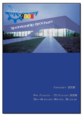
First of all, the brochure is *much* better than no brochure. It doesn't suck at all - and thanks for creating it! It does have some rough edges, though. Before I became a software developer and network administrator, I was a professional printer. Went through an apprenticeship and worked many years printing stuff. So here I wade in - hopefully with criticism a little bit more constructive. ;-) The front page doesn't suck but it definitely is unbalanced. The blue area carrying almost nothing is far too big. The building in the picture is draen perspectively (right word in English?) but "Sponsorship Brochure" is not. So it sticks out like a sore thumb. Someone suggested to put it under the picture. This would probably help and reduce the "vast emptiness of the blue are. If you go to File -> Properties -> Fonts in okular you will notice, the fonts actually are embedded in the file. (You can also learn from this dialog that the document was created using scribus.) On pages 3 - 5, the font seems odd. (It has been a long time since I worked as a printer. New fonts have popped up right and left. Most are crap. ;-) The old, classical fonts like Times New Roman, Universal and such are still *much* better than most of these new fonts.) I cannot identify the font used on these pages. Some gothic one. Either scribus's PDG engine or okular's (and probably kpdf's) rendering engine mess it up. Spacing is wrong. It also seems to be rendered with anti-aliasing, although I disabled AA for smaller fonts on my systems. What can I say? The creators of this document were at the mercy of the tools they used. One thing is for sure: They should have realised that the font they used was sub-optimal. Use a common one that is known to be rendered correctly by most rendering engines. You will notice, though, that the font used on pages 6 and 7 looks much better. There are other problems that let the heart of a printer skip a beat. ;-) The creators of the document chose to use line spacing between paragraphs. *Sigh* According to the rules of typesetting, paragraphs are separated by indentation. Yes, line spacing has crept in since typewriters became more common. It's wrong. Simply wrong from my point of view. Anyway, they chose line spacing. So be it! Look at page 5. The last paragraph in column 1 ended exactly at the end of the column. The program (scribus) should be smart enough to know that it had to skip line spacing at the top of column 2. It was not. So, again, the creators were at the mercy of their tool. Honestly, it looks *very* wrong. Go to the end of page 5. The two columns don't match. They must. It's a rule of typesetting written in stone. As it is, it looks quite ugly. But again, the tool did it, not the creators.They could have inserted additional blank lines. Yes. But that is not their task. The tool (scribus) should do it. I am not bashing scribus. Over time, it will probably get there. Let's look at the table on page 6. It isn't all that bad. one question occurs to me: All columns but the first one are centred horizontally. The first one is aligned to the left. Why? Looks weird. My conclusion: They creators of the document did well enough. Problem was, they knew very little about the rules of typesetting and layouts. They chose a tool like scribus that knows some of the rules but leaves most things to the human. My advice for the next brochure is to use something that knows all the rules. Something like LaTeX. Sure, you promotion guys don't want to learn LaTeX. Honestly, neither do I. ;-) So use something like LyX, a frontend to LaTeX. End of rant. Uwe
Re: akademy2008 logo sucks. - Alex - 2008-03-13
I seriously think you should get in contact with the Scribus developers and discuss the issues you brought up. They are very nice guys :-) Alex
Re: akademy2008 logo sucks. - Uwe Thiem - 2008-03-15
I am pretty sure they know much more about the remaining deficiencies of scribus than I do since I do use scribus. For everything other than plain text and spreadsheets, I use LyX. The results look like done by a professional typesetter. Scribus is a nice application for flyers and small brochures. As long as the user knows something about typesetting and layouts. No, the scribus developers don't need yet another person to tell them what desktop publishing is about. They know it. They just have to get their app there which will take time. Uwe
Re: akademy2008 logo sucks. - Chani - 2008-03-14
now *that* is constructive criticism. :)
Re: akademy2008 logo sucks. - Uwe Thiem - 2008-03-14
Jeez. So many typos in my posting above. I am embarrassed. But then, I was slightly drunk when I wrote it. ;-) Uwe
Re: akademy2008 logo sucks. - Riddle - 2008-03-14
That is constructive criticism. It carefully outlines the problems with the document (which are mostly problems with scribus) and gives a solution (use Lex or LaTex). Much better than the "It Sucks" comments that started all of this.
Re: akademy2008 logo sucks. - Aaron Seigo - 2008-03-14
nice summary, Uwe... i might just have to tap you in the future to look over documents we do =) and yes, it would be great if the scribus team were made aware of some of these issues if they aren't already. cheers...
Re: akademy2008 logo sucks. - anon - 2008-03-14
Well aaron I would have doubts you meet honest people, but just want to meet ass kissers who agree and say what you want. These two people are being honest and giving their honest view on what they believe. I congratulate people who do speak out, and who don't ass kiss and give the positive view that Aaron wants, but who give their honest view, be it positive or negative. And I say Aaron, if all you need to hear is positive, then KDE is in serious trouble. You have to take the positive to be able to grow, if all you want is negative, then you will stagnate. I say to those who have comments that aren't positive share them, because only through sharing the good, the bad, and the ugly can KDE grow. To Aaron, grow up and understand that, or stand down from your position before you wreck KDE.
Re: akademy2008 logo sucks. - Alex - 2008-03-14
Skipping the part about Aaron... Giving honest view is good, of course also if it's negative, maybe even more than, because they point out what can be improved. But really, the first two posts didn't do that in any way. In that sense they are at most worthless. Alex
Re: akademy2008 logo sucks. - Morty - 2008-03-14
You are obviously not getting what Aaron wrote. Read the comments by Uwe Thiem and m. then compare that to the two so called honest post. Then re-read Aaron's post. If you don't get it then, you most likely deliberatly trying not to.
Re: akademy2008 logo sucks. - Riddle - 2008-03-14
> These two people are being honest and giving their honest view on what they believe. Yes, these people are giving honest answers, but they are not saying how to improve. As a result, they are NOT being helpful.
Re: akademy2008 logo sucks. - Jos And - 2008-03-14
I find this to be pretty stupid comment. Uwe's answer is very constructive, but he was a professionel printer before doing software. Brochures like this are not written to satisfy professional printers. Are you saying that those of us that are not professional printers can not say something "sucks" ? According to Uwe Thiem those that wrote this brochure where not professionals and on the same level as us - so we can say "suck". Just ignore it if you dont like it
Re: akademy2008 logo sucks. - Morty - 2008-03-14
Well it's your comment that's stupid. You don't have to be a professional to write something constructive, nobody said so either. Take a look at the comment by m. below. Rather than just posting a useless it suck comment, you only need to spend a little time describing whats wrong and perhaps how to fix the issues. Suddenly you have an usefull comment. It's not even hard.
Re: akademy2008 logo sucks. - Aaron Seigo - 2008-03-14
perhaps the distinction between destructive stop energy and constructive input (negative or otherwise) has been lost on you. destructive stop energy has no real content: "it sucks" says nothing about what problems the person perceives, let alone suggest realistic avenues of improvement. the only good it does is remove the motivation of others. there are some good writings available (dead tree and electronic formats both) on "poisonous" or "toxic" personalities. often the individual doesn't intend to be poisonous, but it's a pattern they fall into. constructive input highlights challenges with positive, energetic communication. bonus points for suggesting solutions. receiving constructive input, even if it is "wow, this could be a lot better", usually leaves the recipient feeling motivated, inquisitive and open (assuming there aren't ego issues interfering). Uwe's comment is classic constructive criticism.
Re: akademy2008 logo sucks. - Uwe Thiem - 2008-03-15
Well, I had the advantage to know what I was talking about. ;-) On the topic of constructive and destructive criticism, you don't necessarily need to point out how to improve it. Maybe, you don't know yourself. But you definitely have to point out as precisely as possible *what* actually sucks. General comments without any meat in them don't help anyone. Of course, it you know how to improve whatever you are criticising then spell it out. But I would always defend the right to criticise without knowing a better way. It can be a starting point of the process that will eventually lead to the solution. The thing is to criticise in a way that helps which means to point out exactly what is wrong. So. Not too many spelling errors this time. ;-) And no, my spelling of "to criticise" doesn't qualify. :-) Uwe
Re: akademy2008 logo sucks. - oxblood - 2008-03-14
Well said.
Re: akademy2008 logo sucks. - Iuri Fiedoruk - 2008-03-13
I think the logo is nice as almost everthing in the pdf. But what is that building pixelized (bad redimensioned) with a text over it? ich! sucks big time ;) For the rest, looks good and professional, even cited brazilian use of KDE in the computer for all campain, congrats!
Re: akademy2008 logo sucks. - alex - 2008-03-13
Yes, the brochure is nice. Except one thing which could be improved easily, and that is (IMO) the text "Sponsorship brochure" on the title page. I guess it's intended to be aligned with the roof, but this just looks out-of-place as it is. I would suggest to put "Sponsorship brochure" directly below the picture using some nice somewhat dynamic font. Alex
Re: akademy2008 logo sucks. - m. - 2008-03-13
Whatever happened to constructive criticism, eh? Yes, this brochure isn't the pinnacle of corporation PR but I saw much, much worse examples. What is bad with this brochure: - "sponsorship brochure" should be better aligned for "faux banner" effect, not only rotated a bit but also transformed like trapezoid to give impression of perspective - compare it with wall of building - lack of margins on pages - texts like space. Give me room! At least 10% on left and right and 15% top/bottom. And this is minimum. To fill room on extra pages add some photos of happy developers, maybe personal intro with photo by organizator or KDE eV head - scrap bolding in first chapters or use it with consequence - better get rid of it - shadows in subtitles look strange. May be KPDF fault. - paragraph separation; margin, use it everywhere and with consequence, eg. on page 7 first section doesn't use margins, third - there is *big* margin - Attendees (*cough* proofreading? *cough*) by _country_ and you are listing continents... Attendees by region, it is. - "sponsorship packages" table - first column - margins again - strange borders on first and last page: first black borders with white on top, last white edges except of top - don't know where is Sint-Katelijne-Waver, comparing eg to Brussels? Logo I like :) Note: I probably couldn't create something like this brochure from scratch but I know what I like when I see it (and when don't like ;)
Re: akademy2008 logo sucks. - Aaron Seigo - 2008-03-14
(another nice constructive set of input .. thanks =)
Re: akademy2008 logo sucks. - winter - 2008-03-14
Actually, I think it's great! Obviously your statement is false simply bacause you are stating opinion as fact. Andre, IMHO you are a FHB.
Attendies Akademy 2007 -> Attendees - Speling eror - 2008-03-13
Attendies Akademy 2007 -> Attendees
Looks nice! - Ascay - 2008-03-13
The brochure looks quite nice, I can't really unterstand the complaints. Keep in mind that the margins are for printing. Page 3-5 have a minor font issue. On my system it is nearly noticeable but I've seen some pretty fucked up Linux installations with heavy font problems. Maybe it looks much worser on such systems. E.g. on the screenshot in the news "Sponsorship Brochure" looks absolutely terrible - on my system it looks perfect. What a difference. Besides the content per se is well done. Short paragraphs but enough information. Nice to read even on a display.
ugh... - mike - 2008-03-14
WAKE UP PEOPLE! a negative comment is posted on the dot, and all of a sudden there is a flurry of people debating moderation schemes. That's right, let's ignore the people we'd care not to listen to, to further delude ourselves. oh wait, i have an idea!!!! the negative posters must be some gnomies, or couldnt possibly be contributors. WRONG again. It says on the brochure that it was created in conjunction with two individuals, the akademy team, the community, and the ev. Do we not see a problem here?!?!?!?!?!? WAKE UP! this crap survived a review?!?!? BY WHO?! SERIOUSLY!?! QUALITY CONTROL PEOPLE!!! do you see why people could have strong opinions about this?! they're supporters (not gnomies or windows users you idiots!) You want sponsors with LOTS of money to align themselves with a fantastic DE, and THIS!!! is what you send them!?!??! COME ON, WAKE UP! it looks like it was slapped together in an afternoon. What's with the messed up fonts? compressed to shit rasters? what's with the margins? The pages look like they're shoved in the corners, i could go on and on. (but no aaron. I don't have a lot of extra free time and energy) do you really mean to suggest that AFTER it's officially released I should suggest 50+ things to clean up this rubbish publication so there would be TWO official brochures?! how does that look? There are many problems with the brochure and the process that released it. If instead this was released as a sample to improve with community input, great, but instead a piece of junk is presented as *the* brochure. so i rest, it is horrible, it does suck. consistency was no where to be found. and before the devs fire up their keyboards to shout at me. they should think about the process with which their code is scrutinized and corrected and reworked before it's officially released. Why would something so essential as a sponsorship brochure not be subject to this process?!
Re: ugh... - Alex - 2008-03-14
> Why would something so essential as a sponsorship brochure not be subject to > this process?! Because it was created in a different process by the Akademy team, I don't know the exact number of people, but I'd guess that they are around 4, and I guess they wanted to get it done. Having more people in the team would of course be nice :-) Seriously, I think the majority of KDE contributors are still coders, and in general most of them don't have much spare time left. Alex
Re: ugh... - mike - 2008-03-14
>Because it was created in a different process by the Akademy team the process is clearly flawed. it contains too many errors to be excusable. > I guess they wanted to get it done. everyone wants to get stuff done. but something like this shouldnt be released unfinished unless it is only for feedback. Community input and HELP was ignored. > I think the majority of KDE contributors are still coders An engineering firm (infrastructure related, not computer) I worked for kept a database of the skill sets of the individual employees. It was very comprehensive. If a problem needed to be solved we fired up the database, and was given a list company wide of who possessed the skills. The KDE project being the size it is should definitely have something like this.
Re: ugh... - Boudewijn Rempt - 2008-03-14
"everyone wants to get stuff done. but something like this shouldnt be released unfinished unless it is only for feedback. Community input and HELP was ignored." You're shouting again, Mike. And you should realize that the people who put together this brochure _are_ part of the community. What have you done to become part of the community?
Re: ugh... - mike - 2008-03-14
> What have you done to become part of the community? I do not write code. hope you find my contributions worthy: I happen to volunteer time refurbishing computers to redistribute to low income families. While most have ubuntu installed quite a few try kubuntu. The three volunteers in our shop all use KDE and promote it. I also have submitted many KDE bug reports, art work and do a lot of KDE translation work for two languages. notice i post anonymously. so no, I'm not going to specifically point out everything I've done over the 3 years ive been a kde user. You can believe me or not. > _are_ part of the community yes. I can tell arguing with you would be exhausting.
Re: ugh... - Boudewijn Rempt - 2008-03-14
"and before the devs fire up their keyboards to shout at me." Well, Mike, you're the one doing the shouting.
Re: ugh... - Aaron Seigo - 2008-03-15
> but no aaron dude, chill. the obvious answer is: * don't be an ass to others. (the first two comments are absolutely in the "ass to others" category and it has nothing to do with their not liking the brochure) * input could become the next revision of the document, not a fork as you suggest * you don't need to provide 50 ways, just a couple of thoughtful ideas would be awesome "rubbish publication" .. wow. that's... harsh. would you actually say that to their face? or is this more internet-enabled-rashness? but let's get to the quick of it: "do you see why people could have strong opinions" it has *nothing* to do with strong opinions and *everything* to do with being a complete asshat in the process of communicating those strong opinions. example: one of your volunteers putting together computers connects the IDE cables inside a box wrong. you turn it on to test and it completely fails. do you: a) scream at them as loudly as possible and tell them they are a complete f'ing moron b) look at them with disgust in your face and walk away with a "humph" and a sigh c) open the box, see the cable and say, "you put the cable on wrong, you need to do it this way..." i'll bet that unless you're a real turd of a human, you'd do (c). and yet people jump online, our primary means of communicating for most of the day within the various f/oss projects, and choose (a) or (b). amazing. you can express strong disagreement in a very progressive fashion. you don't have to agree, but you also don't have to be an ass about it. the former can help improve things, the latter only tears communities apart. just how long would your little shop of volunteers continue if you repeatedly chose options (a) or (b) in real life?
What really sucks - Uwe Thiem - 2008-03-15
"This sucks" sucks. Uwe
nothing sucks - litb - 2008-03-16
the logo looks awesome. i especially like the colors of 2008, and how it plays nicely with the background of the sky. continue this good artwork! saying "it sucks" does not tell us anything to improve it. please stop that!