Ataksak - Beta 3 of Amarok 2.0 released!
Wednesday, 5 November 2008 | Lpintscher
The Amarok team announces the third beta release of Amarok 2.0, codename Ataksak. It includes a database importer for users of Amarok 1.4, who want to keep their statistics and ratings, as well as a lot of bugfixes and improvements. The playlist, statusbar and Last.fm integration got a major overhaul and are a lot more stable and polished now. First scripts are showing up and make Amarok 2 really rock. For more information please read the release announcement. Packages are available for Debian, Kubuntu and Windaes.
Comments:
UI idea - Jakob Petsovits - 2008-11-04
Hmm... assuming the empty space above the time slider always stays as empty as on the screenshot, you could save space by removing the menu bar and putting the menu entries directly above the time slider (and right of the play controls). Slightly non-standard, but perhaps worth a thought. (Or maybe that idea is totally on crack, and seriously messes up usability. Dunno, whatever.)
Re: UI idea - joethefox - 2008-11-04
hmm ... and if we put in the empty area the informations about the current track freeing space below for the widget album? as well as we could have a "compact view" of the new amazing amarok with the capabilities to show/hide the "navigation panel" that contains the widgets :O however I believe that amarok is really a beautiful piece of code, Thank you!
Re: UI idea - Ian - 2008-11-04
That looks a lot better. just one little idea from me. Right-align the volume and time sliders as at the moment they look untidy because they do not end along the same line. regards Ian
Re: UI idea - Miha - 2008-11-04
Play, stop, foward buttons just seem kind a broken, because they are put one over other one!
Re: UI idea - joethefox - 2008-11-05
I love the play, stop, foward buttons put one over other one... it's artistic!
Re: UI idea - joethefox - 2008-11-05
I love the play, stop, foward buttons put one over other one... it's artistic!
Re: UI idea - Dan Leinir Turthra Jensen - 2008-11-05
This isn't entirely unlike some ideas i've been throwing around (though not lately, as it's been too busy for that sort of thing in the last few months ;) ). One thing you have to remember for that space is that when using services, the space is filled from the left with tiny controls (last.fm for example has love, ban and skip there) - so that will have to be taken into account, It will also need to be taken into account that the UI needs to work on small screens. In this case it means the large screen netbooks with 1024 pixels wide screens, not the old eeePC size of 800 wide - the reason for the small ones not being a real target is that well... there's plans :) Other than that - i short: i like the idea in principle :) It needs a bit of work, but that doesn't mean it's a bad idea, definitely :)
Re: UI idea - joethefox - 2008-11-05
Read the answer makes me think "damn I love the open source people!"... yes it need a bit of work for all the right considerations you made, I simply made a "cut & paste" with gimp to give a picture to my idea!
Re: UI idea - xbullethammer - 2008-11-05
What about a spectrum analyzer? IMHO the only thing that Amarok lacks is a cool vis.
Re: UI idea - Mark Kretschmann - 2008-11-05
It's currently not possible because Phonon does not allow access to the PCM audio stream at this point. As soon as Phonon supports it, we will implement analyzers, visualizations, etc.
Re: UI idea - Anon - 2008-11-05
"As soon as Phonon supports it" Does this mean this Phonon feature is definitely planned? :)
Re: UI idea - Mark Kretschmann - 2008-11-05
Absolutely, yes. It's already in the experimental API.
Re: UI idea - Anon - 2008-11-05
Cool; thanks for the info :_
Re: UI idea - Mikko - 2008-11-05
I would like to see Ctrl+M possibility to hide menubar. The menu is not so good for usability and for smaller screens. We dont need a "hide menu" action for menu itself, but possibility to use Ctrl+M combination to hide that menu. Other thing what I would like to see is to get ridd of that "spaces" (middle section), so I would have similar UI as on 1.4.x. Database on left and playlist on right. There is bretty much space what is not used wisely, but all kind stuff is pushed to the UI so it looks like spaceship control panel. What I really love is the left side tabs, how they look ;)
OMG, did you just released a killer app for ms win - mimoune djouallah - 2008-11-04
i just installed beta 3 on ms windows ( don't be afread by the 60 MB, it deserve it) it just work ;) go go download it. did i told you the lyrics applet is neat ( hehe at last i could understand Evanescence song ;) and this osd thing is so damn slick. thanks guys and ladies for making this app, ps : lydia, lydia it is windows ;)
Re: OMG, did you just released a killer app for ms win - Bobby - 2008-11-05
Windows users are also legal citizens, I guess they also deserve something good despite the crap OS.
Re: OMG, did you just released a killer app for ms win - Sahreo - 2008-11-05
i cant use it because it does not see that i am using a http proxy
Re: OMG, did you just released a killer app for ms win - mayhem - 2008-11-05
Yeah, poor Windows users. ISVs and IHVs have left them in the cold.
Re: OMG, did you just released a killer app for ms win - Imre herceg - 2008-11-05
Well, if you think Amarok is a killer app for Windows, you have never used Foobar2000. Certainly, Amarok does certain things right and has a lot of features, but it lacks certain features which are indispensable for being a killer app. Amarok even now is not capable of gapless playback. Then can Amarok convert e.g. Flac files into Nero AAC maintaining all the tags? (Not FAAC, please). Does it allow *easy* browsing by folders in addition to the database view? Well, until Amarok can do these all, it is completely pointless to talk about it as a "killer app".
Re: OMG, did you just released a killer app for ms win - Mark Kretschmann - 2008-11-05
In case you have not noticed, Amarok and Foobar2000 have completely different design goals and target audiences.
Re: OMG, did you just released a killer app for ms win - Imre herceg - 2008-11-06
Yes, I have noticed. My criticism was not directed against Amarok, it was against the claim many people make, in my opinion wrongly, that Amarok is a killer app. Just because Amarok happens to be the only decent-looking KDE audio player, many fans think Amarok is the best there is for all OS's. Do they really think Windows Media Player and iTunes users will abandon them for Amarok? OMG.
Re: OMG, did you just released a killer app for ms win - Anon - 2008-11-06
Please define the term "killer app" first. Is Foobar2000 one? Why? Is Windows Media Player one? Why? Is iTunes one? Why? Is Amarok 1.4 one? Why? Is Amarok 2 one? Why?
Re: OMG, did you just released a killer app for ms win - astromme - 2008-11-06
I would also like to point out that amarok *does* support gapless playback for media formats that support it. Off the top of my head, that means ogg/flac/m4a and mp3s encoded with lame. Also, Foobar2000 has a very different set of goals than Amarok. It kind of falls flat on its face when it comes to the whole "rediscovering" your music part of the equation. Yes, it has its place, but so does Amarok.
Re: OMG, did you just released a killer app for ms win - Imre herceg - 2008-11-06
Well, each time I tried, Amarok was only able to produce an *almost-gapless* playback. Almost gapless is, however, sadly not gapless. I do not understand the "rediscovering" your music part. This is surely just marketing blah-blah. Yes Foobar is flat on its face, but if Amarok is only better because of its looks, it is not a killer app.
Re: OMG, did you just released a killer app for ms win - xbullethammer - 2008-11-06
Apart from the reasons given in the above posts... Foobar2000 is an arrogant closed source app wich disencourages people to help on it. I'm about to leave it just because their development model. It's ridiculous to have an app breaking its API in minor releases and therefore breaking your config every update... well windows users are accustomed to this ;) Amarok rulz!
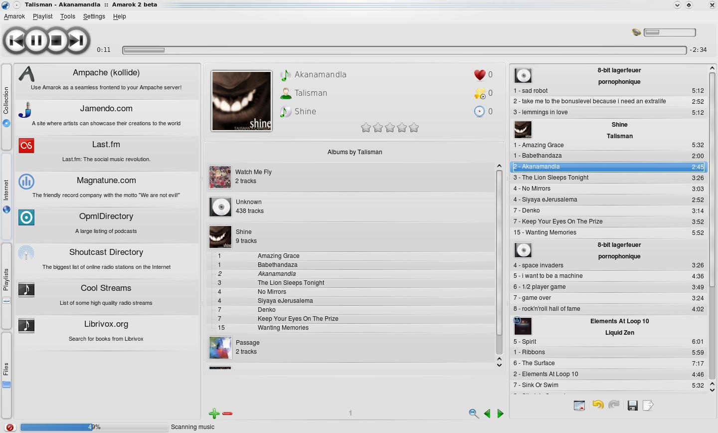
Screenshot - T. J. Brumfield - 2008-11-04
I don't mind the playlist redesign, but I look at that screenshot and I see a bunch of information on a grey window that doesn't look like it is very clearly divided. It isn't immediately clear as an Amarok 1.x screenshot. I think it is very impressive that Amarok has support for plugins like Last.fm, but do we need to dedicate so much screen space to those buttons on the left? What I liked about Amarok is that it was dedicated to "rediscovering my music" with a large, feature-rich content view. Maybe I'm reading too much into one screenshot, but I don't see a focus on content.
Re: Screenshot - Andre - 2008-11-04
I guess it is so big, because the Internet "tab" is selected on the left. It is a pitty that the tab is not visually connected to the pane, because otherwise this would have been immediately evident. I don't really like all those non-standard UI elements, such as the vertical text on the left, and the play/pause buttons cramped into one another... Still, kudo's for this very nice player!
Re: Screenshot - Sebastian - 2008-11-05
This is exactly my though when seeing the screenshots of the upcoming release: "What a mess!" Too many information visible, too many controls visible, too little contrast and focus on information. Why can't Amarok simply concentrate on its main task, "playing music from a given collection/playlist" and hide all the others while not required? In that regard I disagree a little with you, T.J., amarok1.4 was cleaner, yes, - but already crowded.
Re: Screenshot - Andre - 2008-11-05
And where is the simple playlist gone? It was quite usable and convenient, much better than what is proposed now. The argument always was that Amarok2 could be made look like you want but I heard once the same about GIMP 2...
Re: Screenshot - Sebastian - 2008-11-05
I don't know where it is gone. As soon as phonon stabilizes I will switch back to JuK probably (currently too unstable on my special machine). It has a simple playlist, simple collection and a clean UI. A beauty... The drawbacks are lack of features and addons like tagging could be integrated more intuitively. But still: Probably something for you as well?
Re: Screenshot - Dan Leinir Turthra Jensen - 2008-11-06
You are entirely correct - Amarok2 will be able to :) Amarok 2.0 won't quite be able to ;) Note the difference there? ;)
Re: Screenshot - Hobbes - 2008-11-05
Nowadays, computer screens are really large (compare to their height). I think Amarok takes that into account in its new design.
Re: Screenshot - T. J. Brumfield - 2008-11-05
My problem isn't necessarily the amount of information displayed, but rather the focus and how it is displayed. I still intend to download it and check it out.
Wakeups - Yves - 2008-11-04
Actually this beta rocks, and I was somehow surprised the whole amarok + sound stack creates "only" about 110-120 wakeups while playing back. Will it be possible to reduce this number even more ? 32.2% ( 87.3) amarok : schedule_timeout (process_timeout) 16.0% ( 43.3) <interrupt> : uhci_hcd:usb4, i915@pci:0000:00:02.0 13.5% ( 36.7) <kernel IPI> : Rescheduling interrupts 7.4% ( 20.0) <interrupt> : HDA Intel 6.6% ( 18.0) <interrupt> : iwl3945 6.5% ( 17.7) knetworkmanager : schedule_timeout (process_timeout) 3.9% ( 10.7) <interrupt> : extra timer interrupt 2.8% ( 7.7) <kernel IPI> : function call interrupts 2.5% ( 6.7) firefox : futex_wait (hrtimer_wakeup) 1.5% ( 4.0) <kernel module> : usb_hcd_poll_rh_status (rh_timer_func) 1.1% ( 3.0) plasma : schedule_timeout (process_timeout) 0.7% ( 2.0) kmail : schedule_timeout (process_timeout) 0.6% ( 1.7) kwin : schedule_timeout (process_timeout) 0.5% ( 1.3) konsole : schedule_timeout (process_timeout) 0.5% ( 1.3) kmix : schedule_timeout (process_timeout) 0.4% ( 1.0) <interrupt> : ata_piix 0.4% ( 1.0) Xorg : schedule_timeout (process_timeout)
Re: Wakeups - Michael - 2008-11-05
Unfortunately it triggers more or less the same amount of wake ups also when stopped, just sitting there doing nothing. I wonder what for (there is not even an analyzer with idle animation)? ... 80-90 wakups per second in my case, with beta 2...
Collection import ? - Tom Chiverton - 2008-11-04
So, will it import my v1.4 collection and scores etc. yet ?
Re: Collection import ? - Seb Ruiz - 2008-11-04
Yes
Re: Collection import ? - NabLa - 2008-11-05
Having trouble in Kubuntu importing from Amarok 1.4 (MySQL): Error: Could not open Amarok 1.4 database: Driver not loaded Driver not loaded Failed: Unable to import statistics
Re: Collection import ? - ETN - 2008-11-05
Same thing for me...
Re: Collection import ? - Daniel - 2008-11-05
Installing libqt4-sql-sqlite fixed this for me (I had to restart Amarok). However, it then crashes on me after just a few tracks being imported. Crash report: https://launchpad.net/bugs/294240
Re: Collection import ? - NabLa - 2008-11-05
But my 1.4 database is MySQL, not SQLLite - I will check when I'm back home whether there's a similar package for mysql or not
Re: Collection import ? - NabLa - 2008-11-05
OK, I installed libqt4-sql-mysql and I get the error no more, but all I get after entering the database connection settings is: Success: Imported 0 tracks (I've got around 10K tracks) And this on the console: amarok: BEGIN: void DatabaseImporterDialog::pageChanged(KPageWidgetItem*, KPageWidgetItem*) amarok: END__: void DatabaseImporterDialog::pageChanged(KPageWidgetItem*, KPageWidgetItem*) - Took 0.0041s amarok: BEGIN: void DatabaseImporterDialog::pageChanged(KPageWidgetItem*, KPageWidgetItem*) amarok: END__: void DatabaseImporterDialog::pageChanged(KPageWidgetItem*, KPageWidgetItem*) - Took 0.0011s I'll have a look in the bug database later
Missing features ? - JC - 2008-11-04
I will try beta3, but with beta 2 I do not have : * equalizers * Visual effects * CD player (only remote site and mp3 works) * my ipod working Other than that, the gui is really nice and simple (a lot better in true life than this screenshot :)) Many thanks and continue this great job.
Re: Missing features ? - Seb Ruiz - 2008-11-04
Hi JC, Please read this blog entry: http://amarok.kde.org/blog/archives/809-Missing-features-in-Amarok-2.html
Re: Missing features ? - JC - 2008-11-05
Many thanks, I was looking for a such list :)
my biggest hope for amarok2 - mtz - 2008-11-04
the ability to just double click an audio file on a file manager and have it automatically play in amarok ..in amarok 1.*, the audio file is just added to the playlist forcing me to go back to amarok and manually go to the added track ..this behavior is very annoying and its forcing me to have xmms around just so that i can simply play any song from konqueror by simply double clicking it .. ist amazing that amarok survived this long without people asking for this feature that exists in almost all audio players .. there has to be a way to have people click an audio file on their file managers and have amarok automatically play it why not have an option to have amarok to 1 add the song in the playlist(current behavior) 2 add the song in the playlist and then start playing it 3 clear the playlist and only have the added song and start playing it i would settle for option 2
Re: my biggest hope for amarok2 - Morty - 2008-11-04
You are getting the feature right, but you are confused about the tool to use. The click and play feature should NOT involve a music collection application like Amarok at all, it's simply the wrong tool for the job. The click and play functionality should be provided by a simple application, and those have been available for a long time. Blame your distribution if it's not set up correctly. On KDE 3 system the functionality should be provided by Kaboodle and if I'm not mistaken Dragon Player should serve the same need on KDE 4.
Re: my biggest hope for amarok2 - Morty - 2008-11-05
To clarify further, clicking on a file in the filemanager should not change your playlist in any way. Adding to playlists should be done by right clicking and drag and drop.
Re: my biggest hope for amarok2 - mtz - 2008-11-05
i know about availability of "simple" applications ..i use xmms for "simple" audio playback ..since i have amarok running all the time on my tray area..i do not see the point in having two audio players running if i want to play a single file from double clicking it on konqueror .. as an music collection application, i can understand how someone could be annoyed from double clicking a song in konqueror and amarok just deletes his playlist, load the clicked file to the playlist and play it ..but at the same time, the current behavior of just adding it to the playlist and force a user to go back to the playing to play the newly added song is a bit too cumbersome from how i see, there are three alternatives amarok can handle files imported from double clicking on the file manager .. it can 1. add to the playlist and do nothing(basically continuing what it was doing) 2. add to the playlist and jump to the added file and start playing it 3. clear the playlist, add the new song and do nothing 4. clear the playlist, add the new song and start playing it amarok 1.4.9 gives you an option btw 1 and 2 when you drop a file on the player window but only option 1 when adding a file from clicking it on the file manager .. i can clearly see how option 3 and 4 will break the collection centric aspect of amarok .. to me, option 1 is just as valid as option 2 and both can be implemented without breaking anything and this is basically what i was asking for .. can you elaborate how option 2 will break how amarok is intended to be used and how option 1 works best?(since this is the default behavior)
Re: my biggest hope for amarok2 - Morty - 2008-11-05
Your idea of a simple application xmms are not it, as it contains palylist and whatnot, and not what I am reffereing to here. You get hung up on the applications, that's the wrong approache. You have to consider from the point of user cases. Forget what Amarok or whatever can and can not. It boils down to 2 separate functions. 1. Add it to your playlist/collection. This should be done from right clik, drag and drop or from inside the Player applications. Here you will have one prefference, if you prefer the file to go to the end of the playlist or the top. Your 1 and 2, but it should not do this from (double)clik. As this will fill up your playlist with random crap. 3 and 4 should never be done from anywhere but explicit inside your music collection application. 2. You want to listen to a soundfile right now. Since it may not even be music or some OMG Ponies song from a littel sister, you don't want it in your playlist. You simply want something to play it. As an example, a (double)clik should open a small application like Kaboodle, play the song and then quit(or not). It's the musical eqvivalent of opening a random jpg file, you don't want to open Digikam an add it to your foto collection database either.
Re: my biggest hope for amarok2 - winter - 2008-11-06
(insert favorite insult here) and you can't spell. It's reasonable request. KDE should provide for that kind of option - being all mighty customizable. You should hang out on Gnome's website if you want to tell users how to use software. Many applications let you choose what you want to do when a filename is passed to it either by double-clicking or otherwise. "Add to end of playlist", "Add to playlist as next song", "play now" are popular options. I would like to see that too.
Re: my biggest hope for amarok2 - Michael - 2008-11-05
I disagree. You are not necessarily forced to use a different player by definition. The problem with amarok is, that you are forced to use a (temporary) playlist. It doesn't allow you to play anything which is not in the playlist. For me this is not only a problem with random files outside the colletion. But also with stuff I have in the collection. Often I want to play just this album or that song, and I'm always forced to add it to the playlist, even though it's pointless in this case and there is no gain. On the contrary, it's cluttering my playlist where I might have put something in on purpose and I have to remove it afterwards. ... Leave alone things like radio streams, where adding to the playlist make absolutly no sense... Amarok should be centered about the music sources (playlists being just one of them), not about a (temporary) playlist. Then it would also naturally allow playing random things outside the collection. Well, just a thought on a general design issue, I have with amarok (which is otherwise an awesome piece of software, of course ;)
Re: my biggest hope for amarok2 - Morty - 2008-11-05
"But also with stuff I have in the collection. Often I want to play just this album or that song" That's a internal Amarok thing, and could be solved with a play once option when you add to current playlist.
Re: my biggest hope for amarok2 - Michael - 2008-11-06
Unless I missunderstood you: You'd probably have to add yet another context menu option or some specialized play button. And why does it have to be added to the playlist at all? There no benefit. If I say I want to play just *this* album, it probably has no relation to the current playlist, there might be something completely different in it (while when I assemble a temporary playlist, things in it have a relation to the playlist). Really, this sounds more like a workaround, not like a solution. This also doesn't solve the problem with radio streams, where there is even less a point to add them to the playlist. Or with saved playlists, which you have to load and thus loose the temporary one. (Heck, some time ago I even had to add files to the playlist in order to copy them onto my iPod! Which also has been worked around by adding a context menu entry, but IMO not actually solved.) Wouldn't it be way more foolproof and straight forward to let the user simply select the album, radio stream, saved playlist or whatever and press play? (Instead of additionally adding it to the playlist and selecting it in the playlist, which are are actions which actually have nothing to do with the goal you want to achive - just play it) The user should not be forced to use the playlist, even if it's actually unncessary.
Re: my biggest hope for amarok2 - Morty - 2008-11-06
Thats right, a context menu in the collection manger of Amarok. A play *this* option are what you would get, but handled trough the playlist. Since Amarok are very playlist centered, it's a simple way to achieve what you want. Whatever your playlist contain will not get affected as it's only temporary, it should automatic get removed after it's played. And you get the added benefit that the current playlist will continue as normal afterwards. It would also solve the radio stream issue, also caused by Amarok being strongly focused on playlist. Since adding a radio stream as a temporary track as described, this would ensure it's removal from the playlist when pressing next or stop.
The UI.... - Janne - 2008-11-05
I really want to like Amarok, but I just can't get over the UI. The attached screenshot looks incredibly complicated, confusing and busy. The are vertical buttons on the side, three columns, with some columns split in to several sections... I'm just utterly confused. iTunes might not be perfect, but at least they got the UI right. It's clean, simple and easy to use. Amarok just seems to be getting more and more complicated and overblown. I haven't really tried Banshee, but it too looks clean and uncluttered. Are there any simple and clean music-jukeboxes available for KDE? Juk?
Re: The UI.... - jorge - 2008-11-05
I agree totally
Re: The UI.... - Michael - 2008-11-05
I fully agree with you! After using amarok2 almost daily for about two months now, for instance I must say that I'm still not really convinced of this multipane plasma stuff in the center column... For many things, I wonder: why should I configure this and manually switch? Can't amarok just display it when needed e.g. current track, service info, video? Also switching is CPU intensive and sloooow. Further these vertical columns don't seem to be the ideal solution to me. Looking at the amarok window in front of me, none of the three columns (collection, current track, playlist) is able to display moderately long titles without "..." (or scrollbar)! Only when I use full screen width. Currently the window is a bit more than 1100 pixels wide, which is actually not too narrow... Hopefully they'll do some more polishing before final, so that it doen't look so busy anymore. Also keep in mind that this is the first release of amarok2. (And it's way more usable already than KDE 4.0 final was ;) Though the fundamental UI issues will remain, I guess. Still it has a lot of cool ideas in it and for KDE it's by far the best music player, IMO.
Re: The UI.... - Antonio - 2008-11-05
I agree too... Maybe it is more important for Amarok 2.0 completing the features more than improving the UI. despite that, while I'm sure I will get used to the interface, it seems Amarok 2.0 is not granma-proof at all. Exposing all the Amarok powerful features in a simple and pleasing way could be a challenging technical task for next versions. I suggest to copy as much as you can from iTunes, Rhytmbox, banshee, etc. ;) Amarok 2.1: "Rediscover your music player" ^^''
I couldn't agree more - Dexter - 2008-11-05
I find the new interface too complicated and overbloated... Plasma is like a cancer that permeates into everything!
Re: I couldn't agree more - Janne - 2008-11-05
Plasma is not the problem. It can be used to create beautiful and functional UI's, and it can be used to create confusing UI's. It's all due the developer and the goals of the app in question. Personally, I think that Plasma is just about the best thing to hit KDE in a while
Re: I couldn't agree more - Michael - 2008-11-05
Well, the question is, if it is the wisest idea to use it in a music player ...
Re: I couldn't agree more - T. J. Brumfield - 2008-11-05
Well, it allows people to easily write a plasmoid to include as opposed to using the old scripting interface. That may be an improvement. I think the issue is design oriented, as why the system is laid out the way it is. However, I think the advantage of Plasma is that someone can easily rewrite a new plasmoid for the center interface.
Re: I couldn't agree more - Janne - 2008-11-06
Why wouldn't it be? Do you think that Amarok has a busy UI because they use Plasma? No, the UI is the way it is because that's what the developers wanted, not because of the underlying technology they used.
Re: I couldn't agree more - Michael - 2008-11-06
No, not busy because of plasma. But perhaps unnecessarily complicated and a resource problem. I have to care about things I don't want to care about i.e. assembling all the pieces I want on the canvas. If I don't add it, I won't see certain things. And then I have to manually switch to the appropriate pane. Now where had I placed the wiki view? It might give the user more freedom, than is good. Zooming is a pain, it's slow. ... And I think it makes for a certain inflexibility in the window layout. Yes :) In the sense, that amarok has to provide a generic space, the centre column, for the applets to live on. They will never perfectly fit. Instead of carefully crafting the window layout, as appropriate in certain situations. Of course, probably one thing or the other can and will be fixed and optimized in the future. So maybe it will eventually be a joy to use. Just until now I'm not convinced that it's more than technically possible. And yes, I'm actually using amarok2 ;)
Re: I couldn't agree more - TheBlackCat - 2008-11-06
The Amarok 2 UI isn't any more complicated than the Amarok 1.4 UI. The main difference is that the context tab has been moved to its own area. Yes, a blank context area would be confusing, but this could easily be fixed with a good set of default applets. The advantage is the difference between "default" and "hard-coded". With Amarok 1.4 you had a hard-coded set of 3 different context view panes. They were a good layout, but they could not be changed. In Amarok 2 you can largely reproduce these same three panes if you want, and I imagine the default set of applets on each page would be similar, but you can rework it however you want. For instance I would prefer to have song info and lyrics grouped in one view, something that was impossible in Amarok 1.4 and was extremely annoyed with having to switch between two context view to see both, but it is easy to group them into a single view Amarok 2. The problem with not knowing what is where is a legitimate concern but could be easily fixed by allowing people to rename the 4 pages, have the list of names at the bottom of context view where people can click them (with the current one highlighted), and once again having some sensible defaults. Besides the context view, the UI has largely the same content and icons, they are simply in different places. Instead of "Magnatune" you have "Internet", and the "Dynamic Playlist" settings have been moved into the dynamic playlist area instead of being in a configuration windows, but largely the same things are there. However, buttons have been moved closer to the things they modify, configuration windows have been integrated into the UI, unnecessary buttons have been removed, unrelated actions have been moved so they stand out as being separate, all in all I think the UI has been made significantly simpler and more intuitive. It is different than the 1.4 UI, but I have a hard time seeing how it is more complicated assuming the program is shipped with some sensible default applets in the context view
Re: I couldn't agree more - Mark Kretschmann - 2008-11-07
Thanks, man! Finally, a sane posting in this thread.
Re: I couldn't agree more - TheBlackCat - 2008-11-07
I appreciate the work that has been done, most of the things I found annoying about 1.x have been fixed or will be by 2.1, and the things I liked that aren't there now should be back by 2.1. Plus there are plenty of cool features that never even occurred to me. Is there a plan to allow renaming of the four context view pages at some point? Maybe not 2.0, but 2.1 maybe?
Re: The UI.... - a thing - 2008-11-07
If that is what you want, then just use JuK.
amarok2 packages for Fedora - Rex Dieter - 2008-11-05
amarok2 is/will-be included in the upcoming Fedora 10 release, and unofficial builds are available for Fedora 9 from http://kde-redhat.sourceforge.net/ unstable repositories.
Re: amarok2 packages for Fedora - Diego Bello - 2008-11-05
Amarok2 is already part of Mandriva 2009 with KDE4 running quite well :D
It must be perfect. - winter - 2008-11-06
I've been reading about Amarok 2 for years... can I say years? It seems like it's been that long. KDE4 seemed to make it to the users faster - that might actually have been a bad thing considering it's state. :p
Crashes consistently with Debian - Marc Driftmeyer - 2008-11-06
Example output: Take Cover/01 - Welcome to the Machine (Pink Floyd).mp3';" ASSERT failure in QList<T>::operator[]: "index out of range", file /usr/include/qt4/QtCore/qlist.h, line 395 Unable to start Dr. Konqi Instead of failing gracefully with an alter panel it crashes fast, hard and consistently. System: Debian KDE 4.1.3.
Ugh... - Stefan - 2008-11-08
Guys, you keep changing the layout for no obvious reason. Overlapping toolbuttons? Why? They don't look funky, they're not easier to understand or click. Mega-gradiented bevel item separators? they hurt my eyes... Widget styles keep coming and coming, so far we had a bombastic gloss one, a nice flat frameless one, a bunch of designs with curves randomly sprinkled in, red/blue/black/grey plasma themes for the context view, etc, etc. This one is probably the worst of the lot, with everything drowned in ash grey and faux 3d, misalignments everywhere, pixeley albino sliders and blurry side tabs. Really, guys, i hate to be negative! i quite liked some of the earlier variants -- alpha version imperfections aside. I left a bunch of feedback but seeing this screenie i feel like I'm just not listened to. Remember mxcl's mockup of *2006*? http://www.methylblue.com/images/amarok_2_mockup.png wtf was wrong with it? At this point it would be great if you just made the thing use the system widgetstyle, with generic-looking svgs for the playlist, and did a stable release. You can add fancier svgs later, if you must. Devs, i'd appreciate a response. Do you plan on settling down? What form must my feedback take to help you get done with the big 2.0? Do you only listen to svgs and patches? =) Bye, happy 1.4 user