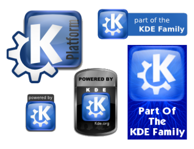
In March, we announced a set of labels for use by people creating KDE software, to demonstrate their association with KDE. We chose three options: Powered by KDE, Built on the KDE Platform and Part of the KDE Family and asked for artwork for badges and banners to illustrate these terms.

Some of the current designs
Last call for designs
It is now time to finalize the designs. We will allow additional submissions on the wiki up to the end of May and then we will vote on the designs. So if you haven't yet submitted your idea or would like to tweak your existing submission, now is the time.
We are requesting design variations that cover both a vertical or square badge-like arrangement (like most of those currently submitted) and a horizontal web banner style design. So if you only submitted one so far please add another one so we can see how well your idea could translate to a different format.
Picking the best
At the start of June, we will determine by a vote the strongest design to be developed into the finished labels. The judging panel will include members of the KDE promotion team and (similar to the Plasma Jam Session) will include an additional member: you. There will be a poll on the KDE Community Forum, the opening of which will be announced on the Dot, so that everyone who is KDE can have their say.
Keep watching the Dot for news on the poll and results.
Comments:
OpenStickers.com - xeros - 2010-05-12
Would you submit these logos to OpenStickers.com?
Maybe - Stuart Jarvis - 2010-05-12
Maybe. That's not the primary aim, but some such as the "Powered by KDE" ones could be suitable for that. Or we can develop some additional texts once we've chosen a design
Not a designer - birdie - 2010-05-13
I'm not a designer but out of these five logos, only the lower middle one looks less of more professional.
The rest four are just unsightly.
PS This post is not a SPAM!
KDE Design - kragil - 2010-05-13
The problem with KDEs design is that more or less only one person is responsible for it. If you don't like his stuff you are out of luck with KDEs default look.
I personally think this plastic colorful look is out of date and KDE needs to simplify and reduce. Less is more. Maybe use colors to convey meaning instead of make it look like a candy shop.
Not true - Stuart Jarvis - 2010-05-13
Disclaimer: I'm not involved with or closely following our art teams, so this might not be entirely accurate.
It is not true to say that KDE has more or less only one designer. The oxygen team is quite small, but - for example - the new KDE.org website design originated from someone not heavily involved in Oxygen (afaik) although he has done a lot of other cool stuff for us, particularly in promo. Also (afaik) none of the designs we have had submitted for the labels are from people who have had very much involvement in KDE graphic design in the past.
One challenge we face is how to have different artists involved and yet still produce things that look consistently "KDE". There's no chance of making everyone happy - a lot of people like the look of Macs, but I don't at all - people have differing tastes.
Hence the need for a vote, later :-)
Could be a lot better - Bobby - 2010-05-14
I agree with you 100%. I am not a designer either but I think that a banner or badge should be beautiful and should appeal just like the nice icons that KDE 4 has. The ones shown here unfortunately don't.
It's a good start imo - neomantra - 2010-05-14
First let me say I'm not one of the people who submitted any of these designs, but I do think a few of them are a pretty good start towards something usable and I appreciate the artists' efforts who took time to come up with them.
Hopefully the critics out there will submit something of their own if they're not happy with the current options.
I like 3 of them - ArneBab - 2010-05-18
I’d disagree to general criticism of all but the center one. I like the top right one, but the middle center one doesn’t look professional too me. It rather looks heavy and like KDE was added to a generic coolish badge.
I understand, though, that making a good logo is very hard.
To me the top right one looks really like “I’m a part of KDE”. With a bit more polish (for example doing a common outline for icon and right viewer) it would fit the logo for me very well - and I would add it to my site (about a small KDE utility) at once.
The top left also looks promising, though it would need a lot more polish (to make it look integrated and sleek).
PS: The top right and bottom left aren’t exclusive. Large vs. small.
