Introducing Your KDE Software Labels
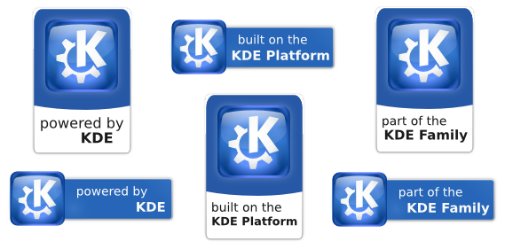
A while ago, the KDE promo team organized a competition to choose a design for labels that producers of software within our community can use to show that they are part of KDE. Today we are happy to announce the winning designs:

These images are now available to download from the KDE Clipart page so that you can use them on your project website or within your application or documentation.
The labels
For giving application developers - and in particular third party developers - a way to identify themselves with KDE and to label their software as such, we wanted to provide a standard set of KDE software labels. These can be used to communicate that developers feel themselves to be part of the KDE community or that they use the KDE platform. They can be used for example on application websites, in the about dialog of applications or in general communication about releases. They can be particularly useful in cases where it is not obvious that an application is part of KDE or making use of KDE technology.
To be able to express different aspects of the relationship to KDE and provide some variety for application authors we provide a choice of three labels, which are recommended for use with KDE software:
"Powered by KDE"
This label encompasses the dual meanings of software that derives its strength from our fantastic community and from the KDE development platform. This label is recommended for all free software applications whose developers feel part of the KDE community or which make use of KDE technology.
"Built on the KDE Platform"
This label has been chosen for the simplicity of the message it provides: this application uses the KDE platform. It is recommended for all application authors who want to stress their use of KDE technology.
"Part of the KDE family"
We recommend this label for application authors who in particular see themselves as part of the KDE community - and we hope anyone producing free software with KDE technology sees themselves this way.
The winner
The winning design scored consistently highly with the four panel judges from the KDE promo team and in the community voting poll on the KDE Forums. It was designed by Philipp Schmieder, a freelance web and software developer from Germany. Philipp is familiar with the Qt framework (as demonstrated by his work on the free software video downloader ClipGrab) and has used KDE software since 2004. He comments that "I haven't contributed to KDE, only reported some bugs etc, so the software label contest was a great possibility to finally do that".
Among the many other great designs we received, a special mention should also go to Carmine De Rosa, whose design edged out Philipp's in the community poll and was only just beaten in the combined community and panel scores.
The voting
In many ways, the software label contest has been successful. We have ended up with an excellent design, received many first time submissions from new contributors and captured the interest of the wider community with over 5000 views of the design poll.
The labels were voted on by the community, using the KDE brainstorm infrastructure on the KDE forums, and by a panel of judges from the KDE promotion team. With the experience we gained during this vote we'll improve the process for future votes.
Get the labels now
The software labels are now available to download and use. We would like, once again, to thank Philipp and all the other participants for their efforts and hope to see further contributions from them in the future.