Skip to content

Randa Report - unEyeCandy

Friday, 11 September 2015  |  Fuchs


Randa greetings from the VDG - Hahmulookin?
The Randa Meetings are happening now in the Swiss Alps. More than 50 people are giving their time to improve KDE software and innovate new value for users. The theme of this sixth edition of the Randa Meetings is Bring Touch to KDE, and the KDE Visual Design Group (VDG) is making their contributions to the look and feel of KDE technology. Visual appearance has been a primary consideration for KDE from the beginning—"users [should be able to] expect things to look, feel, and work consistently".

The Visual Design Group

The Visual Design Group is responsible for the User Experience, Usability, Design, Look and Feel of KDE software. The VDG has been working from a TODO list at the Randa Meetings. There has been good progress and still things the VDG wants to accomplish in Randa.

Already done

The following items have been tackled or are completely done:


Progress with device icons
  • Make all Oxygen icons available in the Breeze theme
    This is planned for Plasma release 5.4.2 in October. The icons are mostly done; for example, device icons are now 80% covered.
  • Meet with Plasma maintainers on Plasma Mobile
    Together the groups decided how Plasma and applications should look and feel on mobile devices. The two teams addressed hot topics such as the behavior and results of swipe action from the edges, navigation in applications and application layout in general. Human Interface Guidelines for mobile applications will be available soon, so that developers can start porting their applications to Plasma Mobile.

  • Plasma sidebars
  • Discuss the look and feel of sidebars with Plasma developers and maintainers
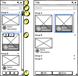
    The discussions about the look and feel of sidebars lead to the results described in a blogpost by members of the VDG.

  • System Settings for Desktop Search
  • Rework System Settings (KDE Control Module - KCM) for Desktop Search
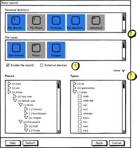
    As a part of the ongoing work of streamlining system settings, the KCM for Desktop Search was reworked. See screenshot below.
  • Fix all icon-related bugs
    These fixes will be available in Plasma release 5.4.2 (October).
Still to do in Randa

  • Enforce Breeze icons for applications wherever possible
    A couple of applications have hard-coded icons that do not respect the user's choice or do not reflect the current state of the Breeze and Breeze Dark supported icon themes.
  • Design sessions with interested application developers such as Kdenlive
    Some applications either lack appropriate Breeze icons or the developers are not sure which icons are the best to use. Working closely together helps both the VDG and developers to know how to offer a good set of icons that look nice, fit well and are easy for users to understand.
  • Oxygen will be moved to git and maintained together with Breeze and Breeze Dark
    Many users prefer the Oxygen icon theme. However, it had not been maintained for a while and is not officially supported. This will be changed as Oxygen will now be maintained as an additional choice (though not extended or further developed), along with Breeze and Breeze Dark. Users will be able to switch between any of the three icon themes with a simple click.

Feedback and message to the users

The Visual Design Group is very happy to be in Randa, where they have a full week to work together, and are able to have intense discussions about design and code with application developers. There has already been a lot of progress in a small amount of time. In addition, some issues that came up during the sprint were resolved, such as KDE software on Windows and Android application developers concerned with the size of icon packages that have to be provided along with the applications.

Developers, interested people or KDE software users are invited to participate in the Visual Design discussions. This is an important aspect of KDE technology. Please contact the VDG on their forum.

The Visual Design Group is planning to have a Design Sprint in 2016. Money raised in the current fundraising campaign will be used to cover that sprint and others. KDE sprints have the primary objective of providing value to users of KDE software. So please consider donating to the Sprint Fundraising Campaign.

Comments:

dont understand - Anonymous - 2015-09-12

<p>WHat this means: Randa greetings from the VDG - Hahmulookin?</p>

Slang term - kallecarl - 2015-09-12

Hahmulookin > How am I looking? In other words... What do you think of my new hat? or shoes? or skateboard? or skateboard trick? In this story ... What do you think of the work of the Visual Design Group? I've been using the Breeze theme for several months. It is useful and doesn't get in the way. Looking good. What do you think of the KDE look?

mockups app - h - 2015-09-12

<p>What app are you using for those mockups?</p>

Take a look at this link: - Josep - 2015-09-13

<p>Take a look at this link:</p><p><a href="https://techbase.kde.org/Projects/Usability/HIG/MockupToolkit">https://techbase.kde.org/Projects/Usability/HIG/MockupToolkit</a></p>

Balsamiq / Pencil - Fuchs - 2015-09-13

<p>You probably either want <a href="https://balsamiq.com/products/mockups/">Balsamiq Mockups</a> (which it looks like), which is proprietary and (recent versions) only available for Windows / OS X, or the free / open source <a href="http://pencil.evolus.vn/">evolus pencil</a></p>

Yay! - Michael - 2015-09-16

<p>This is all very awesome to hear! Great work!</p>

Settings UI to switch theme - Hervé - 2015-09-24

<p>A quick question about theme settings. Currently, to switch from one theme to another, I need to change settings in 3 different UI dialogs (desktop theme, color and icons). Am I doing something wrong ? If I'm not, is there any plan to change this behaviour ? I mean, from a user perspective, it would make more sense to have a single theme dialog to switch theme in one go.</p>

Is it just me being weird and old fashioned - Damijan - 2015-09-28

<p><span style="font-size: small;">Who finds breeze icons (</span><span style="font-size: small;">_especially_ </span><span style="font-size: small;">in system tray) extremely unattractive, plain and more or less ugly. Looking at this monochrome icons reminds me on windows 3.1 with only 16 colours available. It appears to me that this "modern" and "professional" icons were only made for visually impaired (colour blind) people. What was wrong with old 4.X beautiful, colourful icons filled with brightness and colours? They have looked alive unlike "modern" ones ready to be burried 10 feet under ... Well it seems that will be doing </span></p><p>&nbsp;</p><p><span style="font-size: small;">cp -R /backup/icons/usr_share_kde4_apps_desktoptheme/* /usr/share/kde4/apps/desktoptheme/</span></p><p><span style="font-size: small;">and</span></p><p><span style="font-size: small;"><br />cp -R /backup/icons/usr_share_plasma_desktoptheme/* /usr/share/plasma/desktoptheme/</span></p><p><span style="font-size: small;">till eternity ...</span></p><p><span style="font-size: small;">P.S. It seems that will need to do a backup of /usr/share/icons too.<br /></span></p><p><span style="font-size: small;">Cheers</span></p>