KDE's Kirigami UI Framework Gets its First Public Release

KDE has a long tradition of providing user interface components beyond the basics that are offered in Qt itself. With KDE Frameworks 5, these have become more easily available for Qt developers who are not part of KDE. Now, with KDE’s focus expanding beyond desktop and laptop computers into the mobile and embedded sector, our QWidgets-based components alone are not sufficient anymore. In order to allow developers to easily create Qt-based applications that run on any major mobile or desktop operating system (including our very own existing Plasma Desktop and upcoming Plasma Mobile, of course), we have created a framework that extends Qt Quick Controls: Welcome Kirigami!
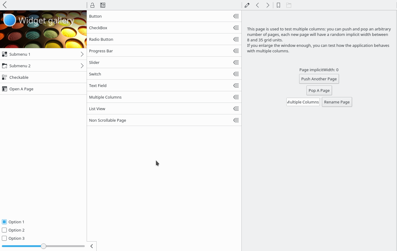
Kirigami is not just a set of components, it is also a philosophy that defines precise UI/UX patterns. It allows developers to quickly develop intuitive and consistent apps that provide a great user experience. Some concepts are:
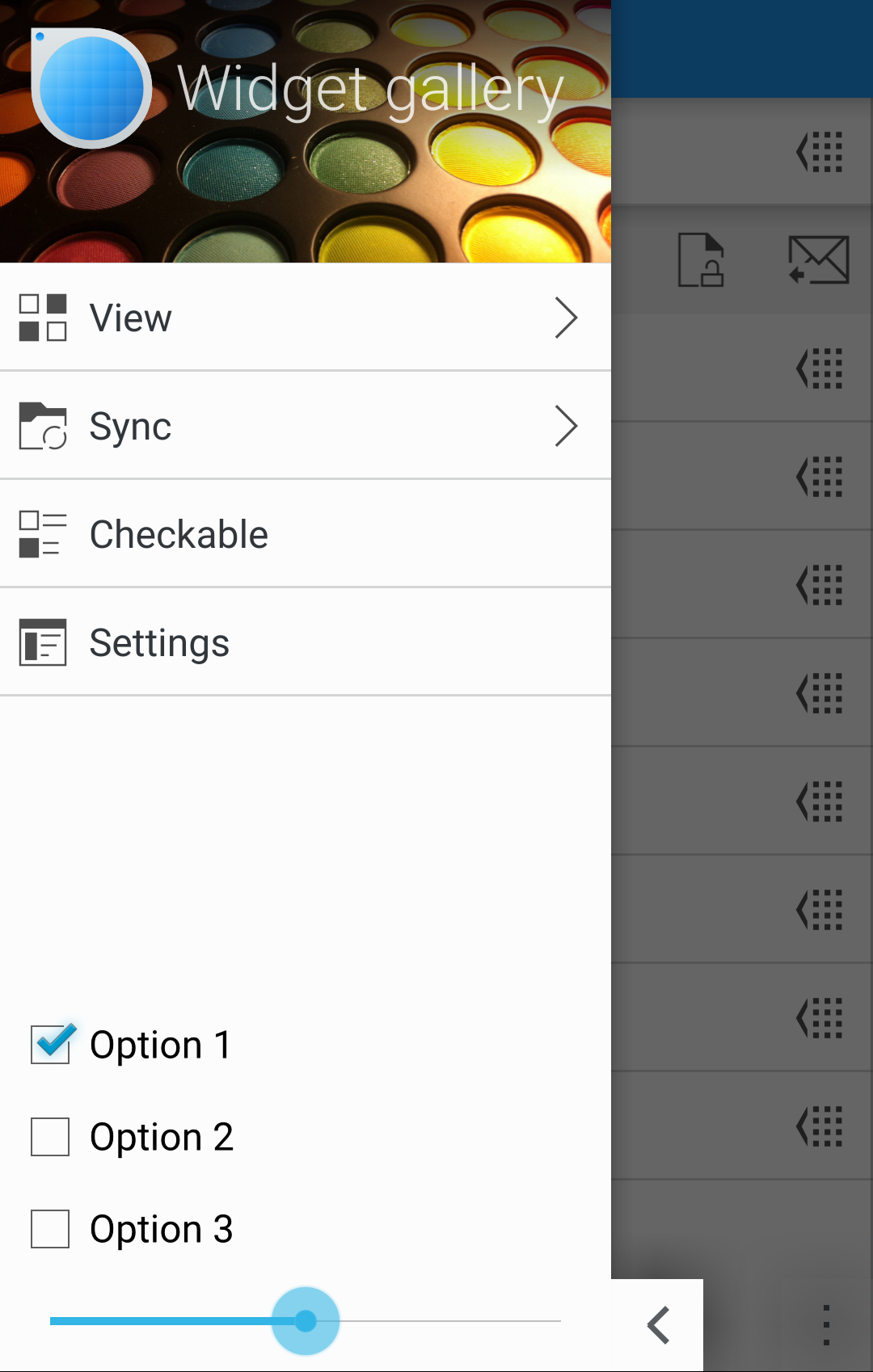
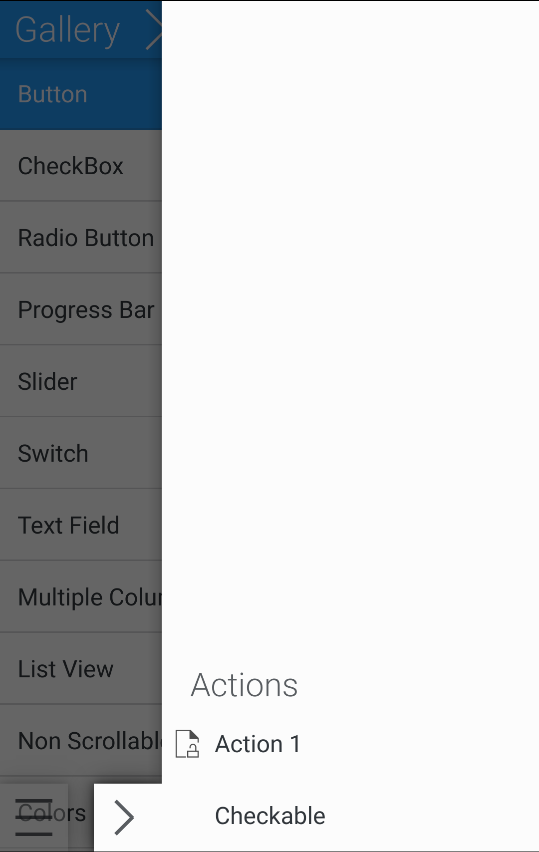
- Actions are available in two drawers and additionally through some shortcuts (buttons or swipes)
- Actions and options are distinguished into global ones and contextual ones, put in two different drawers in the opposite vertical sides of the screen
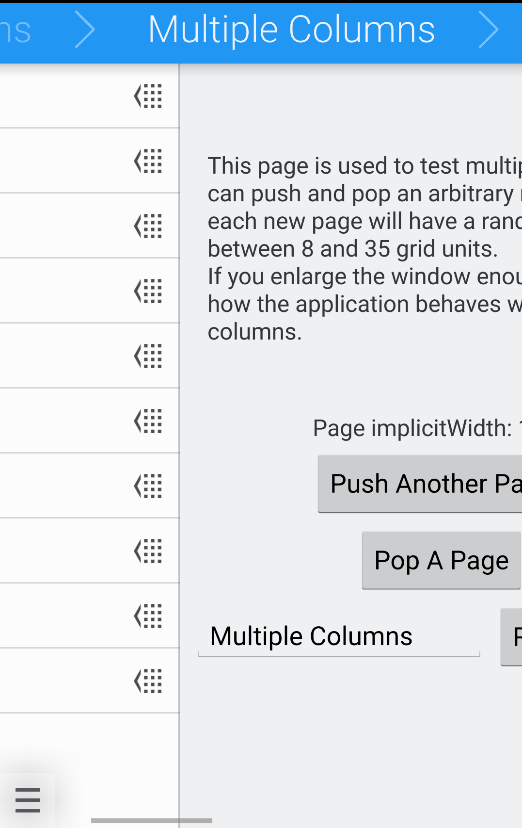
- The app’s content is organized in pages that you can browse through with horizontal swipes.
The Kirigami Components for smartphones are optimized to allow easy navigation and interaction with just one hand, making it ideal for using applications casually “on the move”. Kirigami is not only for smartphone applications. It will allow to create convergent applications, which are not simply the exact same user interface scaled to different sizes, but morphing between optimized interfaces based on the input method and screen size, changing as the context changes (e.g. flipping over a convertible, docking a phone). Another important concept is non-invasive pop-ups to undo an action, rather than confirmation dialogs.
Why the name Kirigami? Kirigami is a Japanese art of papercraft. It is derived from origami, but adds cutting as an additional technique to folding. The reason we chose it as the name for our framework is that different layers or “sheets” in the UI are an important element in its design philosophy. Navigating through screens and the pop up of the drawers are like flicking through sheets of paper.
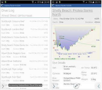
The first real-world application implemented using Kirigami components, Subsurface-mobile, is available for Android, a version for iOS is currently in the works – sharing most of their code. The Subsurface mobile team (which is lead by VMware’s Chief Open Source Officer Dirk Hohndel and has a certain Linus Torvalds as one of their core contributors) and their group of enthusiastic beta testers have worked closely with the developers and designers behind Kirigami to improve both the framework and the application based on their real-world experiences.The second Kirigami-based application to be released, the comic book reader Peruse, had its initial release in June, and was made available on both desktop Linux and Windows as well as KDE’s own Plasma Mobile. The application targets both touch based devices and the touchless desktops and laptops that are still very common, and as with Subsurface above, Kirigami has allowed for the majority of the code to be shared between those two versions. When asked about the experience, the main developer of Peruse, Dan Leinir Turthra Jensen, stated that “developing with Kirigami has been really exciting, and the team behind it is very responsive to suggestions and reports of any issues in the components.”
Kirigami currently officially supports Android, Desktop GNU/Linux (both X11 and Wayland), Windows, and the upcoming Plasma Mobile. iOS support is currently in an experimental stage, support for Ubuntu Touch is being worked on. The plan is to eventually become part of KDE Frameworks 5, but is currently released standalone in KDE Extragear. Since it is aimed to be a Tier 1 framework, it has no other dependencies apart from Qt, and therefore will not increase your application’s size any more than necessary. Kirigami is relatively easy to port to new platforms. If you'd like to see support for a platform not mentioned here, please get in touch with the Kirigami team and they will be glad to help you get Kirigami to work there.
You can find links to the code, API documentation and contact details on the Kirigami Techbase page.
