Beautiful New Design on kde.org
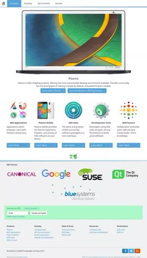
KDE's main website www.kde.org has gained a beautiful new design.
While in KDE we pride ourselves on making beautiful software our website has lagged behind modern requirements and trends. Visual Design Group member Ken Vermette has quietly worked away with key stakeholders to create a design and update the content. The new site uses correct HTML5 and is responsive to working on mobiles and tablets. It includes an introduction to our products, community and how you can get involved.
The scope of KDE projects continues to grow as we evolve from the original desktop environment to become an umbrella organisation hosting projects as diverse as WikiToLearn academic textbook collaboration or KDE Store content distribution site. The new website reflects this change in direction while still focusing on our flagship Plasma desktop.
This change is only to the front pages and many more pages on kde.org still use the old theme but these will be transitioned over in the weeks to come. Many other websites under kde.org are expected and encouraged to adopt the new theme.
If you find problems please check for them and report them on our bug tracker or discuss on kde-www mailing list.
