Consistency Update
By Niccolò Venerandi

It's been a month since Consistency was announced as an official goal for KDE at Akademy. During this time, we have focused on setting up all the tools needed to support the goal and tracking already active consistency tasks. Here's an update on what we have done so far and the main tasks we're working on.
Community Page
We have created a Consistency page on the community wiki where you can learn what the consistency goal is and find out how you can easily get involved in it. Check it out, regardless of your level of technical expertise!
Matrix Channel
There is also a Consistency channel on KDE's Matrix instance. Access it through the webchat page or at consistency:kde.org. You are welcome to come in and join us to discuss anything related to the consistency goal!
Sprint!
A sprint is in the works. If you would like to participate, join in the discussion and come and discuss the time and the place on the Matrix channel as well.
Phabricator Workboard
We created a Consistency workboard so you can track all the tasks and keep up with their development. You can add yourself as a member or watcher to receive Phabricator updates.
Tasks are organized into the following categories:
- Reported shows consistency problems that still need to be addressed, but are currently not being worked on, or are not actively developed yet
- VDG Discussion lists tasks that the VDG (Visual Design Group) are discussing
- HIG Specification shows tasks that are waiting for an HIG (Human Interface Guidelines) specification so they can be developed in a consistent way
- Under Apps Implementation you can find tasks that are actively being worked on
- Meta contains all the tasks that are not exactly consistency problems, but are related to the consistency goal in some way
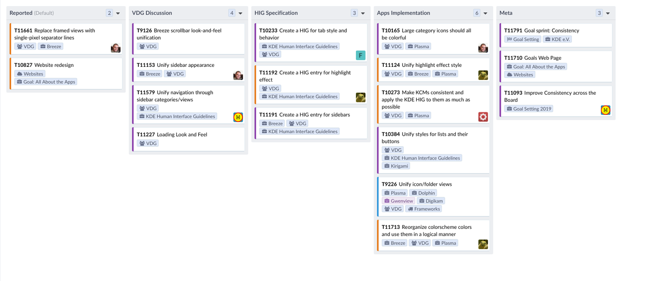
The Consistency goal's workboard.
Consistency Tasks
There are already many tasks in the Consistency project. Some tasks are new, some existed before. Many of these tasks are quite interesting, so read on to get an idea of what lays ahead for this goal.
Unify Highlight Effect Style
This task was already in progress when the Consistency goal was selected, but it is nevertheless a great example of what we'd like to see happen in the goal.
Currently, Plasma has a discrepancy in its highlight effect. The first kind of effect is a plain rectangle using the highlight color, while the second one is a rounded rectangle with an outline and semi-transparent background. Although the former is more common, we think the latter is more appropriate to use in all situations.
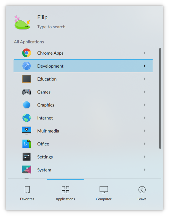
Here's the correct highlight effect in Plasma
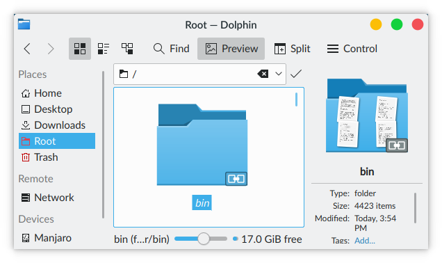
Here's what it looks like in Dolphin now.
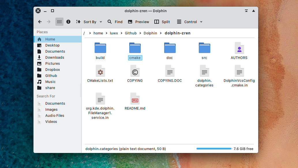
Dolphin mockup showing correct highlighting.
A few more examples of what the new highlight could consistently look like in various use-cases:
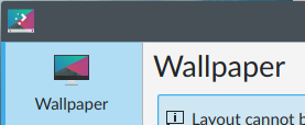
Big icons sidebar highlight.
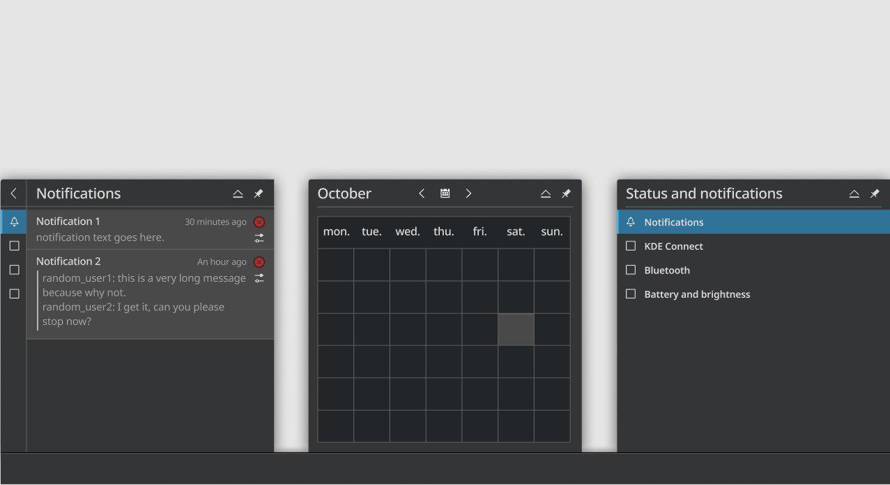
In plasmoids.
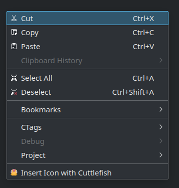
In menus.
This is a great example of what consistency can be: not simply applying the same style everywhere, but finding something that a single app does very well, and bringing that to all the other apps. Noah Davis is actively developing this task, and he's doing a great job!
Unify Sidebar Navigation and Appearance
These tasks originated directly from the Consistency goal.
Sidebars are used in many applications and it would be great that they were consistent. There are two main aspects to this: the type of sidebar (system settings-like lists, big square icons, etc.) and the navigation within the sidebar (tabs, combo boxes, etc.).
What is the best solution? That part is currently under discussion. We welcome everyone's opinions on the matter or, even better, an expert assessment on the feasibility of each of the options.
Let's quickly illustrate some options:
For the sidebar appearance, the current main option relies on using lists and big square icons, depending on the number of elements:

Sidebars.
On the other hand, the option for navigating sidebar views includes tabs that become icons-only when horizontal space is insufficient, vertical tabs on the left, and combo boxes:
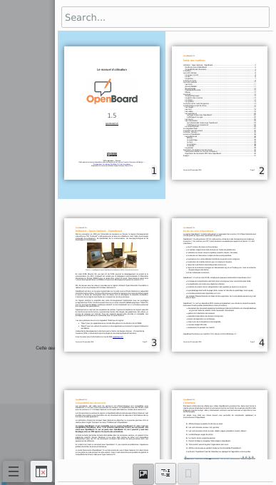
Option 1.
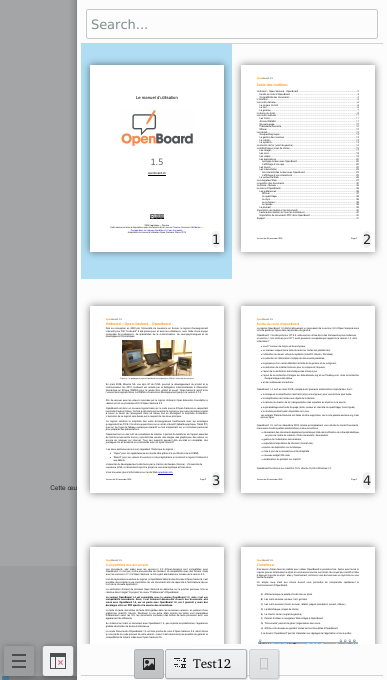
Option 1b.
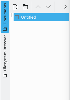
Option 2.
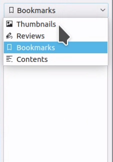
Option 3.
Furthermore, Nate Graham is focused on making sure that all big icons displayed in sidebars are colorful. He has already fixed a lot of them, and only a few are missing that we know of. Finally, there's also a task to create an HIG specification for sidebars as soon as the discussion settles. We welcome help with any of these tasks. :-)
Website Redesign
This task was already ongoing when the Consistency goal was chosen and it aims to modernize old web pages that follow obsolete styles. There are many of them and some are well-hidden. Carl Schwan created and works on this task alongside many other contributors. Check it out and see if you too can find any old websites that need updating!
That's the end of this update!
If you would like to help out, come join us in the matrix room and let's make KDE software more consistent together!