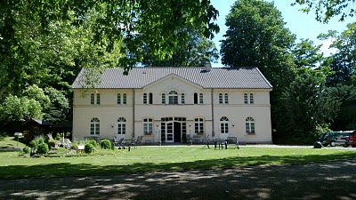
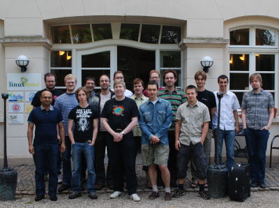
Hot on the heels of the 2.2 release of KOffice -- the first release we feel that users can give a try and use for real work -- the KOffice developers met in Essen-Horst in Germany, in the wonderful Linux Hotel. Thanks to sponsorship by the KDE e.V. and the hard work by Alexandra Leisse and Inge Wallin, we could spend three days discussing and hacking.
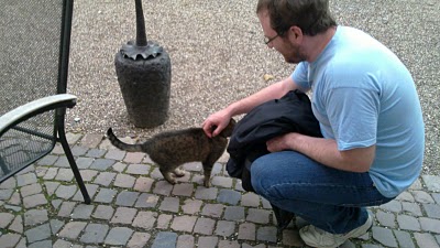
With the weather being perfect, the hotel hospitable and the surroundings leafy and all a-twitter we not only hacked and discussed. There was time to relax over a beer, get to know each other a little better and stroke the hotel cat.
Friday was mostly spent hacking, reviewing each others' code and sitting outside and discussing the state of KOffice until very late in the night. The next morning, Saturday, saw the start of a very long and rather gruesome meeting. No hacking, only a few coffee breaks and one pizza break. This day was devoted to three main topics:
- How can we reach out and gain a real userbase
- How can we gain more developers (keep in mind that many applications of KOffice have only one, or even no, regular developer working on them!)
- How can we keep our work on KOffice relevant in what promises to become interesting times
The meeting notes are on the developer wiki.
Nokia sponsored not just the Saturday dinner but also the Sunday lunch, which was pizza again, for which many thanks from everyone present!
Saturday night again was most spent hacking, comparing notes, benchmarking ODF loading and similar things and drinking Slovakian peach liquor.
Sunday was a lot more technical than Saturday: we discussed text rendering, which is still a sore point, a new architecture for file filters, text layout problems, charting issues and separating the user interface from the core even more. This is something that Nokia has quite some experience with, having developed a completely new user interface on top of the KOffice applications, and we're keen to pursue this path even further.
All in all, the attendants agreed this was a really positive sprint in a relaxing atmosphere. Many decisions have been made and a lot of work got done!


Comments
Good work guys.
p.s. are the picture labels of the second and theird picturs swapped by accident? ;)
>How can we reach out and gain a real userbase
Please, first make the fonts look good in Koffice 2.2.x. It is evident as a proof kspread 2.2 does show nice font while typing (nice font rendering = bug), but it becomes blurry on input!
A nice way to Reach to new users:
1. fix font rendering
2. fix the "welcome dialog" which is another ugly thing in koffice
I as a user concerned for koffice's development (bug reporting, enhancement wishlist) have reported bug for this blurriness, and even with many votes, it is a year old bug...
For what I see as a user, Koffice is lagging because of this font rendering and the welcome dialog...
Bug I reported in March 2009:
fonts look blurry in kword 2.0 beta 7at 100%
Other users bothered by bad font rendering:
Is it me or is KWord's font rendering really awful?
and nokia bug report is lying there, QT guys please have a look:
Zoomed text uses hinting from unzoomed text and looks ugly
Please try to fix the font bug in QT 4.x. thanks.
1. The font problem was discussed at the meeting, for more information see the meeting minutes. The problem is under investigation, but no solution has been found yet. We are aware that this serious problem.
2. Depends on what you want to get fixed. The dialog will basically stay the same, though some details have been improved like new icons in Krita. The dialog isn't really fancy, but it generally works well and there are bigger problems to solve than replacing the opening dialog.
I think the reporter didn't want to replace the dialog, but fix the bugs that are really obvious when you open it. And I think we will be able to do that before 2.3.
Opening dialog needs interface cleanup, nice icons.. that'll do
1. use of proper names/labels (like "Create New document" headline, then those options of general, business, etc. should be there
2. new artwork, instead of 'black & white' and 'blurry scaled' icons, proper icons representing ods etc. should be there.
instead of sidebar on left using *Tabs* would give uncluttered and better appearance to the dialog
------------------------------Open Dialog----------------------------
[*Create Spreadsheet*] | [Open Spreadsheet] | [Recent Spreadsheet]
--------------------------------------|---------------------------------------------
1. General Document -> Blank Workbook (icons/artwork here)
2. Business -> [list of available options]
3. Home & Family -> [list of available options]
[Create] ("use this Template" is too technical) [Cancel]
--------------------------------------------------------------------------------------
thanks.
I agree with the above that the opening dialog is badly layouted and not very welcoming.
What I also would like to see in KOffice are shared templates. I use KOffice docs for specific tasks as I am not an office worker. I need to print a kid birthday invitation, to print labels, to write a formal letter to an administration, to prepare a party (spreadsheet with invited people, answers, planned costs,...) ... and I would like to get ready made templates by other users and to share my own templates as well. Did you discuss the use of KNewStuff with kde-files.org?
What's funny is that MS Office and iWork now use the same layout for side bar instead of tabs.
I'm not convinced that tabs would reduce "clutter" as the sidebar separates everything nicely into groups, which isn't the case for tabs.
Well in KWord I have found no way of changing the style of a text to "Head 1" or whatever and that is the first thing that disqualifies KWord for me, did not bother to look at the rest of it since it would be pointless.
Btw. I tried some minutes. So either the initial layout I was confronted with is pretty bad or you should really make things like that more discoverable.
Also there is no option I find usefull in the side-panell. I want to write texts first so I do not care about transparency or colour gradients.
In that regard you should imo focus more on the single applications. Flake is nice but it should imo be considered as "addon" for most cases --> so move it into a menu, like an add menu.
Basline is in case of KWord: Please focus on what a word processor is for.
Right, that's it. We have to do something about that styles docker. We will get a lot more complaints about this if we don't redesign it.
Here's how it works right now to do what you want:
1. When the cursor is in a paragraph that you want to change to "Head 1", go to the docker labeled "Tool Options". Select the "Styles" tab.
2. Click on the style that you want ("Head 1" in your case).
3. Click on the button in the lower left corner with a check mark on it. That will apply the chosen style.
And yes, I agree that it's cumbersome and should be changed.
Oh, I just realised the needed docker was not present in my case and adding them is also not that optimal --> right clicking on the name of a docker or the seperator == small click space.
I searched for dockers in the View menu, not the settings one. Though that is in fact debatable.
Imo the apply button here is really uneeded, a double click should be enough.
> How can we reach out and gain a real userbase?
Make a Windows installer.