This week we'll take a brief look at some of the many features that are making their way into Amarok 2, which is the development branch for Amarok in KDE 4. The features discussed are all in-progress features which have reached varying stages of completion. Read on for information about Amarok's engines (including Phonon), UI changes, changes to the Magnatune music store, OS X support, and more.
A few weeks ago, The Road to KDE 4 featured an article on Phonon. When that article was published, work on Amarok 2 had not yet started, but the Phonon developers were keeping Amarok very much in mind as they designed the Phonon libraries.
You see, in Amarok 1.x, the developers had to maintain separate playback engines for xine, gstreamer, aKode, etc. This was somewhat of a hassle to keep all of these engines up to date, and in some cases, they were very much a moving target, forcing them to focus on only a single engine, xine. And other programs, like Noatun had to re-implement these backends so there was much duplication of efforts. For KDE 4, the Phonon interface is designed so that programs like Amarok don't have to worry so much about the backends anymore and can concentrate on the other parts of the application. According to the Amarok developers, implementing a Phonon backend took all of 90 minutes before it was usable, and a few extra hours before it was fully implemented. When using Phonon, applications can playfiles over network protocols thanks to KIO, so we'll see what happens as the Amarok team explores this feature in more detail.
So Phonon is now working in Amarok 2. The old engines were also ported over, and in particular, the old xine engine is still being actively developed and they haven't decided to drop their old engines. Since Amarok 2 has only been in development for a few weeks, it is too early to decide to drop their existing engines such as xine, which has served Amarok very well in the past.
One of the side effects of using Phonon is that Amarok can access the video playback functions of the underlying engines where they exist, such as in the phonon-xine engine. They have added rudimentary support for video playback in Amarok, but it's designed to complement audio playback, rather than supplant more involved video players like Kaffeine. The idea is that if you have a music video in your collection, and want to use Amarok to play music from that video, then the video stream would be considered as a Visualization for that music. Having video support will in no way hinder your Amarok audio experience in version 2. According to Dan Meltzer, adding initial video support was a whole seven lines of code using Phonon.
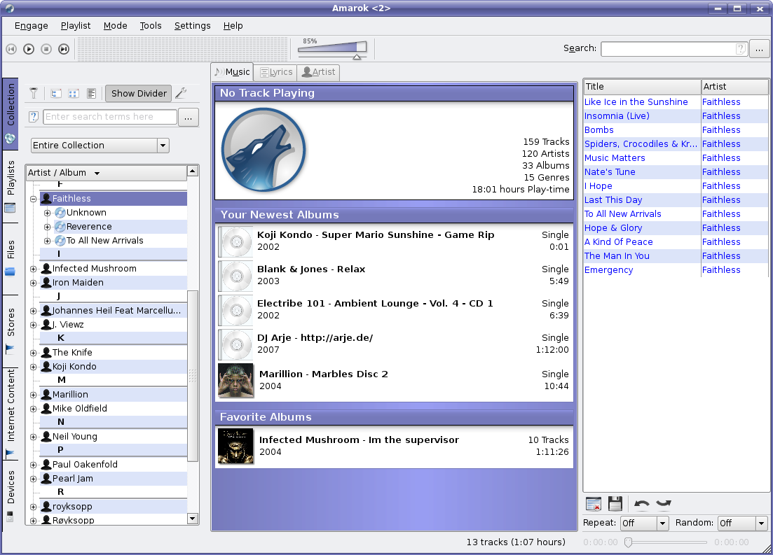
Of course, thanks to KDE 4's newfound portability, Amarok is able to run on other platforms, not just Unix/X11. The development version has already made its first appearance on OS X thanks to the work of Benjamin Reed. Porting to Windows as well is underway, although I don't have a screenshot of that progress.
I personally think that having Amarok on these platforms will single-handedly do more for awareness of KDE as a multi-OS development platform than any other application that currently exists for KDE, since the program is head and shoulders above so many other media players out there.
But they wouldn't have a good reason to call it 2.0 unless there were some really big changes happening, and there are.
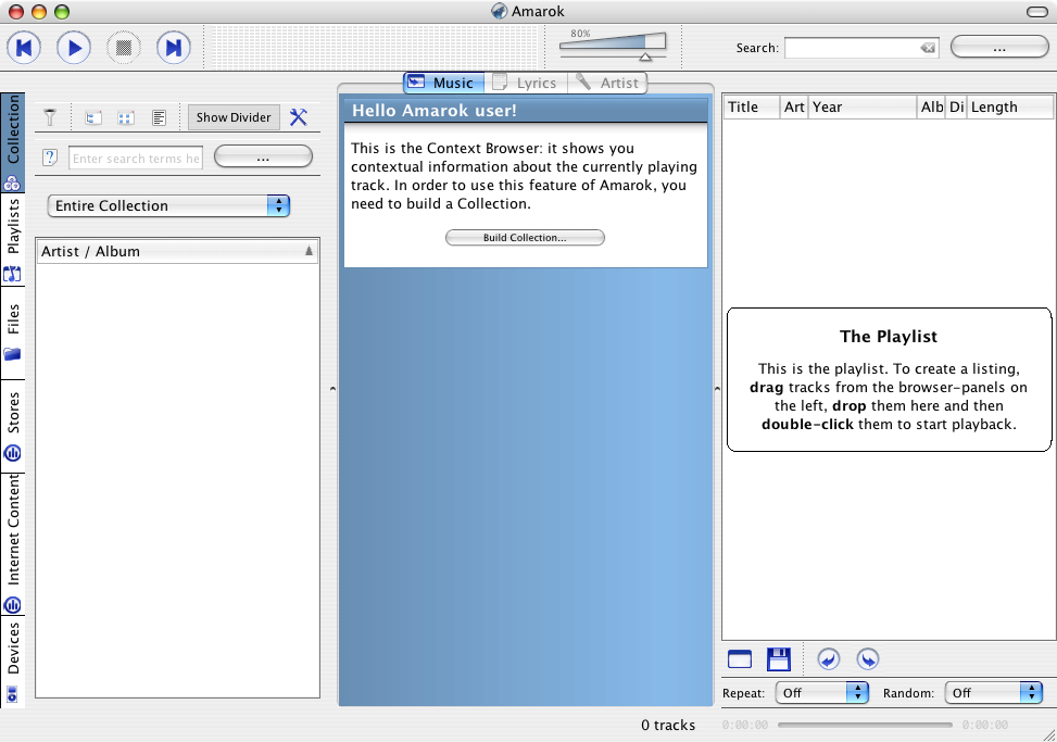
Amarok is in many ways inspired by XMMS, which in turn bears a lot of resemblance to Winamp. Basically, it's a music player with a multi-column playlist that displays information from tags contained within the media files. Now, these multi-column playlists have not really changed much over the last decade, except that different applications have added interesting ways to sort, filter, and edit tags. Amarok is particularly good at sorting and filtering, and half decent at tag editing (see JuK as an example of a player with an amazing tag editor). But none of these functions really require Amarok to present its playlist in a rigid column format, except for traditional reasons. So as part of the UI reworking for Amarok 2, the playlist is seeing a rebirth of sorts. While it still lists Tracks, Titles, and other tags, it will no longer be constrained by the old fashioned playlist column format.
This requires a picture to properly describe, so here is a mockup showing the concept in action.
You may first wonder "Where is the playlist?" as I and a few of my peers on IRC initially wondered, but if you look closely, the list on the right is actually the playlist, only it's broken free from its old format. So now, when your file is missing some tags, the playlist will simply adjust around those missing tags, smartly displaying what information it does have.
Also featured prominently in this screenshot is the middle pane. This pane is the focus of Amarok 2, as they try to give you more information about your current track, and allowing you to "Rediscover Your Music" as their motto goes. The leftmost column will function much as it used to, except with the "Context" information moved to the centre. Of course, as is KDE tradition, much of this will be configurable.
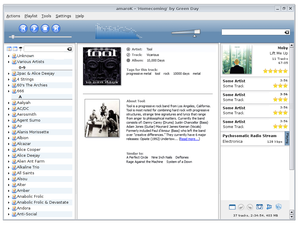
Here is a shot of Amarok 1.4.5 showing its current layout for comparison as well as a shot of the development branch of Amarok showing off some of the progress they've made in moving user interface elements around. The mockup above is the targeted UI they wish to achieve, but there will be bumps and changes along the way as they find what does and does not work well.
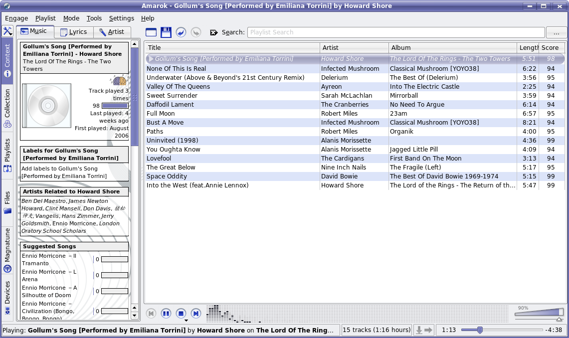
And now another screen the Amarok 2.0 development version, this time on Linux. Keep in mind that Amarok 2 has only been in development for a single month, and work is still ongoing.
One of the most promising of Amarok's features is Magnatune store integration. According to Wikipedia: Magnatune is an independent record label which aims at treating both its musicians and its customers fairly. Users can stream and download music in MP3 format without charge before making a decision whether tobuy or not. Music files sold by Magnatune do not use any form of Digital Rights Management to prevent customers from making copies of music files they have purchased; and actually encourage buyers to share up to three copies with friends.
Amarok debuted with Magnatune support (for both audio streaming and purchase) in version 1.4.4. Since then, the team has received many emails from other stores interested in being added to Amarok as well. But in Amarok 1.4, the developers have been busy polishing up Magnatune support and had no manpower to start bigger tasks. With Amarok 1.4.5, the second version of the Magnatune store was released and developers are really pleased with that version. It works well, and generates a small but growing number of sales for Magnatune.
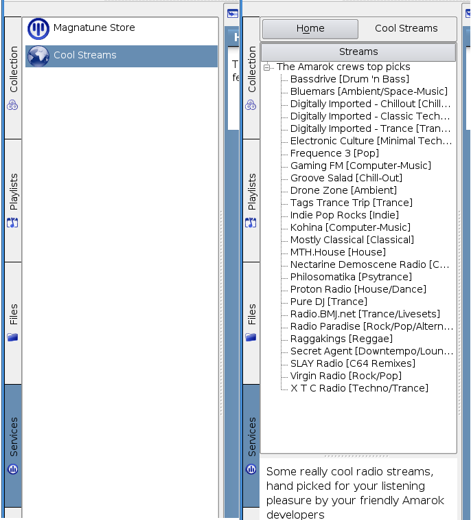
So it is time to move on. Nikolaj Hald Nielsen, the main developer of Magnatune store, is planning to move things up a higher level by providing a service framework for all streaming music sources. This service framework could, and is in part intended to, be used as a starting point for adding other stores, and will provide a large amount of basic functionality with regards to adding previews to the playlist, displaying data about selected items, and similar "read only" functionality. As a prof of concept, a service that can be controlled using scripts have been implemented on top of this framework. Currently there is no intent to make a framework for the more store specific functionality (purchasing, parsing of info from websites), simply because each store has their own unique way of handling these things. Nevertheless, it's a great step forward for unified streamed music support in Amarok, and in fact, the CoolStreams service has been already ported to this new framework (as a rubyscript), and a Shoutcast browser is coming along.
Now, with the Magnatune store well received and with the possibility of using the service framework, it might be time to contact some of these interested music stores again.
Here is a screenshot showing the experimental "Cool Streams" ruby script running on top of the scriptable service:
If you'd like to get involved in the Amarok 2 development process, you will need to set up a KDE 4 development environment. There are instructions for using SVN available at the KDE TechBase website, or use the kdesvn-build program to automate the whole thing. The Amarok developers accept patches, and will hook you up with SVN access if you require it. They also need help from artists, testers, and people to offer user support via the #amarok IRC channel on the freenode network.
Ladies and Gentlemen, Amarok 2 is progressing very rapidly. To quote Mark Kretschmann, Amarok's lead developer: "If development continues at this pace, we'll be done with Amarok 3 by the time KDE 4 is out ;)" Be prepared for something awesome, as you've come to expect from the Amarok team.
To stay up to date with Amarok news, check out the Amarok Newsletter published by Ljubomir Simin. Special thanks for his contributions to this article. It's my first experience co-authoring, and it went very smoothly. :)
Comments
Isn't just ugly, It's unusable.
Even the concept art look bad, I am quietly sure most user will prefer the OLD GUI style, because it's simpler and more useful, BTW, the amarok 1.4 screenshot it's soooooooooooooooooooooooooooooooo manipulated, it's just don't look that way, maybe by default, and whit any cover, but I dosen't look that way for most user, common!
The gui doesn't look right because it resembles itunes so well. Amarok was never such a clone. I really like the big playlist search field that the current amarok has..
Mockups looks ugly. Don't make clone of something. Amarok now looks different, so why do you want to change it. Try to improve it.
My opinion: the mockup is much much better than the older gui in 1.4.x. It is more tidy and more presentable. It only shows what you want to see when a playlist is active and playing. All those other features to manipulate, sort and so on are hidden in the background. It's simply beautiful!
The problem with my beloved KDE is that many applications are overloaded with controls and such. Keep it more simple and think about what the user normally wants to see on the screen! Enhanced editing and manipulation features can be hidden in the background. Think about it like "tidyness like gnome" but "feature-rich and configurable like KDE!" (so far for a brief excursion to KDE in general)
I am lookking forward to Amarok 2 and I hope it will look like the mockup that is presented in this article. Thanks for the amarok-team!
I second that!
The old GUI is soon @ the graveyard!
Just my opinion.
The current GUI is working, but it's not really informative.
The sidebar is annoying when looking at your playlist, and too small when seeking some information.
Now, Amarok's more a database-viewer which can play music.
It should be the other way round, and this mockup seems to fulfill this.
Imagine seeing a construction wharf around a building, and people start screaming "is that going to stay there? That sucks and besides the building looks ugly". (hope construction wharf is the correct English translation).
Please understand a *mockup* is not a definitive version. It's a way for developers to show the new abilities of the program. The next step is polishing it so users also love it. So take part of this enthusiasm, don't demolish it (e.g. not providing good arguments) because people loose their motivation this way.
I think the UK-english word you want is scaffolding.
Thanks, judging from Wikipedia and Google images it's exactly what I ment :)
And I really hate to flame...
But...
"Also featured prominently in this screenshot is the middle pane. This pane is the focus of Amarok 2, as they try to give you more information about your current track, and allowing you to "Rediscover Your Music" as their motto goes. The leftmost column will function much as it used to, except with the "Context" information moved to the centre. Of course, as is KDE tradition, much of this will be configurable."
Read... Please...
Don't complain about what isn't done...
Don't complain about what you can change...
Just... don't complain when you can easily be proven wrong...
Otherwise you look like and idiot, and a jerk.
GR
Agreed.
So many whiners.
The instinct behind the change is right - just too many darn columns. Yes, you can configure them, but I often run out of horizontal space, and then I discover one I hadn't used before, like "last played", ... No Room!
The challenge will be to keep good abilities to sort playlists and do tag editing, particularly bulk-retagging.
But I would be very surprised if the Amarok developers forgot that.
p.s. i used to use juk but initially came to amarok for reasons of stability, and stayed for the excellent features.
Well... As long as we can choose I don't mind having multiple options. But honestly, iTunes UI is very good, so it would pretty stupid to exclude it just because "Amarok is not a clone". Getting the best from other projects is not cloning, is non reinventing the wheel!
Personally, I love the mock up. At the first look, it looks clean and simple and at the second look you discover all the useful features. It is not overloaded. Things must change and this is a good way.
lokking foreward to KDE 4.0
great work!!!
Yes, it sucks, I agree. :(
But, listen, may be that's a global phenomena? I mean, look at the car design of today - the shapes are made so streamline, that they have become dull and ugly: huge fenders, sharp edges, really huuuge lights (both front and rear), etc. I, for example, don't want to have all the objects around me looking like a dzen garden. I like eye candy and ... well, I can't explain it. But for me "new" does not always mean "better". ;)
i think its great. You are free to prefer the old guy.
No no no. This mockup looks bad! Really bad.
Don't try to invent a bike. Take current amarok gui, and try to improve it.
That's what we need, not some iTunes/WMP clone. Amarok now looks different, and that's good.
It is the current GUI, but improved. The mockup looks nothing like, and is nothing like iTunes or WMP, so I spose your amazingly irrational response only serves to make you look foolish because fortunately you are wrong.
Indeed.
http://www.microsoft.com/windows/windowsmedia/images/international/windo...
http://static.kdenews.org/content/the-road-to-kde-4/vol12_mockup.png
Those two look alike?!?!?
I'd pick the amarok mockup over anything, anytime. It's wonderfull, and imho the way to go for amarok 2.0!
I believe it is the natural progression of the old/current GUI.
WinAmp, WMP, iTunes and Amarok each have a very unique look about them. The problem is that content is buried in the current GUI.
The new GUI better frames the content.
I may get flamed for this, but honestly I've always loved WMP9/10. WMP11 makes for a pretty screenshot, but kills usability.
The layout for "Now Playing" is incredibly different from moving through your library and building your playlist.
I think the solution is to follow this approach.
When building/managing your playlist, something closer to the old GUI is better suited, because that is where the focus is.
As media is playing, the current GUI still gives you full control over navigation, while placing the central focus on the content that is actually playing.
Amarok 2.0 looks to be the sexiest media player on the planet.
Keep up the good work!
Well, I think the new UI looks very nice. And since I have used Magnatune long before I discovered Amarok that is one feature I really like. The new version looks very interesting.
I really like the old fashion look Amarok 1.4.5 presents. It's very usable with playlist on the right side with headers under columns displying relevant information. I can simply find tracks sorting them by size, lenght, bitrate and especially type and directory. It's gaining power from it's simplicity, that's why people like Winamp UI, they don't have to think too much to find how to use GUI. To much sophistiated interface could overwhelm new users coming from Windows and MacOS camp. For the time being my female cousin Paula really like Amarok and she is not techncian. So, don't make another app for nerds and geeks, when you must go with learning curve to just play few songs.
Best regards to all Amarok developers, you really do great job:)
I'm surprised, that you call the old playlist simple, and the new one sophisticated.
I see just the other way round.
I think I like the new interface. Why? Because I like to go through my collection. And I like the context tab. With the current amarok, I can't use them at the same time. With the new interface I can. I'm waiting to see it in practice.
And the new playlist looks much cleaner and simpler. The "old" one is very "technical". And although I'm a technician, I like amarok mostly for the reason it hides most of the technique. This helps me to focus on the music, thus "rediscover my music" :-)
It's strange to see so many people crying because of the new interface. I think it's mostly an automatic reflex, caused by the fear of changes.
Both comments are true :
- I want to have a quick view on every bitrates in a playlist, on year and so on. In the mockup design, the new playlist is rather useless (the rating thing is quite useless : if you don't like a track, just delete it).
- It was unpleasant to switch between "collection" and "context" panels. I am pleased it was noticed, and it is being addressed in next version.
Now is there really no way to keep collection, context and playlist visible in the same time?? I definitely think there is, and the current mockup is not addressing this.
The old playlist is simple. You have a database in a familiar and easily-parsed format with metadata in columns that can be arranged at the user's pleasure in any manner desired. If you want ANY particular piece of that metadata instantly, you begin typing and it narrows itself down to what you want automatically. No questions asked- it just works. Queue up what you were looking for and go about your merry way; it will go back to your playlist or random play when it's done.
Rediscovering my music doesn't necessitate knowing who made it and what the album art was- I know who the artists and composers of most of the pieces in my collection are already, and can look at the appropriate column if I've forgotten. This new interface seems to keep me from my arbitrary metadata in a most unpleasant way and makes-more-prominent information I could easily find by looking in wikipedia, either in Amarok itself or in a browser, in the event that I was curious (for the artists that actually have articles- quite a few don't in my case)
I understand that it will be configurable, but I truly don't understand the rationale of this design decision and feel that it can only harm one of the shining stars of the open-source community. Amarok has been almost unique in it's ability to allow me to manage a playlist of 4-5000 items as easily as one with 20-40 with only the metadata already in my files. The last player that did that effectively was dBpowerAMP on Windows (though I have functionality issues with it, after having used Amarok).
I think could actually go on at greater length about my issues with what I've seen so far, but if what I say here sees favourable response it may be a point to take up with the developers directly.
Agreed. What they're essentially doing is putting the spotlight on the context browser, instead of the actual music that's being played.
While the context browser is a nice feature, I have quite a lot of obscure music and often what's displayed in that bar to the left is no more than what's written in the playlist anyway.
I use Amarok to listen to music, not check out album art, artist details, and so on - that's what Wikipedia's for. Keep the focus on the music please, not its metadata.
I greatly disagree.
The new look is cleaner. You still have navigation where you naturally expect it to be, on the sides. The center is best suited to focus on what you have selected/playing.
WMP took a huge step backwards in usability simply to look better at a glance, or in a screenshot with WMP11.
I think anyone migrating from WMP11 to Amarok 2 will find it much easier and more intuitive. As they also learn that it is more powerful, they will only fall in love that much more.
Columns are useful, as you say. for sorting by certain criteria. People know about clicking on column headers to sort from file managers. There is no reason to ditch them.
Not that I care what Amarok does with columns: I'll never be able to use it due to the cluttered GUI from hell (this from someone who thinks Konqueror's default is just fine and doesn't need to be pared down).
Oh, I do like the new mockup, as it eases back on the clutter (though I'm not sold on artist info in the middle so much, I have too many untagged tracks to care). I might actually use Amarok if it looks like that, which is why I decry loss of columns. Something that looks like the mockup, *with columns* would attract me.
Developing this fast is impressive. In this very early state, it's already looking very good. And also quite innovative, I like that. Ofcourse I can't say anything about usability yet. But I'll trust that is in save hands by the Amarok team :)
Thank you for your trust. Thats all we can ask for at this point. :)
isn't that what Hitler asked for in 1933? And look what it worked out to in 1939!
...
ehh, just kidding there. I don't use amarok (except for fetching podcasts) right now because I don't really like the interface.. I mean I haven't had a closer look and all, but it somehow deters me from trying.. but that is only out of irrational reasoning. Anyways, the problem I recognize in the first screenshot that the filename does not seem to count as a valued information resource here, which is wrong as it - atleast in my collection - contains the most correct information in many cases. I also want to be able to tag files without changing a bit of them; what I am not so sure about is where to save those tags.. I'd certainly like an implementation independent from available database backends or filesystem attributes, f.e. XML metadata files stored either in the same directory or a directory above, that would allow transfering a folder hierarchy to a different place or using the same metadata from linux and windows...
anyways, thx for your hard work up to know and for any outstanding. And, let's rock them windows system hard, too ;=====P
> isn't that what Hitler asked for in 1933? And look what it worked out to in 1939!
>...
> ehh, just kidding there.
that's gotta be the lamest joke ever.
I really love the new GUI (Mockup).thats really usable.I think the current Context Browser has a big problem: Its tabs.I hate those tabs (Music/Lyrics/Wikipedia).everytime im in one of them, I miss the others.I really want to see them all merged.(A brief wikipedia text and image that could be extended by a collapsing 'Hide'Show' link + lyrics in a HTML Frame (should have scroll bars) + Similliar artists/Favourite albums and... below that)
but since everyone wants his own things, i was thinking about Templating that (think about Smarty in PHP, something simmiliar that everyone creates his own 'Contex Bar Themes'.not only CSS)
@ all flamebaits around :
1) Don't flame developpers or do it yourselves
2) Don't flame developpers on less that a month of _free_ time work, or prove that you can do better (you're not linus :D)
3) respect people, at least, if you don't like the way they are going say it with respect.
By the way, I liked the parent idea much.
@devel-team :
- continue your great work. I like it.
- have a look to what kdevelop4 team is working on for GUI
(ps : english is far from my natural language, sorry)
Please don't make the new UI the default. Its very cumbersome, and non intuitive. The current UI doesn't have much quirks imho, maybe you can just fold the tabs together or something like that - but definitely, not this way.
How can you know it isn't usable if you haven't used it?
I guess he tried to click on the controls in the mockup :o)
Well, maybe I use cvs...
Maybe a good idea to have an option to display a tag cloud (like on Flickr) on the middle pane to select music. Another comment I would like to make: Why not use (dynamic) treeviews more to cut down on the number of tabs.
Keep up the good work!
Keep going where you're going, amarok devs. Regardless of people's disapproval (at least until you're finished). You've created good things in the past, and I hope everyone can trust you to do so again.
Zack Rusin has written a CoverFlow clone for Qt4. If you Amarok developers want to integrate that:
http://zrusin.blogspot.com/2007/03/reflections.html
Like some other people, I'm not that excited about the new playlist.
Actually... We were discussing this a little sporadically last night, and we actually came up with an idea that might work with this... None of us have ever really thought of CoverFlow as something that's useful - pretty yes, but not useful really... So... How about a CD Stack in stead, which looks like CoverFlow, but where the CD that's focused is shown with all the tracks listed underneath in a list?
The reasoning behind this is fairly simple - we don't have the horizontal space to show the CoverFlow in any pleasant way, however we have a lot of vertical space... So a stack of CDs, where one is shown as open with a track list suddenly flopped into my mind, i suggested it and well... The few people who were looking at the channel at that moment liked the idea.
i'm just tossing it out here to show that we're not ignoring people and that we're really thinking about the usefulness of any eye-candy we include too ;)
I like the look of the mockup. Really, I don't care if it's inspired by something else, and I think complaining about it is pointless. It displays all the information the traditional playlist but in a more elegant and compact fashion. Keep up the great work!
I really like the new Amarok but... I'm much more focusing on my collection than on the context browser. When the Amarok window is shown on my desktop, it's because I want to change the content of my playlist. Otherwise it's closed in the tray. I really think you're focusing on the wrong thing. Of course the context browser is really usefull and I use it, but not as much as the collection pane, which is, let's be honest, crap... I like to go through my collection the same way as I go through my shelves... looking at the covers. I must admit, even if I'm going to risk my life ;-), that the WMP Collection Manager is really well done, usefull, easy to use... At least it shows the covers in a configurable size next to the tracks. And that's the only thing I'm looking at, I don't want to bother reading the tags if I'm not looking for a song in particular. And it shows the track number and the length of the songs as well, in case I need them, which is not even implemented in Amarok. Every back cover of a CD has that information but not the collection manager, that's... weird isn't it ? The TreeView widget is definitely not a good choice for displaying a collection IMO.
So please focus on the collection manager, and make it more useable. Make it feel like wood... as a normal shelf, with real CD's on it.
I fully agree.
You said everything.
The two most important things are the collection browser and the playlist.
I want to browse my collection with covers, track number, album year...
I want to "see" my playlist with such rich informations as well (the mockup is a start in that direction but need a lot of polishments to make it useful, compact and beautiful).
i agree fully.
1. there's nothing wrong in comparing and borrowing features from other media players. ignoring good ideas just because it's itunes or wmp is plain stupid.
2. some people focus mostly on their playlists, sorting and arranging them. other focus mostly on their collection, navigating it looking for new stuff to play. i'm in the second camp, but that's not really the point. the point is:
amarok 2.0 should allow the user to "set up" their inerface the way they want (within limits). so please, allow us to completely hide or resize any view we choose. that way the user can control the focus.
thanks
Your last sentence is gold.
One of the things that's always annoyed me about Amarok compared to other KDE applications is the lack of customisability. Why can't you just allow users to decide how big the playlist/collection browser/context menu is?
Why can't you make the old playlist an option?
Why can't you allow things like the track status scroller to fit the whole width of the screen?
I just don't see why you can't see that different users want different things, and rather than forcing everyone down one path, it makes sense to allow people to change their player.
Personally, I frequently use playlists of hundreds of tracks and I can't see ANY way the 2.0 mockup will handle this.
Is any actual usability analysis being done of the interface or are the developers just storming ahead with what they think?
Little hint, want to make a better interface? Consult HCI specialists. THAT IS THEIR JOB!
Man, what EXACTLY are you whining about? The article has mockups, not actual screenshots of the new software, so you don't know what you're going to get (yet). And it clearly says that much of the interface will be configurable, but here you are sounding like a crying baby that had his candy taken away! And over free software at that!
It's one thing to ask for features, but you are practically insulting the developers.
Here's a clue for you - if you get the new Amarok and it ends up being something you don't like...downgrade.
Yes. The collection browser has been the thing that truly annoyed me about Amarok from the very start. Take a look at the competition:
Winamp, Itunes, Songbird and others.
Time and time again the original(winamp) is copied. Why? Because the multi-pane view separating artist album (and optionally genre) from songs is pretty much the ultimate way to quickly and flexibly find what you are looking for.
I type "someword" in the filter box on top, and I get this view:
someword
---------------------------
artist1 | album1
artist2 | album2
---------------------------
song1
song2
any artist album or song that matches someword is displayed.
any song that has a matching artist or album is displayed.
If i select an artist or album the song list, and all other lists, is further filtered by that criteria.
This is simply orders of magnitude faster and more convenient than the Amarok way of browsing your collection via a tree structure.I've been using amarok for years now, and I'm still frustrated by this on a daily basis. Amarok is superior to winamp in every other way I can think of, but this single feature would have me using winamp instead of Amarok if it only worked right under wine.
I'm begging here; please bring this functionality to amarok, it would make a world of difference.
And of course, since I'm already begging favors, make it ultimately configurable so that the user can set it up with any filter criteria they wish in any GUI layout they wish.With the flexibility of QT interfaces(drag and drop interface parts), what's stopping you from making it so configurable that users could make the filtering look like this if they choose?
somewords
--------------------
album1 | artist1
album2 ! artist2
--------------------
genre1 | year1
genre2 | year2
--------------------
song1
song2
User/Newbie friendly defaults, and ultimate configurability. That's what Linux should be all about in my opinion. Please bring Amarok closer to that ideal!
Try the flat view. Its been in Amarok forever and does exactly what you are asking.