Well, so far I've published a dozen articles about KDE 4 over the last 12 weeks. A lot of content has been covered, but there is rapid progress still being made on those topics. So, in no particular order, this week's issue deals with addenda and updates to the last 12 articles, so that you can see some of the rapid progress happening as KDE races forward. Read on for details.
First, when I demonstrated KRunner back on January 2nd, it was barely useful, contained temporary artwork (it still does), and looked pretty basic. Since then, it's seen a lot of work. It is now installed by default, sounding the final death of many of the elements that previously belonged to KDesktop, one of KDE's oldest components. It (mostly) works, pops up when you press F2 (see note 1), handles CTRL-ESC to pop up the task manager, handles CTRL-ALT-DEL to pop up the logout dialog, loads the screensaver and screen locking routines as expected, and behaves in a very useful and beautiful fashion. Below is a shot of the new KRunner in action:
There's also this short movie (a week or two old) showing off how KRunner works when searching for commands to run. The interface is not yet final, but it's getting closer to completion. When it is further along, you will certainly get more updates.
Speaking of artwork, during the Oxygen article, I showed off KDE's new logout screen. At the time that was using temporary artwork that was a proof-of-concept placeholder. It's been updated somewhat, and now looks like this:
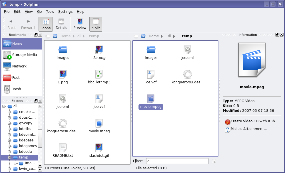
That's not the only screenshot that needs updating. After the Dolphin article, there were many requests for a tree view in Dolphin. Well, Peter Penz, the lead developer of Dolphin listens to feedback, and within hours, there was a preliminary tree view checked in to KDE SVN. After a few weeks of development, here's what the work-in-progress tree view looks like in Dolphin (this is also a good opportunity to show off some Oxygen icon artwork improvements as well):
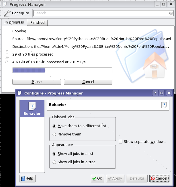
And one more shot: back in January, I wrote about some of the work being done on KDE's Job Progress improvements. This section has seen much work since the very initial code I showed off back then, with much of the user feedback to that article helping shape its development. It now has support for pausing downloads, storing a list of finished tasks, searching for keywords among the active tasks (useful if you have 30 tasks on the go), has a simple configuration dialog, and more. The backend that powers this whole system has seen a lot of work, with more discussion with the GNOME folks on standardizing the mechanism so that applications using this progress reporting will run seamlessly on either desktop. Here's a shot of the job monitor and its configuration dialog (see note 2):
okular has received preliminary support for PDF forms, thanks to improvements to the Poppler backend. okular is the first Poppler-based viewer to add support for forms, but more are expected to follow. The implementation isn't particularly useful at the moment, and looks too ugly for screenshots, but the initial support is there. There has been a lot of development happening in okular - which, alongside other KDE developments, you can read about in the weekly KDE Commit-Digest - including support for additional formats, reworked text searching, and more.
Work on Kalzium powers forward: artwork for a student-friendly view is being developed; a better use of the empty space in the center of the table is in place; and work on libavogadro-based 3D molecule viewer is making steady progress.
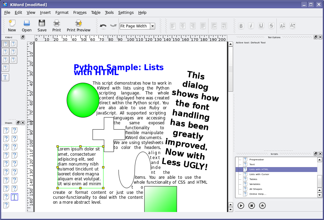
The rendering in KOffice with regards to text and shape rotation has improved. Part of the problems with the screenshots in my original article is that I was using a bad default font that was shipped by my distribution. Here is a shot of a similar document, but you can see what a difference 2 months can make. In this shot, you'll see a number of new things, including a new 'default text' feature. Where you see the famous 'Lorem ipsum' text, clicking onto the text clears the widget of text, leaving your cursor on a blank text shape. Also shown is content generated automatically using the Kross scripting features, and several Flake shapes also inserted using Kross plugins. The user interface also has seen a lot of improvements, however there is still work to be done: missing icons, font and widgets sizes, and so on.
There were many more changes made to KDE since these articles have gone live, and unfortunately I've only had a change to cover a small handful of them. Of course, for a real look at all the work that's being done, you would need to build the sources yourself on a regular basis. In the meantime, I'll return with more new articles so you don't have to build the sources (though I certainly won't discourage you from doing so!).
1Bug Alert: There is currently a nasty, unsolved bug where KRunner stops responding to ALT-F2 after a period. Fear not, this sort of bug will not be present by the time KDE 4.0 hits the streets, as it would be considered 'show stopper' bug. If, however, you need an excuse to get into KDE 4 development, here's a point of entry that will quickly get you accustomed to KDE and Qt programming.
2Power User Tip: This uiserver screen is usually hidden by default when nothing is happening. If you are running KDE 4, you can make it visible at any time by calling the following command:
qdbus org.kde.uiserver /kuiserver/MainWindow_1 com.trolltech.Qt.QWidget.show
Comments
Great job!
KDE is going to blow my shoes away! :D
Very impressive! Good work!
I would like to have a feature in KDE(krunner) that overrides the game you are playing so that you can exit a fullscreen game at any time and go to the desktop by pressing Alt+Esc (Similar to how it is done in windows).
This IMHO is a great feature that I've missed several times in KDE.
Also, great article! These articles really help to keep the community on the edge.
It's not a KDE problem, but SDL. Vanilla SDL allows game to grab keyboard. Some distros like ubuntu have SDL patched to prevent this
What is SDL?
The Simple Direct media Layer or similar acronym. It's a graphics and sound layer designed for making games, visualizations, and so forth. Not part of KDE, but used by KDE applications on a few occassions.
What is happening is that SDL is telling X that all keystrokes have to go to SDL instead of other programs. This effectively locks other programs out of receiving these keystrokes - which is good when you're trying to hit F2 to change weapons at the same time as pressing ALT to jump... You don't want the run dialog popping up :)
That said, certain key combos should still be able to be passed through to X... CTRL-ESC and CTRL-ALT-DEL come to mind. (I'm not sure how SDL treats CTRL-ALT-BKSP... anyone know?)
The real problem is that there's no common, configureable shortcut system, applications have to obey to. One of the big usability issues of the Linux desktop.
Hmm... I think I'll email the freedesktop guys about this, there should be a way in X to configure key combos to be passed through to the WM.
The question is not X, but abstracting the actions from the key combinations and mapping those via a chosen config (so e.g. KDE apps would use Gnome shortcuts in a Gnome desktop and vice versa). This is everything else than simple, since you need to provide fallback shortcuts or even generate them (or ask the user to chose ones) in rare cases for applications, which use shortcuts for actions that are not available in such a common desktop action-scheme. Also getting all and every application support such a change, will take time.
A similar question: In some situations in KDE 3, such as when you have a menu (e.g. K menu or Konqueror menu) open or when you have dropped down a "combo" box (e.g. the address field in Konqueror), global keyboard shortcuts are somehow grabbed and do not work. This means for instance that the volume -/+ keys on my notebook are inoperative. It would be very nice if this were resolved for KDE 4.
I would be happy to file a bug (if one does not exist) if someone just told me which component of the system is responsible for this behaviour.
I've always placed bug reports using my intuition. The bug "handlers" can then re-assign them if they feel they belong somewhere else. It is better to have a misplaced bug report than none at all.
True, this is an annoying problem. I must admit I never thought about reporting it...
Same situation here.
Oh. That explains this problem I've had with KDE locking up completely when a program starting pops up the KWallet password prompt while I'm typing in Konqueror's address bar. Ctrl+Alt+Bksp has been the only solution :-(
No, I never filed a bug report since I'm using "ancient" 3.4.2...
Mac OS X, Windows Vista, and GNOME have stopped using + and - for expanding and contracting folders in the TreeView, and are now using triangle arrows pointing either sideways or down. I think triangle arrows are more intuitive because they actually point in the direction of the folder contents. The + and - are just too cryptic and geekish.
This appearance is a function of the widget style.
I took my screenshots with what are currently the KDE 4 default widget style, but it will not be the final KDE 4 widget style. The final style for KDE 4 is still a work in progress (hence why it hasn't been made the default yet) but this is definitely the sort of change that can happen there.
That said, I don't see anything particularly wrong with the current form, as + and - intuitively mean 'expand' and 'collapse' to me. And changing it just because OS X and/or Gnome have changed it is not a great argument. That same argument would suggest that we change our button orders, and various other things as well, which is not going to happen.
That said, I am under the impression that this is not really a ease-of-use issue, and if it does get changed in a given style, it'll be because the artists who are writing the style think that it looks better :) Which is more valid (in my opinion) than the other arguments :)
"And changing it just because OS X and/or Gnome have changed it is not a great argument."
It have already been changed once, so why not twice?
KDE 1 rules. Nice clear small icons, too!
Yesh, KDE was only good until KDE2 ;-)
That said, the minimalistic style of the days had its appeal.
I notice KDE used to have nice fonts :-)
Well, the fonts depend on the distro... but nonetheless, those fonts are not using anti-aliasing. You can turn anti-aliasing off and have the fonts look somewhat like that still -- they are much more readable in lower font sizes that way, as well as quicker.
X and fonts is still a big problem, after years of work...
Speak for you're self, I like + & -
++
The TreeView widgets are not drawn by KDE apps directly, but by QT (more specifically, by the QT style plugin you use). Thus, some widget styles will have +/- icons in TreeViews, some will have triangle arrows, some will have something totally else :). It's your choice which widget style you use. And some, like the default KDE3 Plastik style, have this configurable. Just run Control Center (why isn't it named "Kontrol Center"?), go to the (Appearance&Themes | Style) applet, and click on the "Configure" button beside the style selector combobox. In the Plastik style the option is named "Triangular tree expander". Enjoy :).
Real-time effects are something I'm really looking forward to in KDE 4. I'm sick and tired of fake transparency, etc. The video of krunner was really neat show of the power of QT4 because the text, which was scrolling quite fast in the background was showing trough the krunner window in real-time. This is what I'm wondering, however, I recognize that QT4 is supposed to be faster, but will it be faster while doing chores that were never done before in KDE? Is real-time transparency with QT4 just an optimization of code which should have been done a long time ago, or will it require a new graphics card and CPU running with aiglx, etc.? It would be nice if i could boast that all this Vista/OSX technology will be available for even old Pentium IIIs with KDE 4, but is that really true?
Actually, that video is showing off a feature I haven't yet talked about for KDE 4 (mostly because it hasn't been merged into trunk yet). It's using kwin_composite, a GL accelerated kwin which does the real transparency at the video card level.
I've briefly talked to the kwin_composite dude (Seli), and he informs me that it will make it into KDE 4.0, barring any unusual problems. It's a good solution for KDE to appeal to those wanting a pretty desktop (like Beryl), but at the same time it has a great fallback mechanism whereupon those without GL acceleration can use some effective software rendering, or have all effects turned off. Basically, it's all about adding bling, while maintaining KDE 3's level of performance (or actually improving it where possible).
When it merges into trunk, I'll feature it here :)
OK, so let me get this strait. The transparency in that video had nothing to do with the QT4? It was just done through a beryl/compiz like setup? If this is true, what is the advertised QT4 real-time transparency good for then?
Take a closer look - there are two transparencies happening:
One is showing a widget that you can see part of the background image from. It is shown off in the still screenshot I posted above, which does not use any beryl/compiz-style transparency. You will notice that the run dialogs' background is showing even in the line-edit. This is an application-internal type of transparency, possible because Qt controls the whole widget stack. It's quite slick...
But Qt doesn't control X, so when doing transparency between windows, X methods need to be used. This beryl/compiz like window tranparency is handled by kwin_composite and relies on Qt, GL, and the X Composite extensions. This video is not using beryl/compiz, but uses a similar implementation found in kwin_composite. It uses Qt for some effects (such as blurring/recolouring the background) and Qt-driven GL calls for others (such as wobbly windows, no demonstrated in the video) where appropriate.
Hey thanks troy for keeping up with me, I understand now.
You gave me an idea though, we really should build an X replacement that's completely controlled by QT, a QT accelerated graphics display system for Linux, where QT can control all elements of the display, not just the internal parts of QT programs. That would be talking. Its unification like this that's needed in order for Linux to take over the desktop.
That's all well and good but what happens when I want to run a non-QT app? There are several here and there that are pretty good......
A display system that supported only QT would force the KDE community to create KDE programs that provide ALL computing needs. This would be a good thing since it would provide complete unification of the Linux desktop. Think about it.. ALL programs would use the same file save and open dialogs. ALL programs would use the same color scheme/widget style. ALL parts of the display would be powered by the SAME graphics engine which means LESS CONFIGURATION and LESS CONFUSION. KDE taskbars should be able to have true real-time transparencies just through QT 4, but NO, in order to do this, we have to write additional 3d extensions to kwin which will be working IN ADDITION to the new QT Arthur paint engine, instead of being powered by it. Arthur is probably powerful enough to do this, but QT doesn't control X, so it can't be done. I'm really sick and tired of X windows actually. X doesn't have native SVG render support so all SVG used in QT programs have to be rendered and cached before they can be displayed by X. If the graphics system was controlled by QT, as QT would improve, so would the graphics system, new versions of QT wouldn't have to constantly maintain backwards compatibility with an out-of-date graphics system.
Go buy a Mac, you really want one of those.
Ha! You're probably right, I probably should just get a mac, but Mac OS isn't completely opensource. KDE Linux really should be a complete Mac OSX replacement, but currently, it doesn't quite cut it.
Does the fallback include using 2d compositing/EXA? I much prefer this as it is, at least on my machine, considerably faster and nicer to look at than all that Beryl crap, which runs slow and looks dumb.
You'd have to ask Seli about who the fallback mechanism works in more details... or, once it's merged back into trunk, I'll do the research and write about it.
*puts on a fedora with a press card on the front*
This subthread is of concern to me as well, as I've presently a now aging but until very recently "best freedomware 3D support available" ATI Radeon 9200 series card. The native xorg Radeon driver in merged framebuffer mode supports accelerated OpenGL on this thing up to 2048x2048, but I'm running two monitors at 1600x1200 resolution, stacked for 1600x2400, so there's 352 lines' resolution unaccelerated at the bottom of the combined display.
With KDE3 (3.5.6 currently, on Gentoo/amd64), running xorg (now the 7.3-rcs), I've found EXA works waaayyy better than XAA, with composite and composite effects (only the transparency, fading takes time, and shadows just don't add anything to my experience, maybe because I run light foreground on dark background by default, so I can't see them in many cases, unless I reversed them of course, which is just... weird) turned on. It works quite well, actually, with the single exception being OpenGL apps go blank when moved partially into that zone... not so great when that's my main work monitor. I'd hope that before the entire desktop goes OpenGL, xorg would kill that 2048 max height/width acceleration issue -- and of course the xinerama OpenGL accel issue if it still exists as well. That's not under KDE's control of course, but a decent fallback to 2D EXA would be fine, as long as it remains a viable option.
Of course, if there's one thing KDE two and three have been good at -- one of the main reasons it's my desktop of choice -- it's giving people reasonable options, and I'm reasonably sure that's going to continue with four as well. I'm just commenting here in the interest of ensuring it does. =8^)
BTW, here's a now dated (a bit over a year old, Feb 2006, KDE 3.5.1) screenshot (1/3 size). Astute KDE users will likely recognize the layout of the page as modified from one generated by the Konqueror Create Image Gallery tool. =8^)
http://members.cox.net/pu61ic.1inux.dunc4n/pix/screenshots/index.html
Duncan
Will the Dolphin style of navigation become the default file open/save dialog?
Will Dolphin have easy navigation?
I read this article here: http://insanecoding.blogspot.com/2007/03/file-dialogs.html
And it made me a bit disturbed to hear about the planned changes and what Dolphin is like.
Will Dolphin end up getting proper inputting of paths, and not have annoying "virtual directories" ?
Okay, since this question keeps coming up over and over...
The KDE File Dialog is part of kdelibs. The icon views and so forth that Dolphin is using are part of Dolphin but anything that would be useful to other programs are being sent down the chain into kdelibs as well. So anything sent down can be shared between Dolphin and the File Dialogs (and Konqueror, and any other program using icon views, like K3B, for instance).
That said, the only thing they are complaining about in that blog is the breadcrumb. And it is indeed *configurable* to have the old style selector in Dolphin as the *default*, and no, the KDE 4 File Dialogs do not use the breadcrumb (nor have I heard any rumblings that anyone plans to make that change). The keywords here are _configurable defaults_, as KDE tends to be.
The other thing they are complaining about is Qt4's dialogs (in a non-even-beta-release version of Qt 4.3), but since KDE implements it's own dialogs, Qt's changes here will not affect KDE.
So really, no need to worry...
He also noted the lack of renaming possibility (at least for KDE 3), which is a feature I found particularly useful (in fact like every basing file management you can do in the file dialog). If it would come with KDE 4 it will be great (and unobtrusive: right-click or F2 press). For everything else, as long as it's configurable it's okay.
The file dialog is something quite important, given how often it is used, making it feature complete spares time. (I think it is the thing in Gnome I dislike the most, given how unusable it is.)
I've used a bit of a workaround for the lack of renaming before: choosing properties and then renaming from within that dialog. I agree though, adding rename on F2 (or whatever the user has configured for keypress) and/or in the context menu would be useful (and less clicks than my workaround).
Well, F2 would be good shortcut to support, but your workaround is the exact same number of clicks as if we had a rename action in the right click menu.
In both cases it is:
Right click the file
Choose Properties/Rename
Type the new file name
Hit enter/Click Ok.
The file name is highlighted by default when you open properties, so its not any slower.
Placing rename as a top-level function in the open/save dialog is mixing concepts and growing context menus while not providing anything extra, as troy showed you can still rename if you need to.
The thing is, while you are working in a file save dialog filesystem manipulation is not one of the things that is on the feature list for almost all cases. If you want to do filesystem manipulation, start your Dolphin to do so.
People that cry 'feature creep' or 'bloated' tend to point to the amount of features available in a given UI. Getting the amount of features right is a case of balance. And discussions we had over the last 2 years made us decide that the balance is kept by not providing filesystem operations in the file dialog itself.
Hope that explains it.
What if I want to save a file with a specific name, but a file with that name already exists that I want to keep? Or what if I have just created a new folder and want to change its name? Both of these circumstances are helped by the presence of a top level rename option. Yes, I could go via a Properties... dialogue, but they seem to be fundamental enough to the operation of saving files that it deserves its own entry.
You do have a point here, imho. I use the properties dialog for renaming, and just being able to use F2 or a click to rename a file would make sense. Having to start konqueror/dolphin, go to the location in the filedialog, just to rename a file - not really efficient. Besides, you can create new folders, why not rename a file?
Like I already posted, your aversion to the Properties option is purely psychological. It is the same speed as a dedicated rename action. Think about the actions involved. Try it.
Click to rename is a horrible feature in windows. Ever watch a newbie trying to double click? Half the time they rename by accident.
F2 would be nice to have though.
The problem with the Properties dialog is that it is not obvious that you should open it if you want to rename a file. It already occurred that I wanted to change a filename in a dialog and then it did not pass my mind to have a look in the Properties dialog for that feature (by the way, thanks for pointing it out).
I agree that click to rename is a horrible feature. Failing to double click properly is something that happens all the time to me, and I am double clicking already for more than ten years. No need to say that I hate double clicking and programs that force me to double click.
Was it the usability experts that said to remove these features? Or was it something random that you decided?
Well, I always thought KDE was the UNIX desktop from the professionals for the professionals, and we very much expect filesystem manipulation from the file dialogs. Heck, even Windows has it, screw the 'rather not confuse the user mentality'. I love KDE because it lets you do things the way you expect them to work, and I and many others (http://insanecoding.blogspot.com/2007/03/file-dialogs.html) do expect a renaming in the file dialogs to work. Troy's workaround is just that, an inefficient glitch and not the solution.
All people on the KDE team please note: do not sacrifice any power features for an assumed 'ease of use' for the masses, many avid KDE users who promoted it for years are very pissed off by moves like this. I for one am, and Aaron 'knight of ui' himself has first induced this feeling by acting like a gnome robot on this: http://bugs.kde.org/show_bug.cgi?id=96570
Quotation from the first link:
"I always found that feature useful if you wanted to save a file as the same name as something existing, but wanted that old file to be backed up. Perhaps some KDE developers have been spending too much time with GNOME/GTK devs.
Speaking of which, I've been previewing some stuff for KDE 4. Now while I have no idea what the final product would look like, some changes as they currently stand are a bit disturbing.[...]
I don't know why KDE devs are adopting stupid GNOME ideas, or taking a step backwards to design mistakes and oddities from Windows, but I sure hope someone knocks some sense into them soon.
[...]
The copying of stupidity is uncanny. It seems they removed features and changed defaults to make it resemble GTK more, for some absurd reason.
[...]
I don't know what's becoming of KDE and Trolltech these days, they seem to be taking the bad from GTK/GNOME and throwing away their own good technology.
[...]
I can't even begin to describe what a major step backwards it is. What happened to the sanity? Where's the intelligence? Where's all the good stuff? Why am I looking at garbage from a lesser API, in the best cross platform one available?!?"
Chill :)
We have no plans to remove any features from the file dialogs.
cant chill right now have a very important exam tomorrow X==P
anyways what i said not only applies to file dialogs but everything in kde, that's why i quoted out of context ;)
You know, KDE4 is not even Alpha yet. For these detail levels, a review is not yet appropriate, I believe. Arguing about what's not yet there is NOT the point of the previews.